Create Custom Visual Reports
Learning Objectives
After completing this unit, you’ll be able to:
- Create a custom bar chart visual report.
- Create a custom line graph visual report.
- Explain which fields are available for selection as a Calculated Field.
- Export a visual report.
Plan Your Custom Reports
Not every report you want to monitor is included in Spiff by default.
If you want to create a custom visual report, think about what reports your teams need. Identify the specific metrics and key performance indicators that are most relevant to your sales team's goals, such as total sales, conversion rates, and average deal size. From there, you can use Spiff visual reports and choose the right visualization tools and formats that best represent the data, such as bar charts or line graphs.
In this unit, you learn how to create a few common custom visual reports.
To get started, you create a leaderboard to monitor success across your teams. Let’s explore how to create one of these leaderboard visuals with Spiff's visual bar chart.
Create a Custom Bar Chart Visual Report
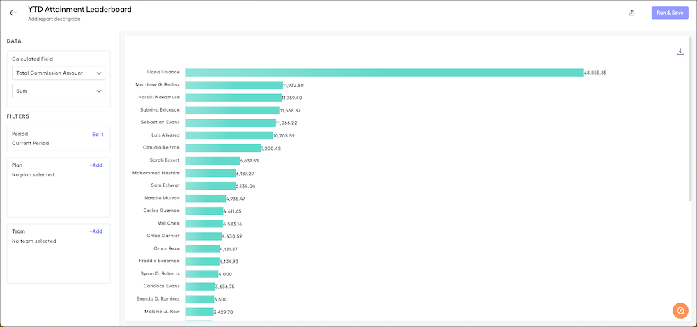
Imagine you want to create a visual bar chart report that shows a leaderboard of year-to-date quota attainment for each rep.
First, make sure you have a year-to-date attainment worksheet calculation, then create the bar chart. Any worksheet calculation or statement measure can be used in a summary or visual report, so why use a worksheet calculation for the year-to-date attainment figure? In general, worksheet calculations are better suited for visual reports than calculated fields and datasheet fields. That’s because worksheet calculations return a single output (like a sum total) instead of individual line-by-line results.
Let’s create a report using the example of a worksheet calculation called YTD Quota Attainment, which calculates each rep’s progress toward their year-to-date quota.
- Click Reporting in the Spiff navigation menu, then select Reports.
- Click + Create Report.
- Enter a report name and description, then select a report type. For this leaderboard example, select Bar Chart.
- Click Create Report.
The default view of the bar chart shows the total commission amounts for all sales reps.
In the Data and Filters menus, you can make customizations to the report.
For this example, select YTD Quota Attainment and Sum in the Calculated Field fields, then click Run & Save.
After the report loads, it’s narrowed down to include only the sales reps on the plans that use the YTD Quota Attainment worksheet calculation.

Let’s examine the results for a single sales rep, Chloe Garnier. Upon comparing Chloe’s statement with this report, there appears to be discrepancies.
Remember that Sum is selected for the Calculated Field. This selection returns the sum of all records applied to the statement. In Chloe’s case, her already impressive 209.61% Quota Attainment YTD is added as many times as she’s recorded using the calculation, resulting in a total 1,467.29%.
Sum works well for measures like annual recurring revenue (ARR) because it combines all records into a single sum for the report. The YTD Attainment calculation, however, is already aggregated, so using Sum isn’t necessary. Change the Calculated Field to Average and click Run & Save.

When using Average, and not Sum, the numbers on the leaderboard are considerably lower because they aren’t being added several times.
Create a Custom Line Graph Visual Report
Let’s create one more custom report: A line graph visualization, which works well to chart a calculation over time.
Rep statements often include important measures that admins, managers, or reps want to track. These custom visual reports allow you to quickly compare calculations across your organization’s reps. Here’s how you create it.
- Click Reporting in the Spiff navigation menu, then select Reports.
- Click + Create Report.
- Enter a report name and description, then select a report type. For this leaderboard example, select Line Graph.
- Click Create Report.
The default line graph appears.
In the Data menu, choose the calculation to display. You can choose between statement/summary calculations or line-by-line calculations that are used in any of your payout rules.
To create a report for a summary calculation (the metric cards you see on the statement), we suggest you select Average in the Calculated Field field. Summary calculations are typically values that are already aggregated over many records. The Sum value in the Calculated Field would work well for line-by-line calculations—which are seen as columns on the statement, also called calculated fields—that typically haven’t been aggregated.
Like with standard reports, you can define the period, plan, and teams to include in custom visual reports.
Click Run & Save to generate your report.

To eliminate the results from one or more plans, click their colored dot on the key to remove their line.
Add Calculated Field Options to Custom Reports
What if the field you want isn’t showing in Calculated Field options?
A field is only available in Calculated Field if it’s formatted as a currency, number, or percent. The report can’t use any string data types as a calculated field. If the field is visible on the statement, but not an option when creating your report, check the formatting of the field.
- Click Designer in Spiff Navigation.
- Click into the Global Search bar at the top of the page.
- Find and select the name of the calculation you want to add to a report.
- On the calculation, click
 to open the right sidebar.
- In the Format section of the sidebar, check the Display Format field. Display Format must be set as Currency, Date, Number, or Percent before it shows as an option on a report.

- Change the Format value as needed.
After you check or change the Format value, go back to your custom report to check that it’s available in Calculated Field.
Export a Custom Visual Report
Custom reports can be exported as image or data files to share in presentations or for further analysis. Reports can be exported to .svg, .png, or .csv format, depending on your needs.
To export a report:
- On the visual report, click
 on a bar chart or
  on a line chart.
- Select the format for the file to download.
That’s it! Find the file where you saved it and use it however you need.
Wrap Up
In this badge, you learned about visual reports in Spiff. You explored the five standard reports, then created a few custom reports of your own. You also learned how to export reports so you can use them to further analyze the data or add them to presentations.
With this knowledge, you have the tools to identify trends, outliers, and patterns in sales performance. What custom report will you build first?