Get to Know the B2C Commerce Promotions Dashboards
Learning Objectives
After completing this unit, you’ll be able to:
- List the four Promotions dashboards in the Reports & Dashboards tool.
- List the types of analytics covered by the All Promotions dashboard.
- Explain how to analyze and evaluate the All Promotions dashboard report metrics.
Explore the Promotions Dashboards
The Promotions dashboards in the Salesforce B2C Commerce Reports & Dashboards app provide you with insights into your promotion strategy. On the surface you can find metrics that tell you the number of times a promotion has been used, the revenue attributed to a promotion, the number of orders placed from a source code, and the promotion conversion rate. But dig deeper and you can find analytic data that can help you take a successful campaign strategy from high-performance to supersonic.
There are four Promotions dashboards, each with a specific focus to help you evaluate and improve your promotion strategy.
-
All Promotions dashboard: Shows you Most Used Promotions, Total Promotion Discount, Promotion Combination, Average Order Discount, Used by Promotion Class, and Revenue Impact by Promotion Discount reports.
-
Promotions Detail dashboard: Shows you data and reports for an individual promotion.
-
Promotions Source Code dashboard: Is your single source for all source code data. Use the dashboard to view source code conversion activity and to determine which source codes are driving orders and revenue in your storefront.
-
Promotions Conversion dashboard: Shows you promotion conversion metrics for all classes of promotions, grouped by campaign. Use it to identify the promotions that convert site traffic to revenue and the promotions that underperform.
Launch the All Promotions Dashboard
In this module, we assume you are a B2C Commerce merchandiser with the proper permissions to perform these tasks. If you’re not a B2C Commerce merchandiser, that’s OK. Read along to learn how your merchandiser would take these steps. Don’t try to follow our steps in your Trailhead Playground because B2C Commerce isn’t available in the Trailhead Playground.
If you have access to B2C Commerce Reports & Dashboards, you can try out these steps in your instance. If you don’t have access, ask your manager if there is one that you can use.
There are two ways to launch Reports & Dashboards. Both require that your admin grant you access permissions through Account Manager.
- Launch Reports & Dashboards from Business Manager.
- In Business Manager, click App Launcher, and then select Merchant Tools |Site | Analytics | Reports & Dashboards.
- From there, click the Promotions tab.
Tables, Graphs, and Metrics
When you click the promotions tab in Reports & Dashboards, the All Promotions dashboard shows as the default.

This table describes the All Promotions dashboard tables and graphs.
Table or Graph |
Description |
|---|---|
Most Used Promotions (1) |
The Most Used Promotions table ranks the top 10 promotions by number of uses during the time period. Promotions are ranked by uses in descending order and include the total number of uses and total discount. Use the column sorting options to change the data ranking from descending to ascending.
Use the results to see where a promotion ranks; compare the number of uses and total discount with your performance goals. For example, you projected 10,000 uses and the table shows 12,000. |
Most Used Promotions (by selection) (2) |
The Most Used Promotions by Selection table ranks the top three promotions by number of uses for a segment type.
Use the selection options to get insight into who is using your top promotions, how are they using them, and from where. For example, you might see that a promotion that was used 1,000 times had 300 registered customers and 700 unregistered customers. |
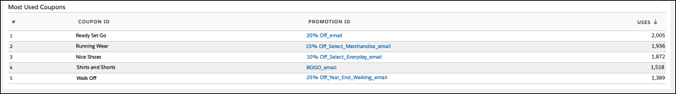
Most Used Coupons (3) |
This table ranks the five most used promotion coupons during the time period. Use the column sorting option to change the ranking order from descending to ascending.
Use the table to review the performance of promotions that use a coupon as a qualifier. See the number of uses and the total discount for the coupon. |
Total Promotion Discount (4) |
This graph plots the value of all promotion discounts over the selected time period. Plot lines are shown for each promotion class (Order, Product, Shipping) as well as total discounts from all promotions.
Use the graph to track how promotion discount values change during a promotion. For example, track seasonal use of promotions during an annual holiday. |
Promotion Combination (5) |
This table ranks how often two promotions are used together in a single order. The ranking is based on the percentage of the total number of orders. For example, promotion 1 and promotion 2 are used together for 10% of all orders. Select the Frequency column heading and change the ranking to the ten least used promotion combinations. |
Average Order Discount (6) |
This graph plots the daily average promotion discount value per order over the selected time period. It shows the average value for the entire time period and each day of the selected time period.
Use the graph to see the performance trend and evaluate the impact your promotions have on average order values. |
Uses by Promotions Class (7) |
This graph shows you the percentage of all promotion uses by promotion class.
Use it to analyze promotion usage relative to class type. |
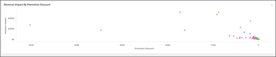
Revenue Impact by Promotion Discount (8) |
This graph plots promotion revenue impact over promotion discount for each promotion used during the selected time period. Points on the graph represent promotions used during the dashboard time period.
Use it to compare the amount of discount each promotion gives away relative to its revenue impact. |


This table defines the All Promotions dashboard metrics.
Metric |
Description |
||||
|---|---|---|---|---|---|
Uses |
The number of times the promotion applied a discount to orders created in the selected time period An order may have multiple uses of a single promotion if the promotion setup allows this. For example, a product-class promotion has two uses within a single order if the order contains two products that both receive the discount. Note that, in this example, if the two discounted products were the same SKU appearing as one line in the order, this would be reported as one use. |
||||
Discount |
The amount of discount applied by the promotion to orders created in the selected time period |
||||
Total Promotion Discount |
The total amount of discount applied to orders created in the selected time period—includes discounts from product, order, and shipping promotions, as well as any manual price adjustments made (for example, by a customer service agent) at order creation |
||||
Average Total Promotion Discount |
The daily average amount of discount applied to orders created in the selected time period, calculated as: Total Promotion Discount / Number of Days in Selected Time Period |
||||
Promotion Combination Frequency |
The percentage of all orders to which the same two promotions are applied |
||||
Average Order Discount |
The average amount of discount applied to orders created in the selected time period, calculated as: Total Promotion Discount / Total Number of Orders |
||||
Most Used Coupons |
The number of times the coupon/promotion combination applied a discount to orders created in the selected time period
|
||||
Revenue Impact |
The total value of the merchandise discounted by the promotion Product class promotions take only the merchandise value of the products they are applied to. Order and shipping class promotions take the total merchandise value of the order. When multiple promotions are applied to an order, the value of the affected merchandise is prorated uniformly between those promotions, ensuring the same revenue is not attributed to more than one promotion. |
Collectively, the tables, graphs, and metrics show you how your promotions performed during a time period you select.
Evaluate Campaign and Promotion Performance
Brandon Wilson is a senior merchandiser for Cloud Kicks, a high-end custom sneakers retailer. He knows that accurate promotion performance data is critical to effectively managing his campaign and promotions strategy.

He’s excited to use the metrics available in the All Promotions dashboard to assess the performance of his latest campaign.
Cloud Kicks recently introduced a new trail-running shoe, the Soft Rock. To jump-start sales and generate customer excitement, Brandon configured the Soft Rock Happy Trails campaign. Brandon’s strategy is to target registered and returning customers who are running and hiking enthusiasts. Later, after he assesses the performance of his initial campaign, he can explore other possibilities and build on the campaign’s performance results.
Here are the initial campaign promotions.
-
25% Loyalty: Requires a coupon code offered to members of the Cloud Kicks Loyalty Program.
-
20% Soft Rock: Requires an email link sent to registered customers who purchased Cloud Kicks running shoes during the past year.
-
15% Order: A storefront offer that requires shoppers to combine Soft Rock Trail-Runners with qualifying running accessories.
Campaign Performance Analysis
The Happy Trails promotion has been running for two weeks, and Brandon is ready to review performance numbers. For his assessment, he uses the All Promotions dashboard. Let’s look at the metrics that grab Brandon’s attention and see what they tell him about his campaign.
Most Used Promotions

All of the Happy Trails promotions are listed in the top ten most used. Two of them (1) are in the top five. Cloud Kicks generally runs around 25 promotions simultaneously, so making the top five ranking is exceptional performance!
Brandon expected to see a higher number of uses for the 25% Loyalty promotion (2). He suspects that he didn’t account for the wide range of interest in the loyalty program demographics.
Most Used Promotions by Customer Type (New and Returning)
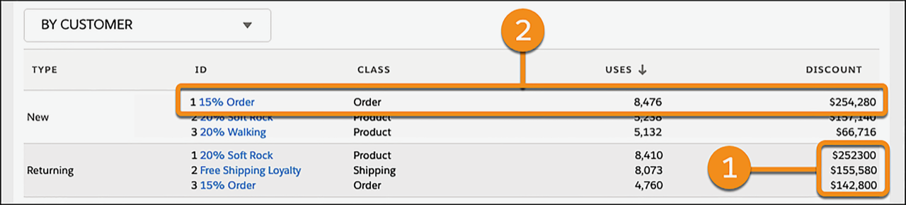
Because his initial campaign promotions target returning customers, Brandon is interested in the new versus returning customer metrics. The table shows his promotions have more uses with returning customers (1), not surprising since they are the principal target. But Brandon sees that new customer uses of the 15% Order promotion (2) is outpacing expectations. That, combined with the top 5 ranking, indicates that the promotion is performing well across customer types.
Total Promotions Discount

Brandon notices spikes (1) in total promotions discounts on the first Sunday and Tuesday of the campaign. He knows Sunday was when the 20% Soft Rock email was sent to customers, so that's expected, but he makes a note to have a closer look at what happened on Tuesday.
Revenue Impact by Promotion Discount
When Brandon reviews the Revenue Impact by Promotion Discount graph, he sees that the 20% Soft Rock and the 15% Order promotions are generating revenue at a 3:1 and 4:1 revenue to discount ratio, respectively. That’s awesome! He attributes the numbers to the running accessory qualifier. Later, he can confirm his theory with the Promotions Details dashboard. And although the 25% Loyalty promotion hasn't achieved use rate expectations, its revenue to discount ratio is 5:1. That’s impressive.
Brandon has a few changes to consider but is pleased with these initial campaign performance metrics. Now he’s ready to see more granular promotion metrics. He can use the Promotion Details dashboard for that review.
Next Steps
In this unit, you explored the All Promotions dashboard. You learned how to launch the dashboard, what analytic areas the dashboard covers, and how to assess promotion performance. Next, you learn about the Promotions Detail dashboard.
Resources
Quiz Scenario
After reviewing the Happy Trails campaign, Brandon is encouraged by the promotion results. He wants to take advantage of the strong sales with new customers and decides to add a new promotion to promote the Soft Rock shoes to a wider running and hiking customer base.