Take the Steps to Build Better Experiences
Learning Objectives
After completing this unit, you’ll be able to:
- Describe the three-step approach to designing better information apps.
- Explain how relationship design informs the design process.
- Articulate how information design is a chance to express your organizational values.
The Problem with Having Everything in One Place
Now you’ve got a toolbox to work with. Great! But what does this all look like in practice? How do you actually go about designing and building great user-centric products? In this unit, we’re going to show you how relationship design can help your end product serve the needs of your business, your customers and users, and the broader community we share. Ready?
The product developers at Cloud Kicks recently launched a new sales dashboard. The dashboard was supposed to make it easier for company leaders at all levels to stay on top of key sales metrics. But it’s not working.
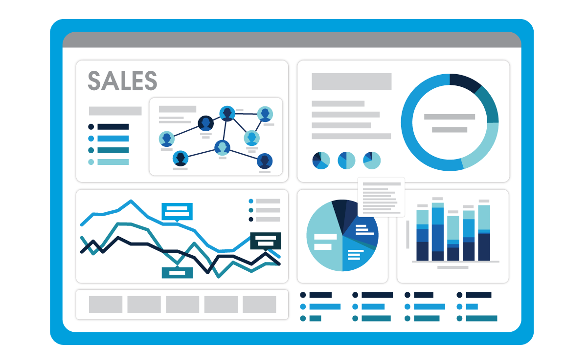
Adoption of the new dashboard is low. User feedback is almost nonexistent, but the few bits of feedback have been negative. The product owners tasked developers with building a dashboard that puts all key data onto a single screen. But the new dashboard is busy and confusing, and users can’t find the information they need. One user specifically said they couldn’t drill down to see the context behind specific data points, which made them mistrust the entire dashboard.
Cloud Kicks’s product team is now setting out to redesign the sales data experience from the ground up. Let’s go through the first stages with them, and see how they use the relationship design process, mindsets, and tools to elevate their information design.
Three Steps to Better Information Design
Step 1. Discover
The first step to designing a better app is to discover needs and constraints.

Cloud Kicks’s team gathers all the information they can about their users’ intentions and desired actions. They talk to stakeholders—the CFO, regional sales managers, and customer support agents, as well as project owners and development leads—being sure to involve everyone who might be building, managing, or using the end product.
Designers work with stakeholders, helping them complete a simple worksheet that helps discover each individual’s identity, motivations, frustrations, and goals. The designers ask lots of open-ended questions—a Jobs to Be Done hallmark—about how and why the stakeholders use sales data, and dashboards, specifically.

The product team starts to better understand their stakeholders. Dipping back into the JTBD framework, they start to draft some job stories.
In Cloud Kicks’s case, the team quickly realizes that they have three main types of users to serve. As such, they land on three job stories.
The executive:
- “When I look at data, I want to see top-line sales performance at a glance, so that I can understand how sales is impacting the overall health of the business.”
- “When I need a high-level view of overall business health, I want to see top-line sales performance at a glance, so that I can understand how the sales numbers are doing as compared to projections.”
The sales leader:
- “When I look at data, I want to have a 360-degree view of my sales performance, so that I can meet or exceed quota and identify new sales opportunities.”
- “When I’m optimizing our performance at the sales team level, I need to understand how we’re doing on leads, pipeline, and closed sales, so that I can manage the team’s focus and drive efforts toward our goals.”
The sales rep:
- “When I look at data, I want to see my sales numbers and open opportunities, so that I can make my quarterly numbers.”
- “When I’m gauging my own sales performance, I need to understand my progress toward my goal and become aware of open opportunities, so that I can make my quarterly numbers.”
It’s clear now how the original, fit-everything-on-a-single-screen approach was the wrong one to take! Having gone through the Discover process, Cloud Kicks’s product team now knows they have three distinct personas to design and develop for, each with their own job story and product needs.
Next, the team brainstorms a list of questions they think their users will need answers to in order to achieve their goals. This helps them think in terms of, “questions first,” not “metrics first.” They go through the questions with their stakeholders, creating a path of inquiry that structures user information needs into an outline. Team members start noticing similarities in the questions they came up with. Those similarities form into unifying sets of questions—emergent themes that will inform the structure of the app, and its individual screens.
Step 2. Define

Step two is to define the solution to be created. This step, like the others, involves a lot of collaboration and idea generation. Which means…
It’s Design Session Time!
Cloud Kicks’s product team gets together for a working session with a cross-section of stakeholders. They use the design session format, so the workshop starts with sketching. The process allows the group to start visualizing a solution that meets the key needs of all three user groups: the executive, sales leader, and sales rep.
Quickly, it becomes clear why the current single-screen dashboard experience isn’t working. It doesn’t really solve for any of the user stories, let alone all three! The first step any user takes toward the goal of “seeing the latest sales metrics that affect my role,” is to look at the dashboard. Immediately, they all face the same challenge—namely, being paralyzed by information overload on that single screen.
As the design session progresses, ideas take shape for three sets of screens and navigation paths, one to fit each user group. The ideas are presented, sorted, and prioritized by way of silent vote. From there, it’s a pretty quick mental leap from the current, static dashboard to see the framework of a new, dynamic user experience coming together.
The team starts to envision a clean, easy-to-use sales performance app that serves up the appropriate home screen and navigation options according to who’s using the app. As noted above, the themes that emerged while creating the path of inquiry during the discover phase will inform what makes it into the final design of the screens in the app. Which brings us to an important point.
Represent Your Values in Every User Experience
A lot of great work has been done, and not a single line of code has yet been written, or pixel placed on screen! Which now begs an important question: What actually makes it into the app?
Relationship design suggests that question might actually involve answering two related questions:
- What is it that the users care about, and how do we show it to them?
- And, how are we doing at representing our values via the things we’ve defined as important?
That second question brings relationship design into focus. Recalling unit one, RD has us consider the various impacts of potential solutions, including if and how we’re manifesting our values.
In other words, if you make a dashboard that's explicitly about speed to sale, and that's all you measure, you may be incentivizing your sales team to sacrifice other important factors (like getting to know a prospective customer enough to match them to the right product) in order to make these specific numbers move.
Relationship design simply asks us to stop and examine the downstream effects of what we've just designed. And to check in with our integrity. If we want to incentivize people selling the right products, should we add metrics about customer retention or repeat purchases?
Cloud Kicks’s product team has a solid vision for their app, and an organized information structure to work from. They’re ready for step three: design.
Step 3. Design

Create the Plan for Communication
The third step in the process is design. We also refer to this step as creating the plan for communication. You need to create a clear information architecture that will support page layouts that are simple to understand, nice to look at, and follow patterns that people are familiar with.
Think Like Your User
All of the work from steps one and two have given Cloud Kicks’s product team a good understanding of what their users need from a new sales data app. Top-voted questions from the path of inquiry are grouped into logical themes that form an app structure. Here, the team lands on performance, focus, and team as the themes.
Here’s how it looks for one of the team’s core user types, the sales leader.
Performance |
Focus |
Team |
|---|---|---|
How much have I closed the quarter? |
Where is my white space? |
How much pipeline do each of my reps have? |
What's the current gap in quota? |
How much product have I sold by state? |
How much product have I sold by state? |
The three themes—and the associated questions that the app needs to answer for the sales leader user—readily translate into an app structure.

For Cloud Kicks’s sales leader users, this is enough information to answer their questions and needs. The product team replicates the process for their other two user types, drawing from the path of inquiry questions for each group.
Now that the app structure is defined and mapped out for each of the three user types, the next step is designing page layouts.
Page layouts, interaction design, and the other things that go into designing screens are beyond the scope of this module.
Summary
Though we didn’t get into the details here, our friends from Cloud Kicks nailed the visual design and technical development of their new analytics app. Buoyed by a well-thought-out internal rollout, the new app saw great internal adoption. Users enjoying a well-designed experience that makes their jobs easier? Makes sense to us.
Congratulations, Trailblazer! You’re at the end of the module, with a core understanding of how relationship design can help drive value in all of your UX design work. Our example walked through the information design stage of an analytics app, but relationship design can be applied to all UX work. The user centered process of relationship design has led to solutions that drive business outcomes, and it helps us make information easier to access and more useful through basic design principles and tools, which anyone can adopt and use.
Resources
- Trailhead: Journey Mapping
- Trailhead: UX Research Basics
- Lightning Design System: Accessibility Overview