Read Charts with Confidence
Learning Objectives
After completing this unit, you’ll be able to:
- Critically evaluate interpretations of data.
- Use a checklist to assess the credibility and accuracy of charts.

The Importance of Careful Interpretations
Even charts created with accurate source data and appropriate design choices are subject to misinterpretation. The key is to think critically and take the time to thoughtfully evaluate the interpretations of data that you see portrayed in charts and other data visualizations.
When reading a chart, take a moment to consider whether any critical information is missing. If you’re able to dig into the source data, sometimes you’ll find relevant information that isn’t reflected in the chart. Hidden or missing information can skew how you perceive the data presented to you, regardless of whether the omissions were intentional.
Consider the Comparisons Made
“Visual displays, if they are to assist thinking, should show comparisons.” –Edward Tufte, Beautiful Evidence
As you learned in the first unit, charts can help you make better decisions. They help you make informed comparisons and answer the right questions to help you make good decisions. Beyond determining the credibility of a chart’s data, it’s also important to consider the context of the chart and understand the comparisons made within them. Even if a chart’s data is trustworthy, you might jump to incorrect conclusions if you don’t pause to make sure the chart is addressing the right questions first.
Think About the Big Picture
Another common pitfall to watch for is when charts fail to show the whole context in a scenario.
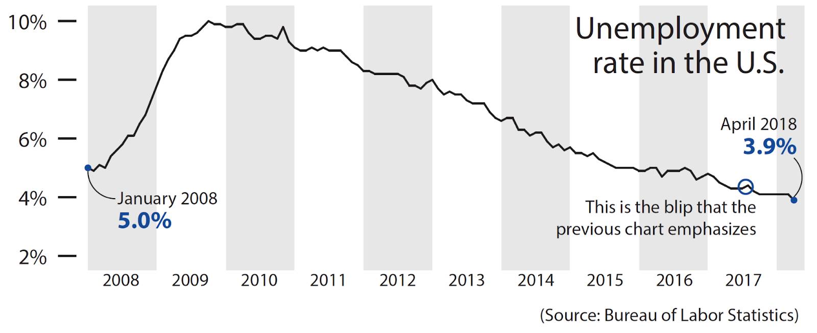
For example, in "How Charts Lie", Alberto Cairo discusses the following bar chart. The suggested takeaway is that the unemployment rate is increasing.
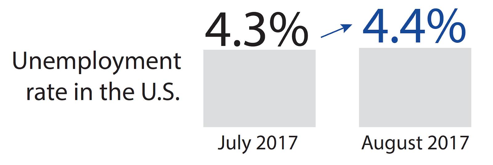
However, if you look at these two data points in the context of the entire year or even across multiple years, a different pattern emerges. Although the unemployment rate did increase between July 2017 and August 2017, the rate is actually going down over time with fluctuations occurring between months. This tells a very different story.
Consider Margin of Error and Uncertainty
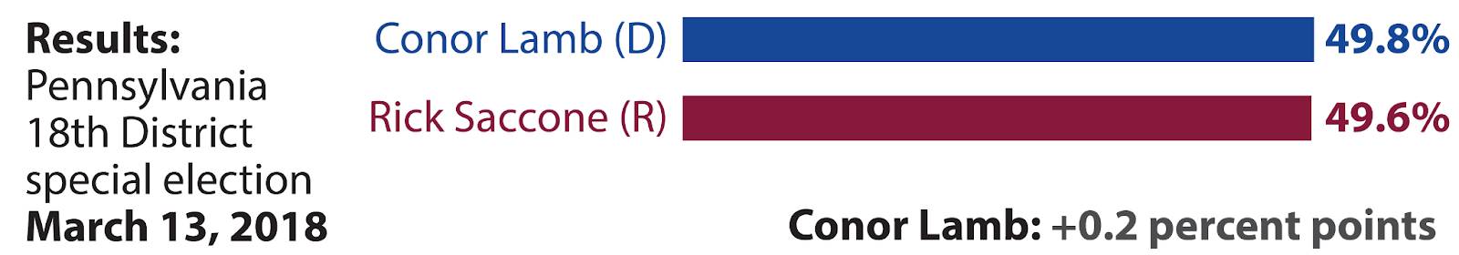
Nothing’s perfect, including data. You can be surprised sometimes by the results of elections when the polls show the non-winning candidate ahead.
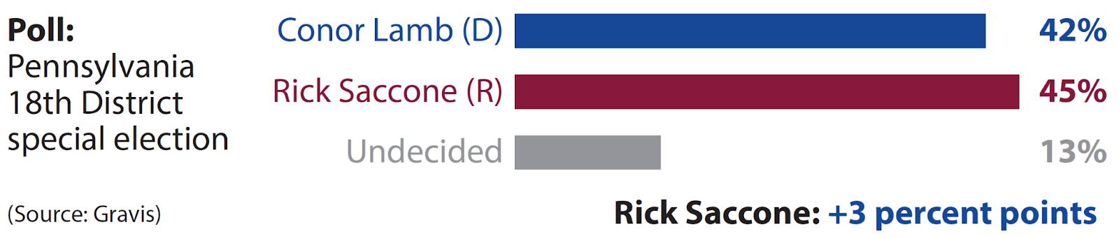
When interpreting polls, look for the margin of error or confidence interval. In this example the margin of error was +/- 3 percentage points. What does this mean?
The margin of error is not describing “mistakes” in the study, rather it’s telling us how much uncertainty there is in our estimate. Usually an estimate is a middle point of a range. Imagine trying to measure the length of a very squirmy, happy dog. The more times you try to measure it, the more confident you’d be that you know how long it actually is. All you can say for certain, though, is that this particular poodle is somewhere around 28 inches long, give or take an inch.
In this example, you would say, “Given our methods of collecting and measuring, we are 95% confident that the value for Rick Saccone that we’re trying to estimate is between 42 and 48, or 3 points larger or smaller than 45 and the value for Conor Lamb is between 39 and 45, or 3 points larger or smaller than 42.”
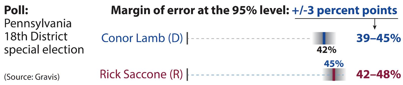
When statisticians describe margin of error, they will say at a particular confidence level or level of uncertainty. Statistics allow you to be confident that if you ran the study many times with the same methods, 95% of the time your estimate would fall within the margin of error. In this example, the gradient areas that represent the confidence interval of +/- 3 points around the point estimates overlap so we can’t conclude that either candidate would win from these results. In addition, if we consider the 13 % of undecided voters in the poll, it is no surprise that either candidate would win the race.
If you review the poll and consider the margin of error, you discover that the final result was within the margin of error. A margin of error is the degree of uncertainty that there might be in the data set.
For example, a poll might indicate that 60% of respondents prefer Brand A over Brand B. If the margin of error is 2%, the actual percentage of respondents who prefer Brand A is within the 58–62% range.
Many sources cite the margin of error that they’ve calculated for the data set. If the margin of error isn’t clearly stated, keep in mind that there’s always a degree of uncertainty to consider.
For a deeper dive into margin of error and uncertainty, check out the Variation for Data Comparisons module.
Correlation Doesn’t Imply Causation
Correlation only shows how strongly variables are related. It doesn’t explain the how or why.
For example, ice cream sales correlate with the number of sunglasses sold. Are people buying ice cream because they bought sunglasses, or vice versa? No. The cause of both purchases is clearly something else. In this case, the cause may be the hot weather.
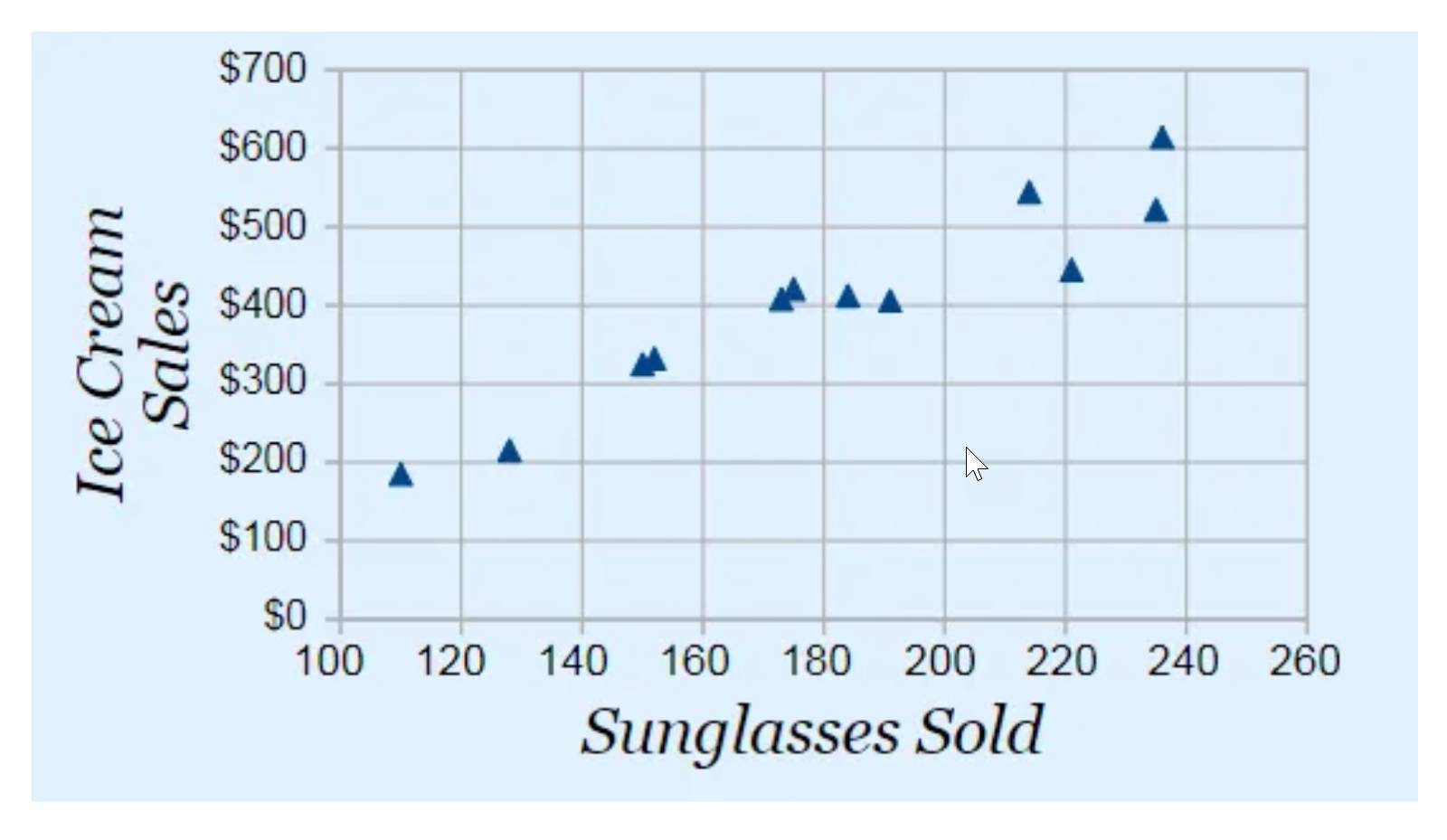
It’s important to try to avoid making assumptions and drawing incorrect conclusions based on correlation alone. Always consider if there might be other, hidden variables that impact what's shown in the data.
Pay Attention to Words
Be mindful of the language used to describe and annotate a chart. Consider things like:
- Do the title and subtitles properly describe the chart?
- Is the chart labeled properly?
- Are the words emotionally laden in a way that influences your perception of the data?
Keep Asking Questions
When you read a chart and another person’s interpretations or visual representations of data, always ask questions. If you see something that doesn’t add up, ask why and dig into the data. You’ll be amazed by what you can learn and how you can help those around you by staying curious and asking smart questions.
Use the SCAM Checklist
To help guide your review and thoughtful analysis of charts, reference the handy SCAM checklist. SCAM stands for Sources, Charts, Axes, and Messages.
SCAM Checklist
Use the checklist as a reminder to ask the following questions when reviewing charts:
| SCAM Checklist | |
|---|---|
|
Source |
|
|
Chart |
|
|
Axes on charts |
|
|
Message (or interpretation) |
|
Talk Data
As you can now see, reading charts isn’t as simple and straightforward as it might seem. While it’s important to think critically and ask yourself smart questions, it can be extremely helpful to analyze data with others. Discuss your interpretations and chart critiques with your peers and friends. You’ll find that you can help each other become more skillful readers of charts and data.
Wrap Up
You can all help improve how decisions are made every time you accurately read charts or call out misleading charts. With your critical thinking cap on and the knowledge and tools you’ve just learned, you’re able to better analyze and interpret charts and benefit from a greater understanding of data and information. Now go forth and conquer those charts!
Resources
- Trailhead: Variation for Data Comparisons
- Trailhead: Correlation and Regression
- Book: Edward Tufte (2006): Beautiful Evidence. Graphics Press
- Book: Alberto Cairo (2016): The Truthful Art: Data, Charts, and Maps for Communication. New Riders Publishing
- Book: Alberto Cairo (2020): How Charts Lie: Getting Smarter about Visual Information. W.W. Norton & Company
- Academic Paper: Leo Yu-Hu Lo, et al (2022): Misinformed by Visualization: What Do We Learn from Misinformative Visualizations? Wiley & Sons