Define Misleading Charts
Learning Objectives
After completing this unit, you’ll be able to:
- Define and explain the purpose of charts.
- Describe misleading charts.
Before You Start
Take a look at your social media feed, the online news sources you consume, and the business applications you use in the workplace. In all these places, charts provide visual presentations of data.
In today’s fast-paced world, the ability to swiftly make decisions and act on data is vital. But how often do you stop to consider the integrity of the conclusions drawn from a chart? Are you confident in your ability to critically explore information presented in charts? With more data presented to us every day, it’s our responsibility as individuals to carefully analyze data and how charts represent this data.
In this module, you learn about common misleading practices in how data is presented in charts. With greater awareness of what to look out for and how to accurately interpret chart data, you can more confidently make decisions for yourself and your business.
Note: Interested in learning more about data literacy skills? Check out the Build Your Data Literacy trail.
The Purpose of Charts
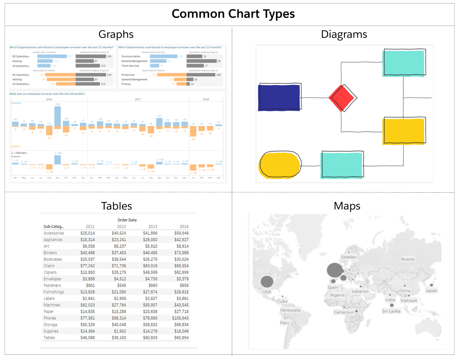
To start with the basics, Cambridge Dictionary defines a chart as “a drawing that shows information in a simple way, often using lines and curves to show amounts.” Charts help us identify relationships or patterns in data more quickly than what might be possible when simply reviewing raw data points. There are many types of charts, including graphs, tables, diagrams, and maps among others.
For example, think about your last electricity bill. Did you notice the electricity usage chart, showing your electricity use this month compared to previous months? It’s likely that this chart grabbed your attention more effectively than a table representing the same numbers would.
Charts help us make comparisons, see trends, draw conclusions, and act much more efficiently. When you notice that your electricity usage skyrocketed in July, you may investigate why and what may be behind the spike. You might decide to limit your use of air conditioning in August, or budget accordingly to spend more on electricity until winter. (Either way, be sure to stay cool. 😎)
Charts are incredibly useful tools in the workplace as well. They help us to see how efficiently a business unit operates, understand and evaluate the success of an initiative, and can even help interrogate our human biases in performance management. Charts can help us determine the best direction to explore in our data.
“A good visualization can do more than just answer questions; it can help you see that there are other questions you need to answer.” —Steve Wexler, data visualization expert and author of The Big Picture
Misleading Presentations of Data
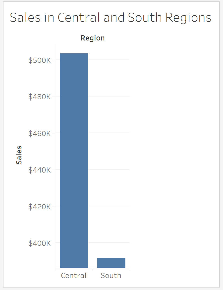
A chart that misinforms viewers can sometimes happen unintentionally. For example, the individual who creates a chart might understand the data but inadvertently make design choices that misleads others. Take a look at the following bar chart. At first glance, what do you notice? Do you draw any quick conclusions? Does there seem to be a sizable difference between sales in the Central and South regions?
Now, take a look at the following bar chart.
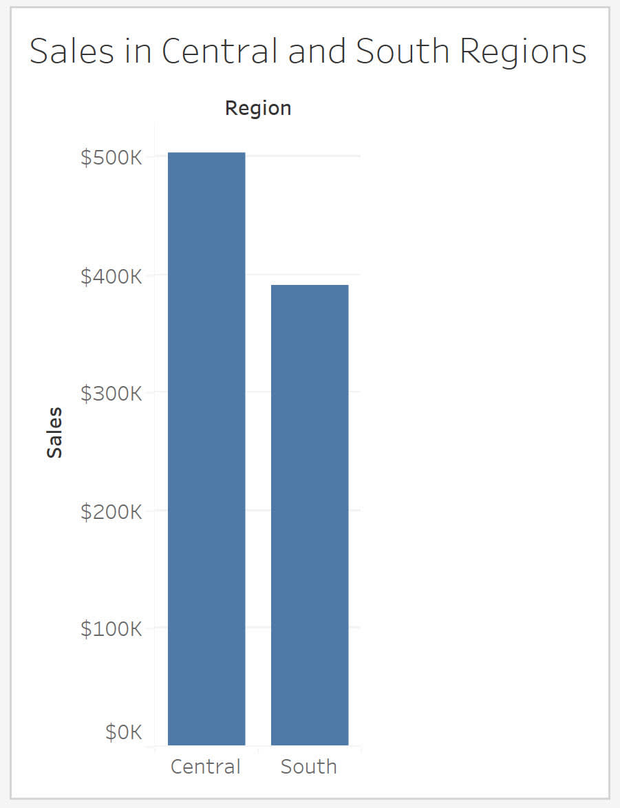
Both charts present the same data, with the same chart type but with a different axis. How does this small change affect your conclusion?
Now, view the two bar charts side-by-side.
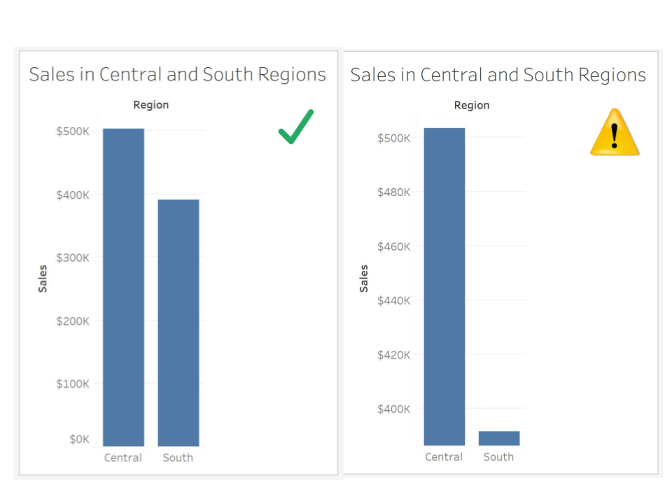
The bar chart on the left has a zero baseline, whereas the bar chart on the right has a $390K baseline. The truncated axis exaggerates the difference between the total sales of the two regions represented and may mislead you to conclude that sales in the Central region are much higher than sales in the South.
Misleading Charts Are Everywhere, And You Can Help
As you learn how to read charts accurately and interpret them wisely, you’ll notice misleading charts all around you. You’ll find misleading charts in blog posts, newspaper articles, social media posts, and even professional presentations.
If you want to have a clearer and more accurate picture of our data, you need to read charts responsibly and help others do the same. The following units provide a framework for how to analyze charts with greater accuracy and confidence, so that you can be more informed and make better decisions as a result.
Resources
- Book: Alberto Cairo (2020): How Charts Lie: Getting Smarter About Visual Information,W.W. Norton & Company
- Book: Alberto Cairo (2016): The Truthful Art: Data, Charts, and Maps for Communication, New Riders Publishing
- Book: Stephen Few (2012): Show Me the Numbers: Designing Tables and Graphs to Enlighten, Analytics Press