Avoid Misleading Chart Design
Learning Objectives
After completing this unit, you’ll be able to:
- Describe best practices for creating charts.
- Identify common misleading chart design choices.
Everyone Loves a Bar Chart
Bar charts are a mainstay for visualizing data, and for good reason. Research indicates that a bar chart is one of the most easily understood types of visualizations. A simple format that lets viewers quickly draw comparisons between bar lengths makes bar charts a go-to in the data visualization world.
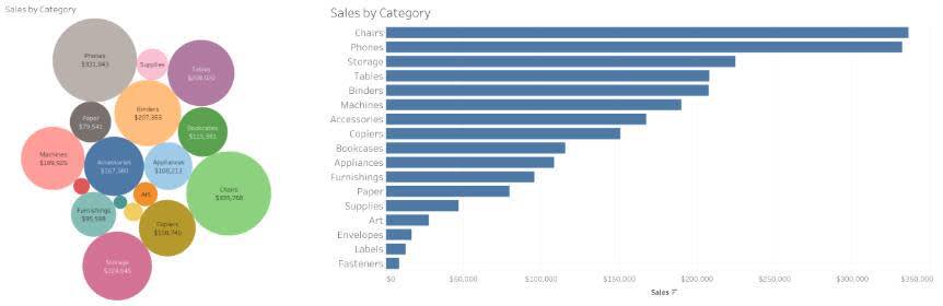
Beware of Bubble Charts
Bubble charts might seem fun, but unfortunately they're not always an effective way to present information. For example, check out the following charts. Each shows the same data about the sales revenue generated by different categories of products. In the bubble chart, it’s difficult to interpret which categories generated the highest revenues because several of the larger bubbles look similar in size. In the bar chart, it’s much easier to glance at the length of the bars and see that sales of chairs and phones generated much more revenue than all other product categories.
Watch for Pie Charts
Pie charts are used to show part-to-whole relationships. The individual slices of the pie are shown as part of the whole, and together all of the slices should add up to 100%. If you spot a pie chart that doesn’t add up to 100%, something is amiss.
Unfortunately, pie charts can create confusion when used inappropriately. The eye is well suited for distinguishing the differences in length in a bar chart, but struggles to compare the area of a wedge. When comparing categories with similar values or viewing several categories with small percentages, interpreting the values of the slices in the pie becomes more difficult.
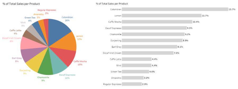
To illustrate this, take a look at the following charts. Each shows the same data about the sales of different coffee drinks. Sales of cafe mochas and decaf espressos are similar, but not exactly alike. It’s much easier to see that cafe mochas are more popular than decaf espressos in the bar chart than in the pie chart where they look nearly the same.
To help avoid pie chart pitfalls, here are a few suggestions.
- If possible, ask the pie chart creator to make a bar chart instead using the same data.
- Don’t know the chart creator but have access to the source data? Create a bar chart of your own.
- When all else fails, slow down and give yourself time to process the data in the pie chart. Don’t make quick assumptions, and question your understanding of the facts, regardless of how things might initially appear visually.
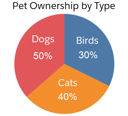
Tip: There are a few times when pie charts are the appropriate choice. In To Pie Chart or Not To Pie Chart, Ben Jones describes a scenario when a pie chart is the better choice. When you intend to display an exactly half proportion, a pie chart is more effective as the following example shows.
To summarize, use pie charts when there are very few slices of different sizes.
Be Careful with 3D Graphs
In your journey with data visualizations, you might come across three-dimensional (3D) graphs. Although 3D images might grab your attention, they make it much more difficult to interpret charts. When 3D objects are closer in the frame, they appear larger. Normally that’s not a problem, except for when you’re trying to make comparisons based on size. Compare the following two graphs.
Notice how you interpret the difference between Darjeeling, Mint, and Green in the 3D pie chart, the 2D pie chart, and the bar chart. The 3D version makes the Darjeeling slice look smaller. The bar chart allows you to accurately see that Mint accounts for a slightly higher percentage of total sales than Green.
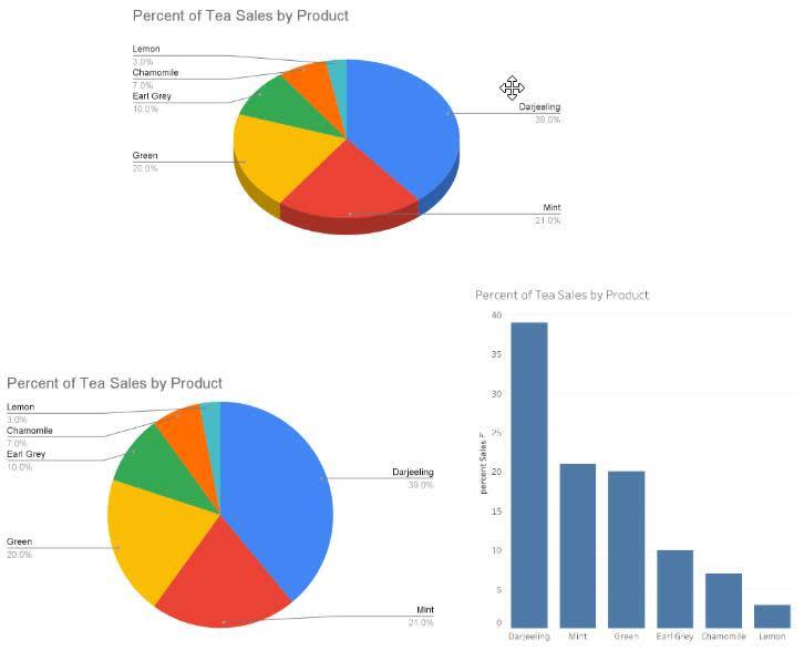
Chart Color Choices
The use of inappropriate colors can confuse or make charts difficult to read. Inappropriate color use in the context of chart includes:
- Too many colors within the same chart
- Different colors to show the same values
- Color schemes that are difficult to read
- Color schemes that aren’t colorblind-friendly
- Colors of different intensity
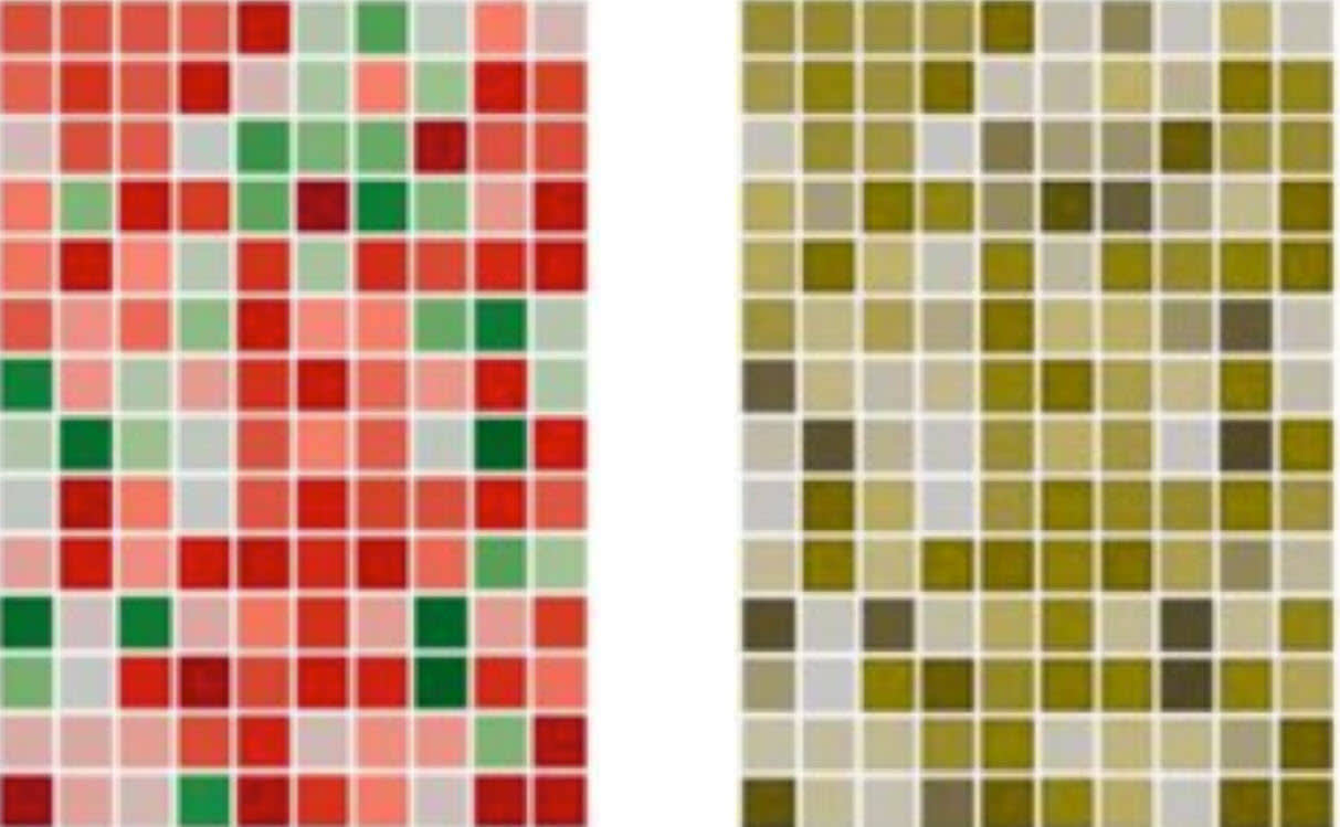
As an educated chart viewer, it’s important not to let colors distract from the data. In the above image, red and green are used to portray a range of values with red representing values above zero and green with values below zero. A colorblind person would not be able to distinguish the differences that red and green are used to portray. Try to find chart resources that use colorblind-friendly palettes that are inclusive and easy to interpret without misunderstandings.
Chart Design Considerations
While creative and intriguing designs can be effective and eye-catching, some can actually distract from properly communicating important insights in the data.
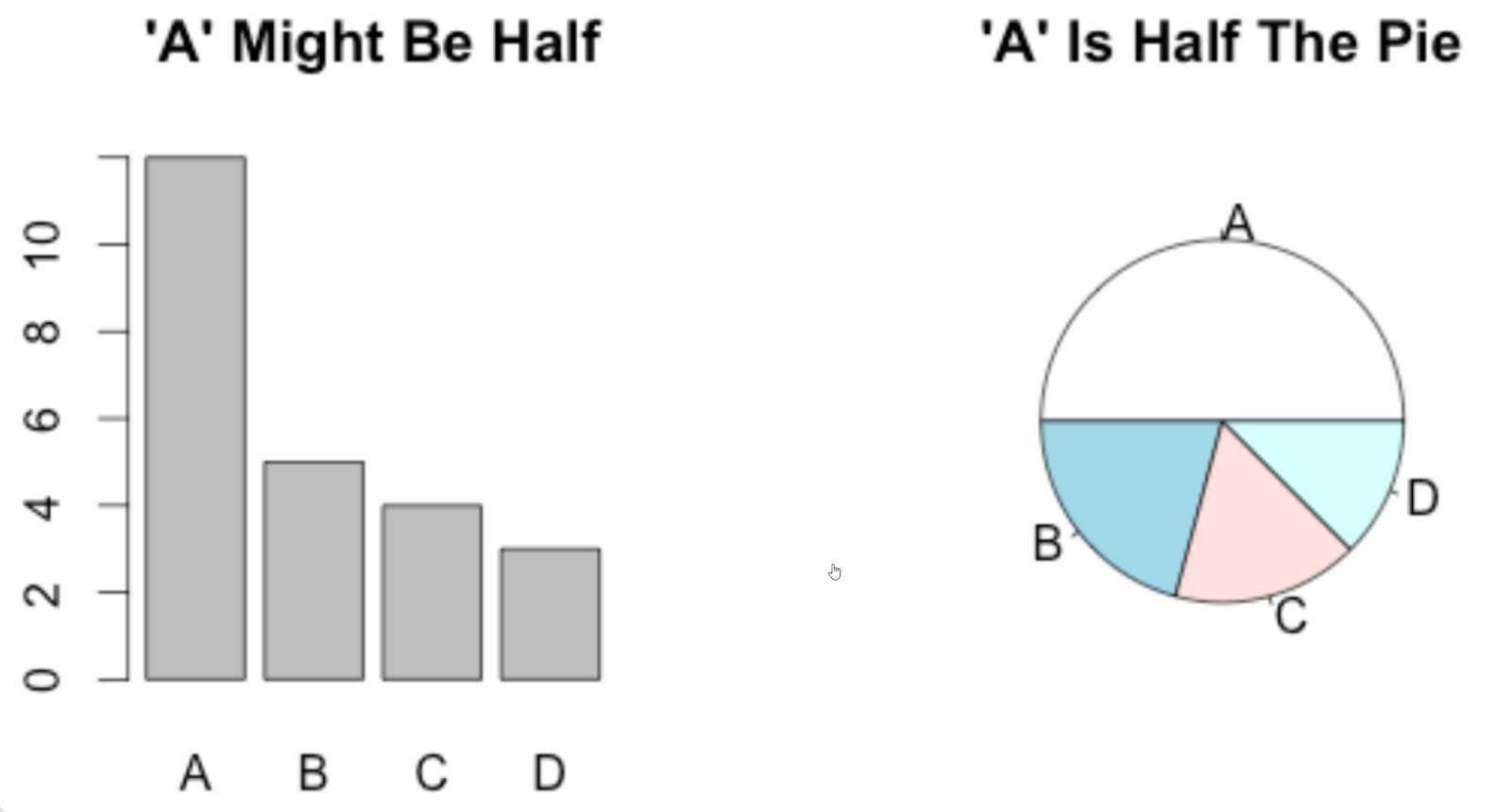
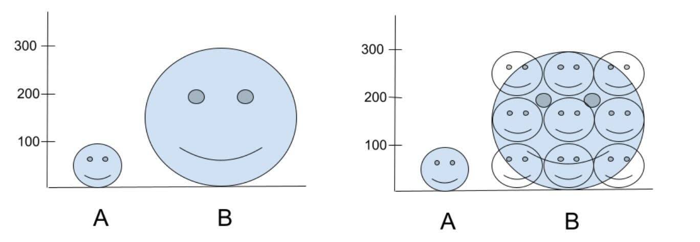
For example, pictograms that use symbols and images to convey information may add visual appeal. However, when pictograms don’t follow best practices, they may mislead viewers, particularly when used to display size differences. This is evident in the following pictogram, where you’re misled into seeing a much larger difference between the two categories than what actually exists.
The underlying data is that A is 100 and B is 300. While these pictograms include a y-axis that begins with zero, viewers are more likely to interpret the area between A and B in the chart on the left rather than height as the difference in chart 1. between A and B. Using area misleads us into thinking there is a 9-fold difference instead of the correct 3-fold difference.
Whenever you view a chart, it’s important to pause and investigate beyond initial appearances. The chart might be difficult to read or be misleading because it wasn’t designed with best practices in mind.
Resources
- Blog Post: Dual Axes: A Favorite of Tricksters
- Tableau Site: Understanding and Using Pie Charts
- Blog Post: Data Dialogues: To Pie Chart or Not to Pie Chart?
- Blog Post: 5 Tips for Designing Colorblind Friendly Visualizations
- Book: Kathy Rowell, Lindsay Betzendahl, and Cambria Brown (2021): Visualizing Health and Healthcare Data. Wiley
- Book: Steve Wexler (2021): The Big Picture: How to Use Data Visualization to Make Better Decisions–Faster, McGraw-Hill Companies
- Book: Stephen Few (2012): Show Me the Numbers: Designing Tables and Graphs to Enlighten. Analytics Press.