Design a Simple OmniScript
Learning Objectives
After completing this unit, you’ll be able to:
- Describe the Omniscript element types and their uses in Omnistudio for Managed Packages.
- Explain the steps for determining which Omniscript elements an interaction requires.
Examine Omniscript Elements
Omniscripts are built by moving elements into the canvas and defining their properties. These elements are placed in a specific sequence for the workflow. There are elements for:
- User interaction on the user interface (UI).
- Getting, saving, and manipulating data behind the scenes.
Omniscript elements are grouped by type, based on the kind of functionality they perform, and they each have settings that must be configured appropriately.
Here are the different types of elements and how they can be used.
|
Element Type
|
What Is It For?
|
|---|---|
Actions |
For calling on other tools to perform various actions: getting or saving data, calculating, sending an email, and so on |
Display |
For displaying text and images on the screen to enhance the usability of the UI |
Functions |
For performing calculations within the Omniscript, showing conditional messages, and providing geolocation |
Groups |
For grouping elements together on the UI |
Inputs |
For system or user input or selection |
Omniscripts |
Reusable Omniscripts to insert and use |
Ready for more details? Let’s go!
Actions Elements
Action elements are used to:
- Get data from one or more Salesforce records (Omnistudio Data Mapper Extract Action).
- Update the data in one or more Salesforce records (Omnistudio Data Mapper Post Action).
- Call a series of actions (Integration Procedure Action).
- Get, save, or delete data through a web application programming interface (API) (HTTP Action).
- Populate and send an email as part of an interaction (Email Action).
- Send DocuSign emails for signature or sign DocuSign emails (DocuSign Envelope Action and DocuSign Signature Action).
- Send the user back to a previous page after the interaction is complete (Navigate Action).
Display Elements
Display elements help you provide important context within the workflow or help you with the layout of the page.

Display elements include:
-
Line Breaks element: Allows you to create a line break to control the spacing on the page.
-
Text Block element: Allows you to add instructions, images, and hyperlinks.
Functions Elements
Functions elements are commonly used to:
- Perform average/sum calculations (Aggregate).
- Perform formula functions and algebraic calculations (Formula).
- Display warnings, errors, and other feedback to users based on conditions (Messaging).
Groups Elements
Use these elements to group items together, such as the step/page view. For example, Step elements group interaction items onto one view or page. They're the UI canvas for a step in the flow.
Another type of Groups element, Type Ahead Blocks, includes a combination of functionality that provides autocomplete and search. For example:
- The user begins to enter information.
- The system searches for matches and displays a list of the matching items.
- The user then chooses the appropriate item.
Other commonly used Groups elements include:
-
Block: Group elements together within the page/view.
-
Edit Block: Add, edit, or delete records in real time.
-
Radio Group: Group radio buttons such as when a user has common choices on a questionnaire.
Inputs Elements
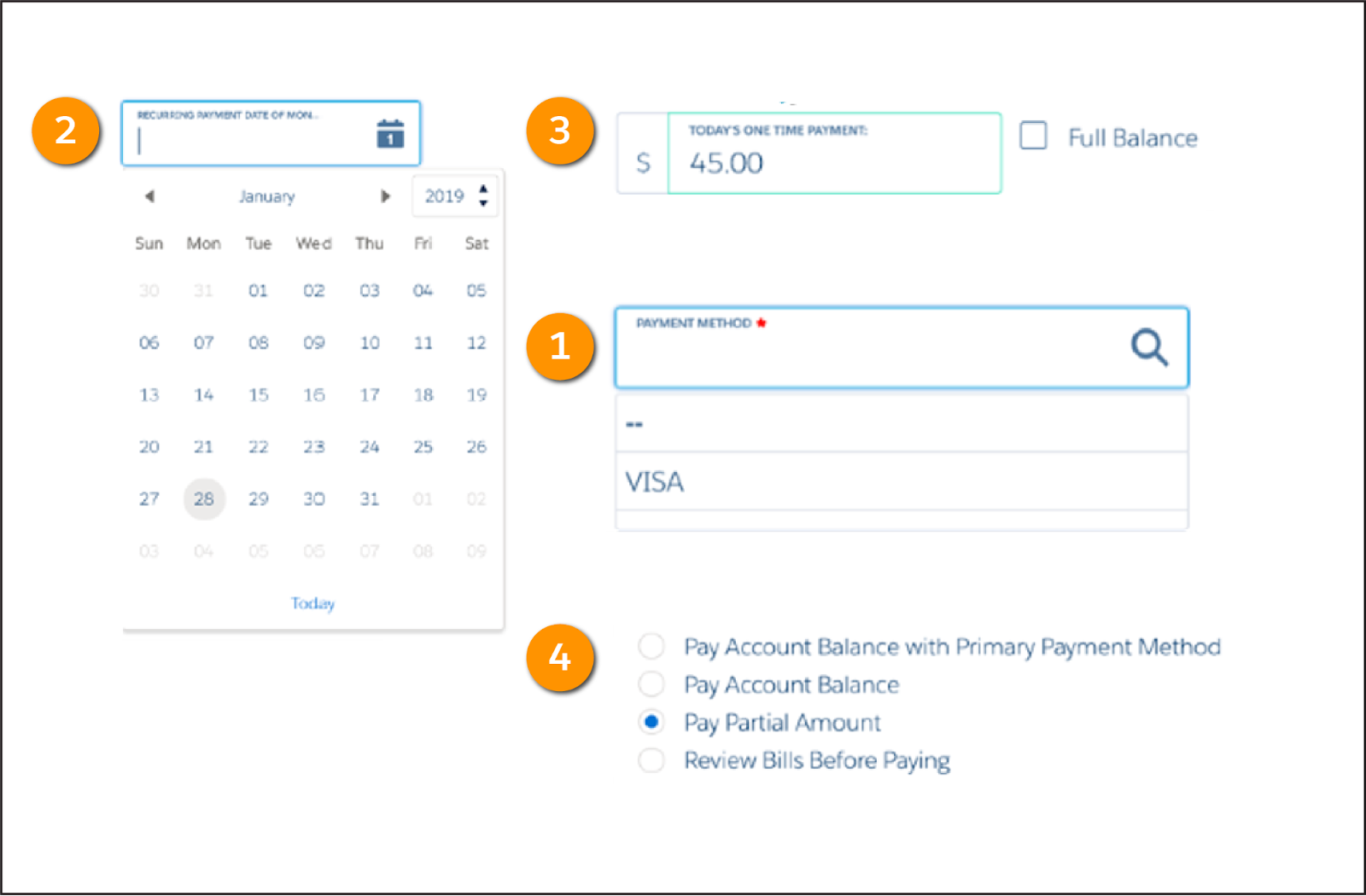
Inputs elements collect user input. With these element types, a user can:
- Enter information, such as payment method (1), the payment date (2), and the payment amount (3).
- Select one or multiple options (4).
- Select a checkbox.
- Enter or view text, a phone number, an email address, or a website.
Here’s another example.
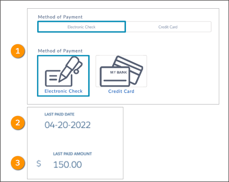
This example shows the Radio element as payment method buttons (1) and fields used to prefill data such as last paid date (2) and amount (3).
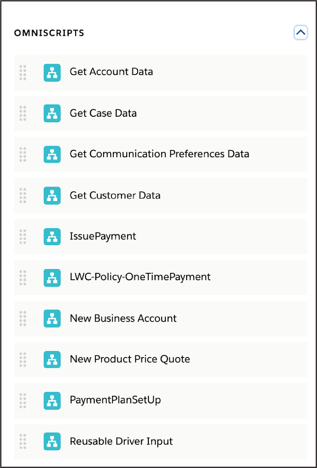
An Omniscripts element (Child Omniscript) calls an Omniscript to reuse it within another one. This allows you to create smaller child Omniscripts for common functionality, such as showing specific contact or account fields.
This example shows several reusable Omniscripts to include as part of any Omniscript being built, if needed.
You’ve got tons of tools at your disposal as you design Omniscripts, as you can see. But how do you determine which ones to use?
In the following example, you see how customer requirements help focus your project and determine the Omniscript elements you need.
Choose Elements for an Interaction
Here’s an example Omnistudio Flexcard that displays the customer's name, phone number, and website, and includes an Edit Account action.
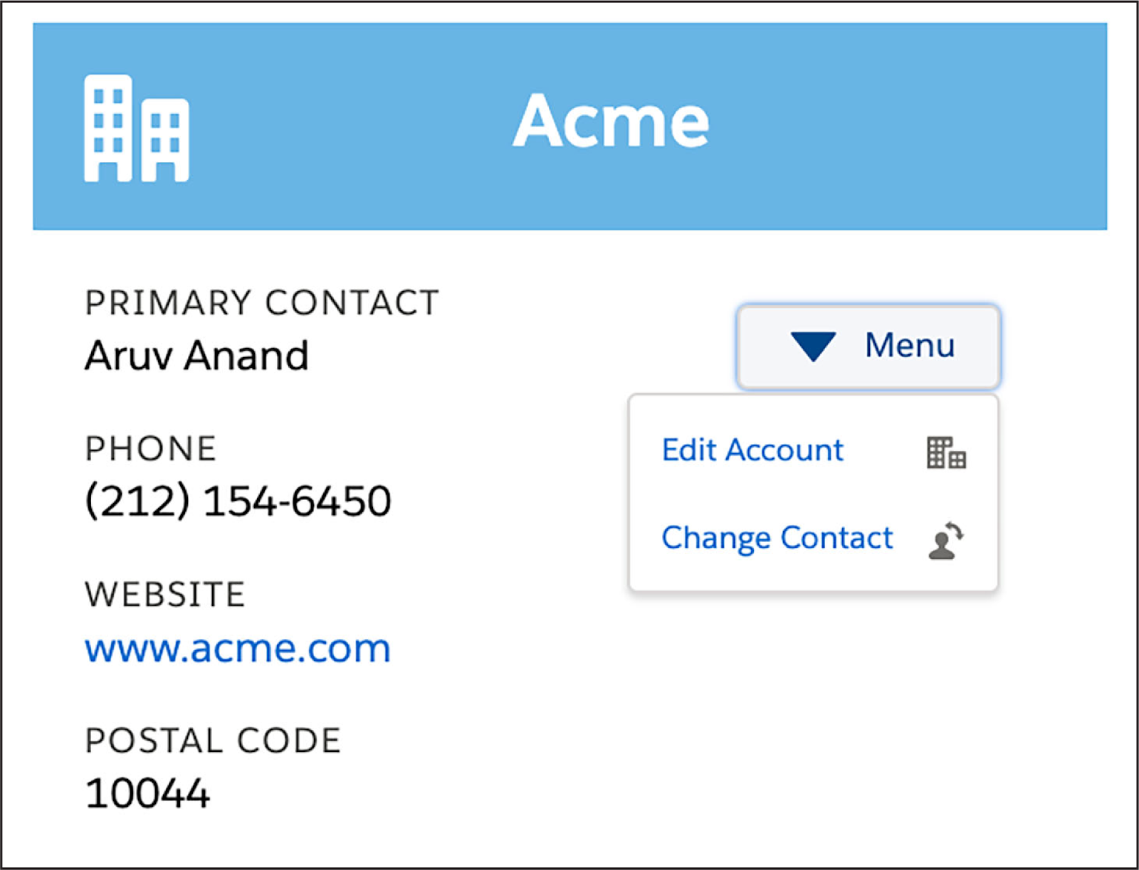
Selecting this action will eventually launch a guided interaction that allows a customer service rep to change the account details. However, you must design this interaction first.
Here is the initial requirement for this interaction: “As a customer service rep, I want a guided interaction that allows me to review and change customer account details, such as phone number and website, from the console.”
Here’s how this interaction could appear to service reps to meet that requirement.
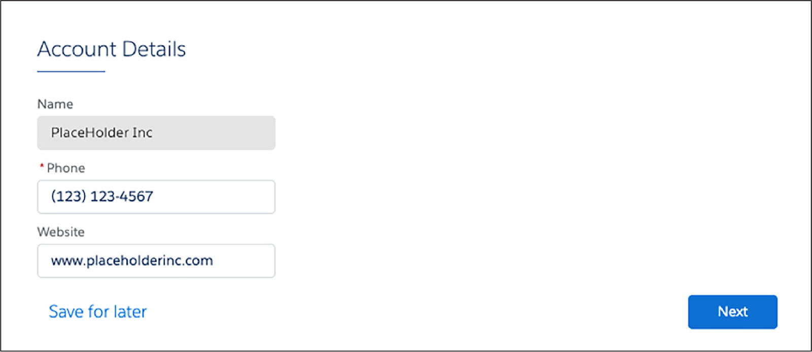
You determine that the Omniscript must have these features that are visible to the rep:
- A page for the interaction
- A way to view the account name and edit the account’s phone number and website
- A way to control the spacing of these fields on the page
Which Omniscript elements will you choose to meet these requirements? Here’s what you need.
- First, create a page for the interaction. To create a page for the Edit Account interaction, you need a Step element (Groups type). The step will be the canvas for the Inputs elements you want to include.
- Next, you need a way to view the account name, and a way to edit the account’s phone number and website.
Sounds like you need a few Inputs elements.
A Text element seems like the best choice for the account name, as it’s just one line of text. However, you don’t want Omniscript users to change the account name, so adjust the element properties to make this field read-only.
You want users to be able to edit the phone number and website.
- For the phone number, use the Telephone element so the phone number formats automatically and the reps don’t format them inconsistently.
- For the website, use the URL element, as this requires http:// or https://. This also helps ensure consistent data entry.
Finally, you want a way to control the spacing of these fields on the page. This sounds like a display requirement, so examine the Display element options.
You want to make sure the inputs remain on separate lines within the UI. To that end, you’ll add two Line Break elements to your design, one between the Account Name and Phone Number fields, and another between the Phone Number and Website fields.
Now you can focus on what capabilities you need on the back end.
- A way to get the account record data from Salesforce
- A way to save the data updates back to Salesforce
- A way to complete the interaction so the rep can get back to the card that launched it
It sounds like it’s time to check out your Actions elements.
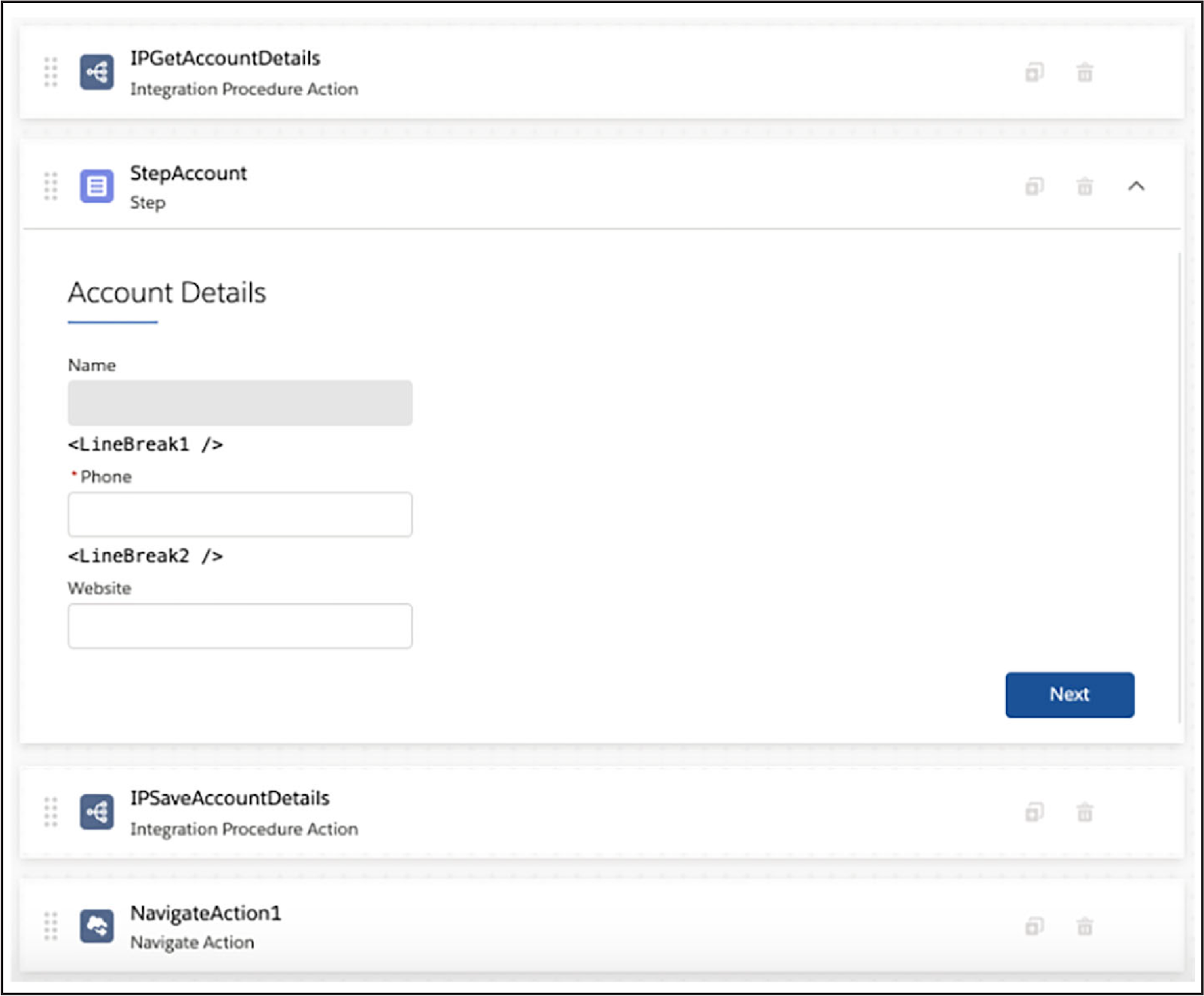
Omnistudio Integration Procedures are an optimal way to get and save account data. Add two Integration Procedure Actions elements to the design: One of the actions will call the Integration Procedure that gets the data, and one will call the Integration Procedure that saves the data.
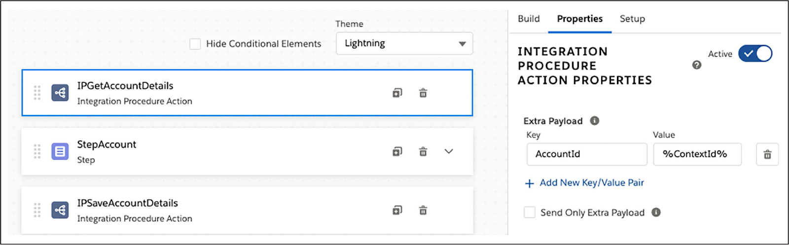
The placement of these actions in your Omniscript is important.
- Place the first one before the Step element (not inside it), as the data needs to be fetched before the rep can edit it.
- Place the second one after the Step element (again, not inside it), as the changed data can only be saved back to Salesforce after the rep changes it.
You’re almost there!
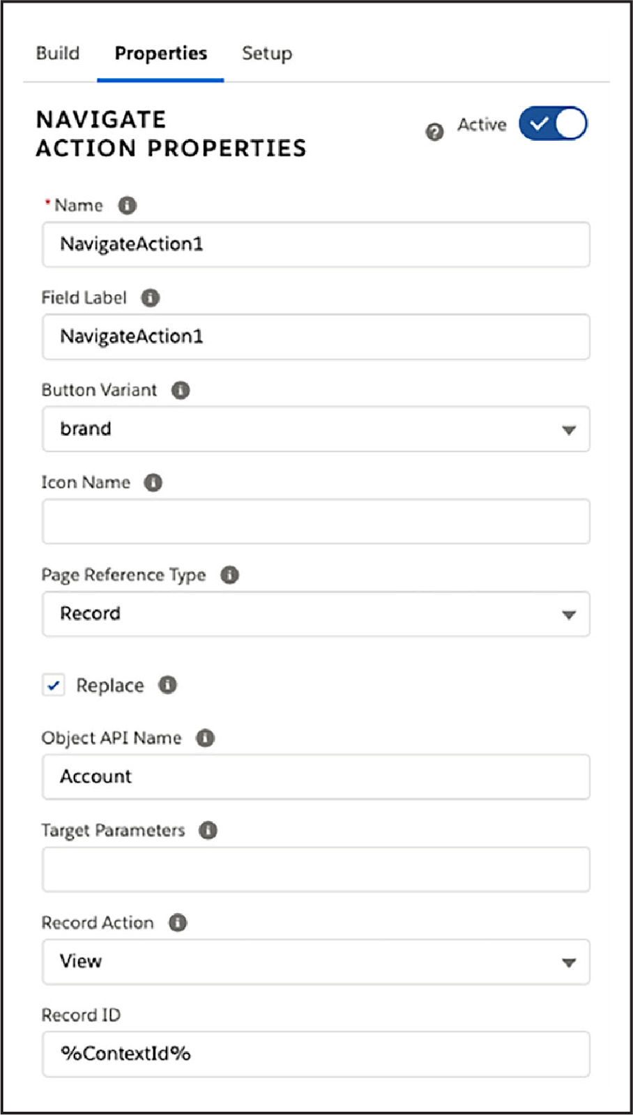
Now you just need an Actions element that allows the rep to complete the interaction and return to the Flexcard that launched it. Here you choose the Navigate Action, which you can configure to redirect the user back to the Account card when they click Next at the end of the interaction.
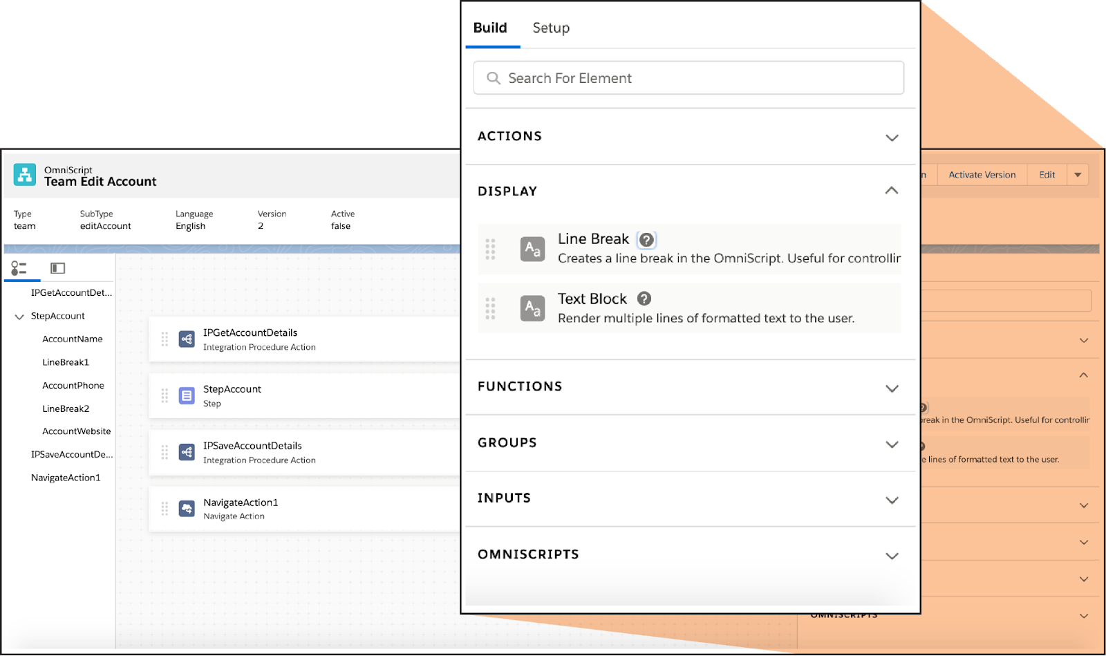
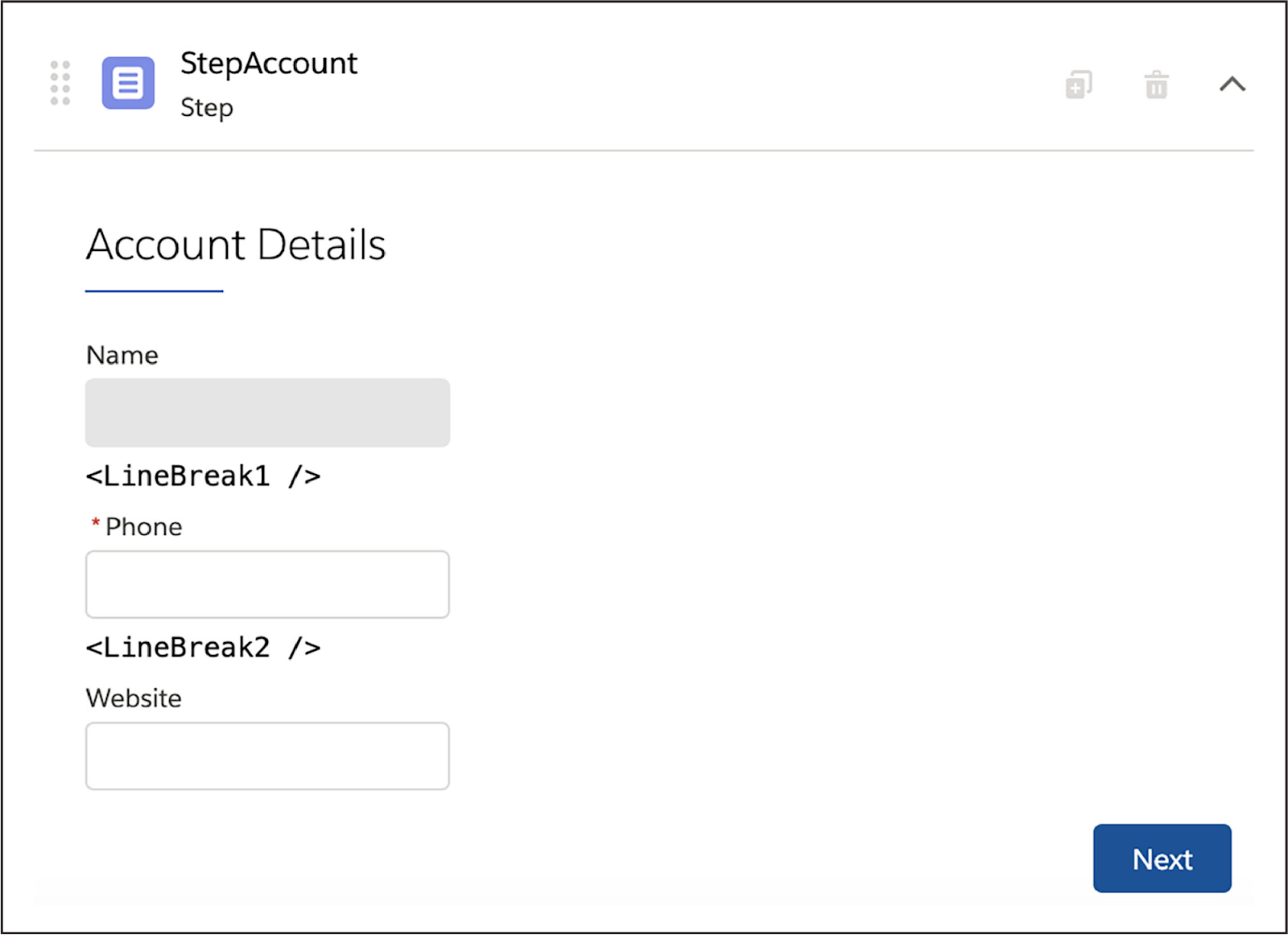
Congratulations! You completed your design of the Edit Account Omniscript. Here’s what it looks like after it's been built in the Omniscript Designer.
That’s one nicely configured Omniscript. In the next unit, you get to build it!
Resources
- Salesforce Help: Omniscript Element Reference (Omnistudio for Managed Packages)
- Salesforce Help: Omniscript Best Practices (Omnistudio for Managed Packages)