Explore the Flexcard Designer
Learning Objectives
After completing this unit, you’ll be able to:
- Explain how to access the Flexcard Designer in Omnistudio for Managed Packages.
- Explain how the Flexcard Designer header and canvas operate.
- Describe the Build, Properties, Style, and Setup panels.
- Summarize how to preview and publish your Flexcard in real time.
- Describe the in-product help and tooltips features.
Where to Find the Flexcard Designer
Flexcard Designer in Omnistudio for Managed Packages gives you the tools to quickly configure, preview, and debug cards. You can do all sorts of awesome things like drag, position, and resize user interface (UI) elements onto a canvas to format text, buttons, icons, images, links, charts, tables, and even other Flexcards.
Where do you find this super tool? Use the App Launcher to find the Omnistudio app. Select the dropdown menu and select Flexcards. Now, you're ready to explore the Flexcard Designer header and canvas.
Header and Canvas
The header is where you view metadata and perform actions related to your Flexcard, such as:
- Viewing basic metadata about your Flexcard, such as Author, Version, Status, the Flexcard it's been Cloned From, whether it's a Child Card, Last Modified date, and Theme.
- Switching between Design view and Preview, creating a new version of your Flexcard, and cloning, activating, or deactivating your Flexcard.
- Configuring Publish Options for an activated Flexcard, and exporting your Flexcard.
- Accessing Flexcard documentation via the Help link.

You build your Flexcard by dragging elements onto the canvas.
- Drag elements such as fields, actions, images, states, child Flexcards, and custom Lightning web components (LWC) from the Build panel onto the canvas.
- Rearrange, clone, delete, and adjust the widths of your elements as needed.
- In Design view, test the responsiveness of your Flexcard with the viewport dropdown (1). This feature allows you to see how elements are positioned at different viewport breakpoints.

Build, Properties, Style, and Setup Panels
Build Panel
To build your Flexcard, drag fields and elements onto the canvas from the Build panel.
-
Fields: Drag fields based on the Flexcard’s configured data source onto the canvas.
-
Display:
- Add simple elements to your Flexcard such as text, images, icons, and blocks.
- Add more complex elements such as actions, charts, menus, and datatables.
- Add states to your Flexcard, embed custom Lightning web components, and embed reusable child Flexcards.

Fields and Display elements are found in the Build panel (1).
Properties Panel
When you select an element on the canvas, you can change the element’s properties in the Properties panel (1) to specify how it behaves. For example, when you select a Field element, you can update the label, choose the data field value to display, and select the field type.
In this screenshot, you see an Action element. In Properties, you can select an action type, change the element name and label, and select an icon to associate with the action.

Style Panel
Use the Style panel (1) to style your Flexcard elements and update their appearance in real time. This panel has settings for configuring backgrounds, sizes, borders, padding, margins, height, fonts, and responsiveness. When you create a style for an element, save it for use on multiple elements on the Flexcard.
For custom designs, create and apply custom CSS.

Setup Panel
You configure multiple settings when you create a Flexcard using the data source. For existing Flexcards, go to the Setup panel (1) to update these settings or configure more settings. In the Setup panel you can:
- Update your Data Source.
- Apply custom permissions to limit access to your Flexcard.
- Track Custom Data on elements with tracking enabled.
- Enable Multi-Language Support, set Session Variables, and create Event Listeners.
A Session Variable is a special type of variable that stores values from data sources or external systems so that you can access them globally on a Flexcard.
An Event Listener is a function that ‘listens’ or waits for an event to occur and takes action in response.

Preview and Publish
Preview your Flexcard in real time to test its design and functionality.
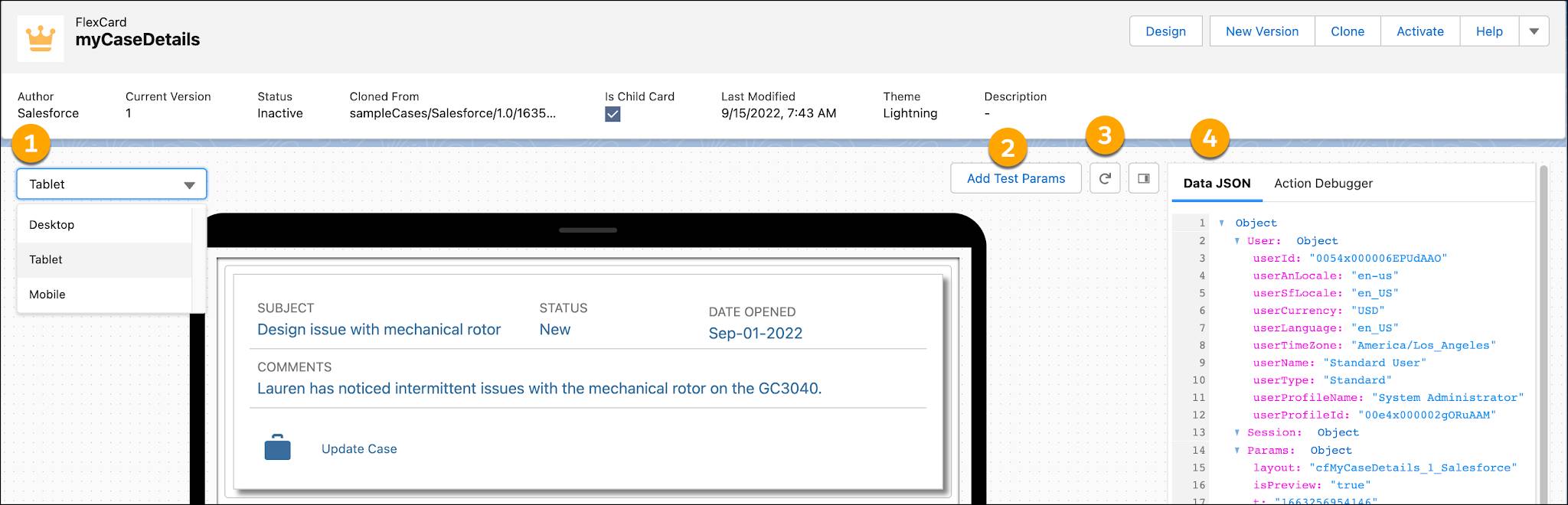

- Select options in the viewport dropdown menu (1) to preview how a Flexcard appears on different devices, such as mobile, desktop, and tablet.
- Click Add Test Parameters (2) to preview your Flexcard with different parameters, such as record Ids and pagination limits.
- Refresh (3) just the canvas while previewing and debugging your Flexcard. Refresh reloads the card and resets the data JSON.
- View your Flexcard's Data JSON (4). Look for potential issues in how your data source populates elements. The Data JSON panel updates when you interact with the Flexcard.
- View your Flexcard's action and event requests and responses from the Action Debugger (5). Click an actionable item to display its log and associated events.
Then, select Activate in the header to activate your completed Flexcard. This process compiles and deploys your Lightning web component.

After you activate your Flexcard, configure your generated Lightning web component’s metadata values, such as where it’s published (Targets).
Add your own custom component SVG icon to identify your generated Lightning web component from the Experience Builder for Communities and from the Lightning App Builder for Lightning pages.

In-Product Help and Tooltips
There are a few different ways to use the in-product help feature.

Click ? (1) to view detailed documentation about an element in a slide-out help tray. Click Help (2) in the header to view page-level help in the slide-out help tray.
Move your cursor over the i icon to reveal tooltips and access inline information about specific properties.

Whew! Talk about a lot of tools! Next, you’re off to meet the wizard—the Data Source Wizard, that is.

Resources