Display Data and Actions on a Flexcard
Learning Objectives
After completing this unit, you’ll be able to:
- Describe the various Flexcard elements in Omnistudio for Managed Packages.
- Explain the purpose of Block elements.
- Describe the purpose of Text and Field elements.
- Explain the purpose of Icon elements.
- Describe the purpose of Menu and Action elements.
Flexcard Elements
You’re probably excited to dig even deeper into Flexcards, so let’s jump right into it.
The Flexcard in the screenshot here has two distinct areas. The left area displays basic account information for a customer account: an icon, a title, four fields, and a menu for actions. The right area, although blank in the following example, will eventually display weather information. In this unit, however, you focus on the account information side.

First, let’s strip away the data and style of the Flexcard to show how the elements are working underneath.

Block Elements
There are two Block elements that make up this Flexcard. A Block element combines logical groups of other elements inside a Flexcard. You can make a Block collapsible to hide and expand its content. You can also place a Block inside another Block.
The Account Block contains a few simple user interface (UI) elements: Text, Icon, and Menu UI elements. It also includes another Block, which groups an Icon and Text element to make a header in the Flexcard.
Text and Field Elements
In the example, the Text element is used to add the data fields returned from the data source. The Text element combines text and parsed merge fields using a rich text editor. The rich text editor adds an HTML div for each section of text to build the layout of the text element. This element also includes a Style menu for formatting the text.

You can also use Field elements to show data returned from a data source on a Flexcard.
There are two ways to add data fields using this element. The simplest way is to drag a field from the Fields list onto the canvas. The Fields list shows the list of available data fields.
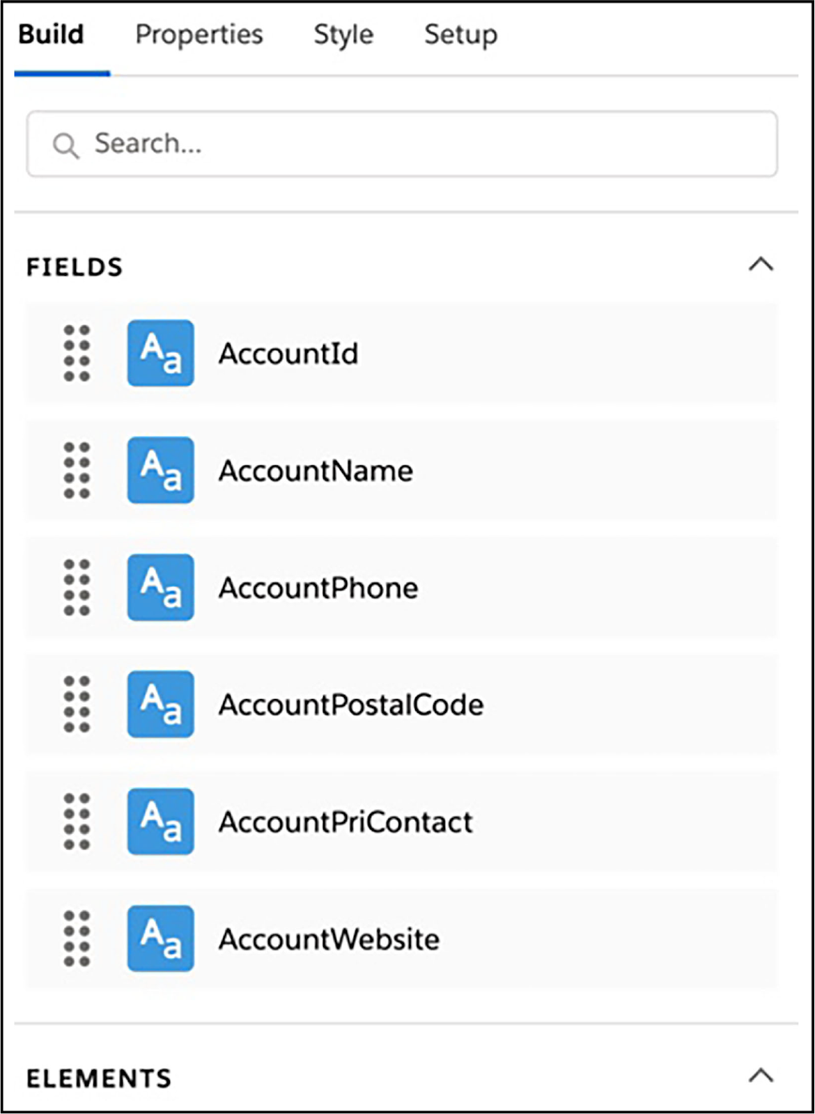
The second way is to drag the Field element from the Elements list onto the canvas. The Field element displays the output from a data field.
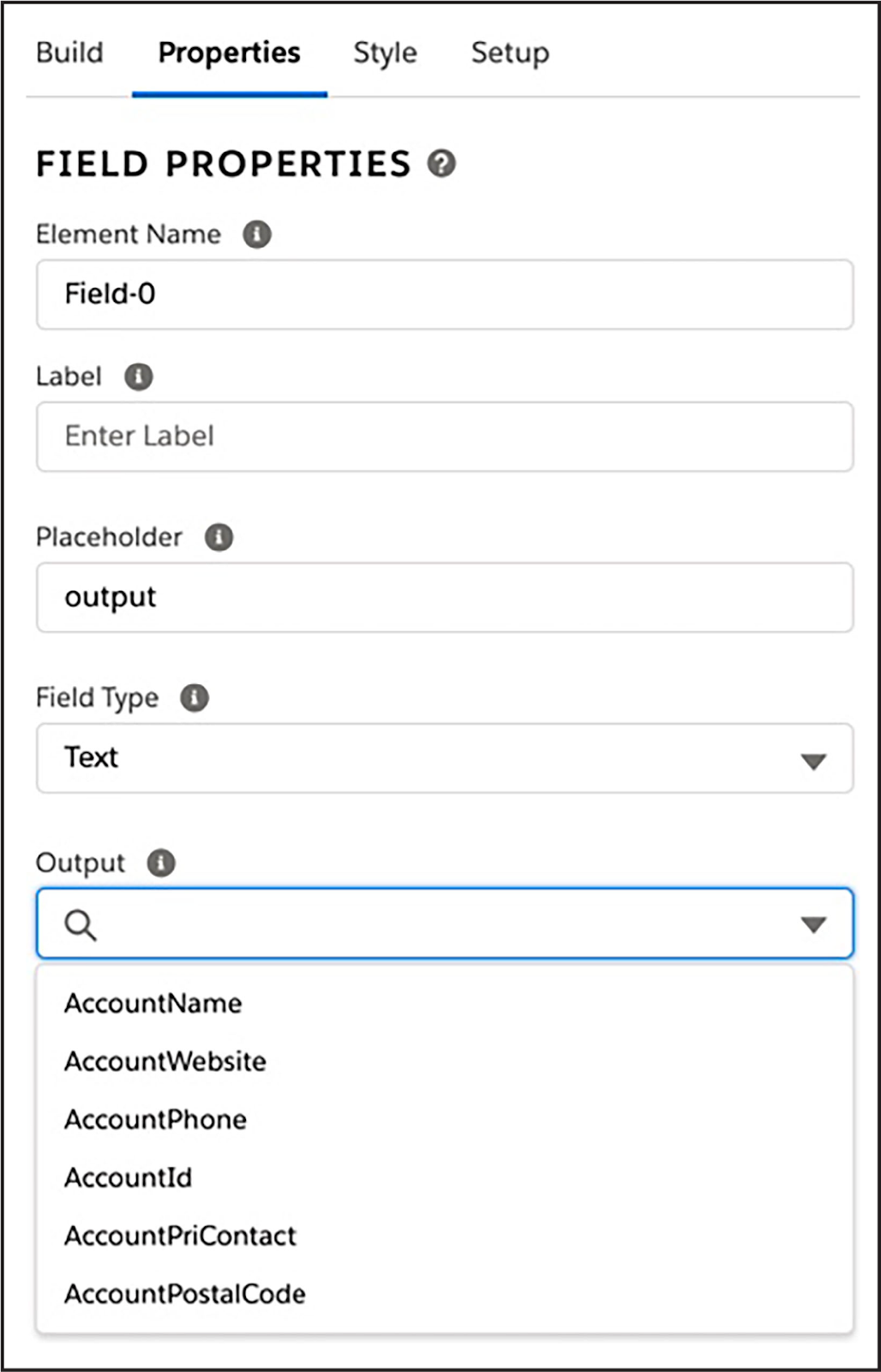
The Field properties include a Field Type setting, which is useful for showing data in its correct format. For example, a Date field type displays a date in its proper format.
Icon Elements
The Icon element displays a Salesforce SVG icon that you access from the Salesforce Lightning Design System library of icons or a custom icon that you upload.

You can configure icons to perform actions when clicked. Image, Block, and Toggle elements also have this capability.
Menu and Action Elements
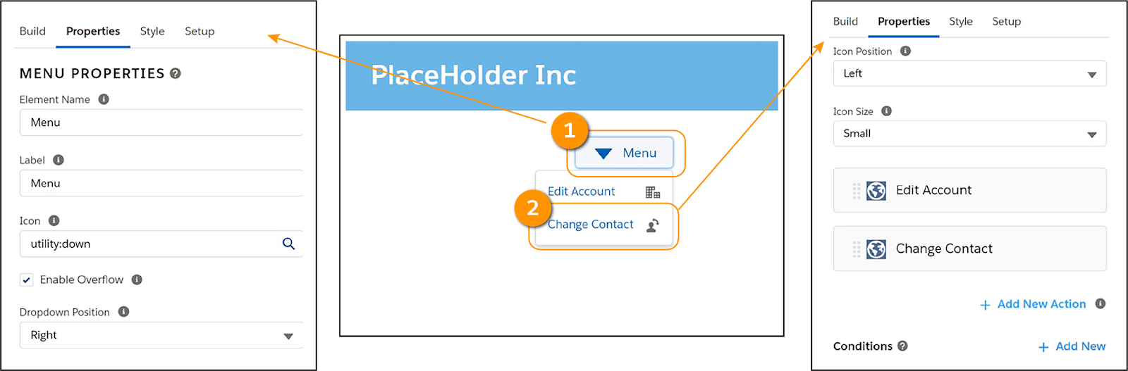
The Menu element (1) creates a menu from a list of actions on a Flexcard. Style the menu button and each action in the menu’s dropdown. This element is a useful option when you want to add many actions to your Flexcard but you don’t want to clutter the card. The Action element (2) renders text or a button that executes an action when clicked.
There are several types of actions available.
Action Type Name |
Description |
|---|---|
Card |
Perform card-level actions, such as reload, update data source, and remove. |
Data |
Trigger a data source from an action to get data from a server or post data to a server. |
Event |
Custom: Fire a Custom Event to notify the parent Flexcard of an event occurring. PubSub: Fire a PubSub Event to notify another component on a page or application of an event occurring. |
Flyout |
Display additional information from a child card, Omniscript, or custom Lightning web component (LWC) in a window or popover. |
Navigate |
Select a target URL or a PageReference type that enables navigation within Lightning Experience, within Communities, or to an external web address. |
Omniscript |
Launch an Omniscript from the Flexcard. |
Update Omniscript |
Update an Omniscript from a Flexcard embedded as a custom Lightning web component in an Omniscript. |
Customizable Flexcards help you see all sorts of awesome information at a glance, right? Next up, kick your cards up a notch and learn how to style the displayed data and Action elements you add to Flexcards.