Discover the Key Capabilities of Flexcards
Learning Objectives
After completing this unit, you’ll be able to:
- Explain the function of Omnistudio Flexcards in Omnistudio for Managed Packages.
- List key capabilities of Flexcards.

Get Familiar with Flexcards
Omnistudio Flexcards in Omnistudio for Managed Packages show contextual information in an at-a-glance format. They also provide access to relevant tasks for the displayed data.
Here’s a Flexcard for an insurance company’s customer named Sophia Fournier.
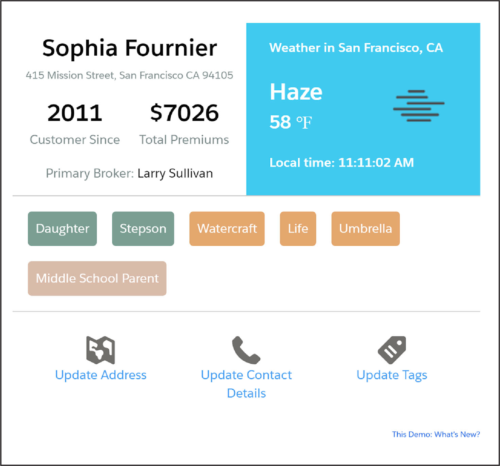
Notice Sophia’s key profile data, including her address. You can also see the current weather for her location. Sophia might want to grab a jacket!
Underneath the profile data are several attributes, or tags, that the insurance company’s reps have informally learned during their calls with Sophia. The second set of tags—Watercraft, Life, Umbrella—indicate her current policies with the company.
The bottom of the Flexcard includes clickable actions to update Sophia’s address, contact details, or tags.
You can also combine several Flexcards together, displayed on what we call an Interaction Console.
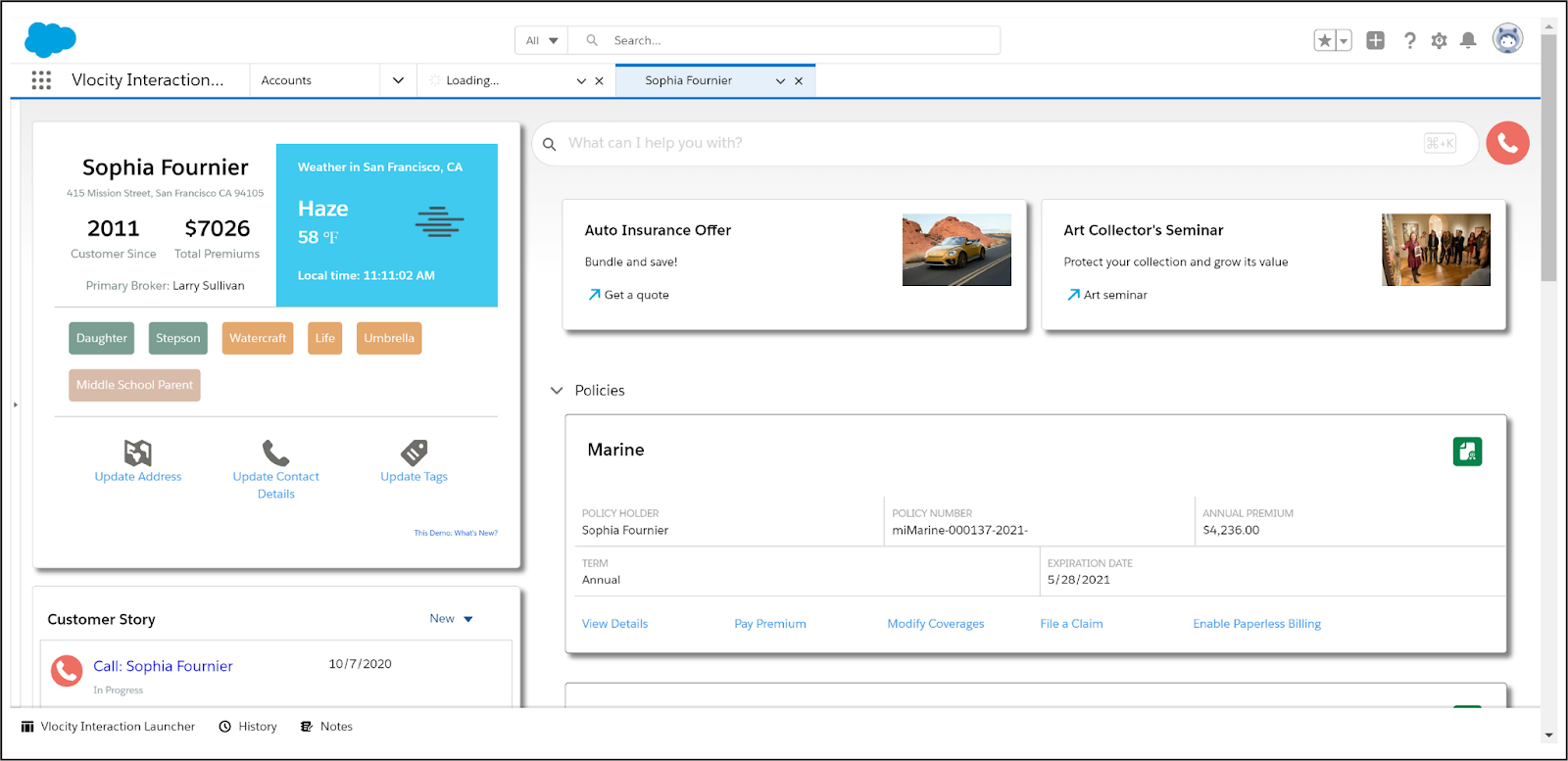
The Interaction Console provides a holistic view of the customer's information—and Flexcards are important components of these 360-degree views. The Flexcards you see on the console are Lightning web components (LWC) based on Flexcards, and the console itself is a Salesforce Lightning console.
Key Capabilities
OK, so let’s say you have 2 minutes to describe what Flexcards are and what they can do. What do you say? Here are Flexcards’ key capabilities.
- Flexcards summarize contextual information at a glance.
- Flexcards are the beginning and ending points for customer transactions.
- Flexcards are viewable on any device or channel.
- Flexcards can display data from multiple data sources.
- Flexcards are built quickly using drag-and-drop elements.
- Flexcards have a what-you-see-is-what-you-get (WYSIWYG) editor for controlling their layout and style.
- Flexcard actions are relevant to the context of the card.
- Flexcards are embeddable in other Flexcards.
- Flexcards are embeddable inside an LWC Omniscript.
- Flexcards display more detail on demand with flyouts.
- Flexcards have multiple states that display based on conditions.
Pretty impressive! Now let’s dive in and explore each capability.
Flexcards Summarize Contextual Information at a Glance
Most Flexcards provide a combination of information and actions. Remember Sophia Fournier? Let’s look at another Flexcard, this one detailing marine insurance for her boat.
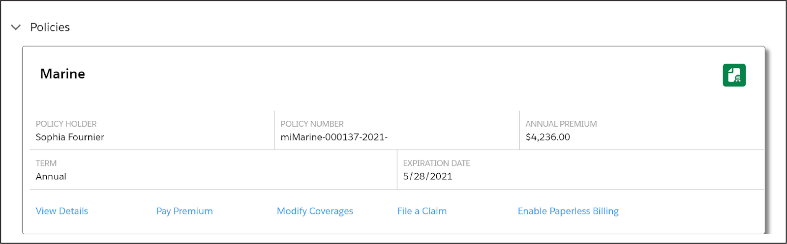
The at-a-glance details of the policy include the policy number, annual premium, term, and expiration date. The actions help you view details, pay the premium, modify coverages, file a claim, or turn on paperless billing.
Flexcards are the Beginning and Ending Points for Customer Transactions
Let’s take another look at Sophia’s profile Flexcard.
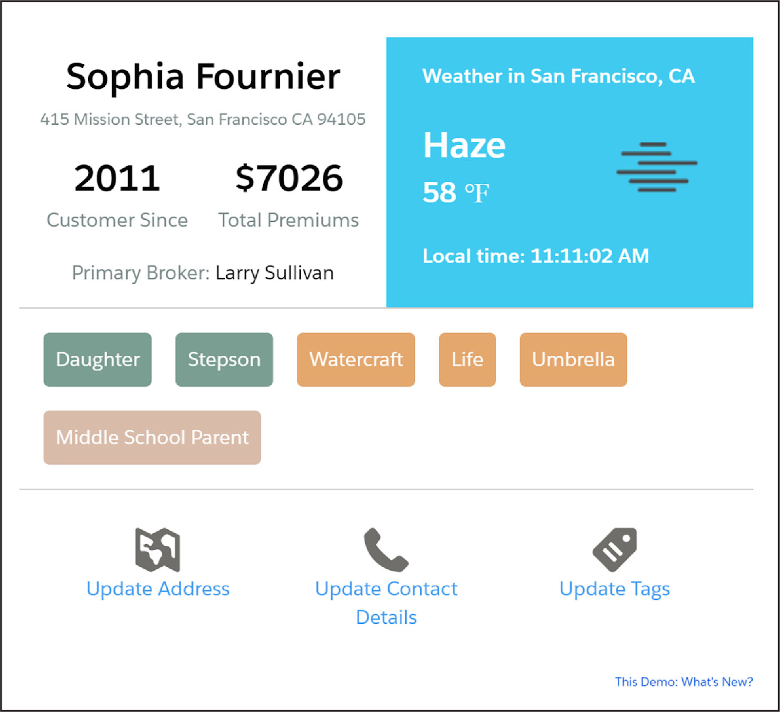
In a call center scenario, a call center rep interacts with a customer over the phone, views the customer’s information, and launches guided processes from the Flexcard.
Let’s say Sophia needs to change her address. The rep launches the Update Address process from the Flexcard. After the process is complete, the Flexcard displays the new address and weather information.
View Flexcards on Any Device or Channel
Flexcards aren’t restricted to Interaction Consoles for call center reps. You can deploy Flexcards for any device and channel, such as a mobile device or a consumer portal.
You deploy Flexcard Lightning web components from the Lightning App Builder to a Lightning page or from the Experience Builder to a Community or portal page. You can also deploy Flexcards to an external content management system, such as Adobe Experience Manager, or inside a custom web container, like Heroku.
Display Data from Multiple Data Sources
A Flexcard can show both internal information from Salesforce and external information from a website or a third-party legacy system. The Flexcard can display this information together in the same way, even if it comes from multiple sources. For example, Sophia Fournier’s profile Flexcard displays internal data from her account details and external data related to the weather.
Quickly Build Flexcards Using Drag-and-Drop Elements
The Flexcard Designer in Omnistudio for Managed Packages gives you the tools to quickly configure, preview, and debug cards. You can drag, position, and resize interface elements onto a canvas to format text, buttons, icons, images, links, charts, tables, and even other Flexcards.
Use the Properties panel to configure the element’s properties. The properties available depend on the element type. Some elements reveal different properties depending on how you configure them.
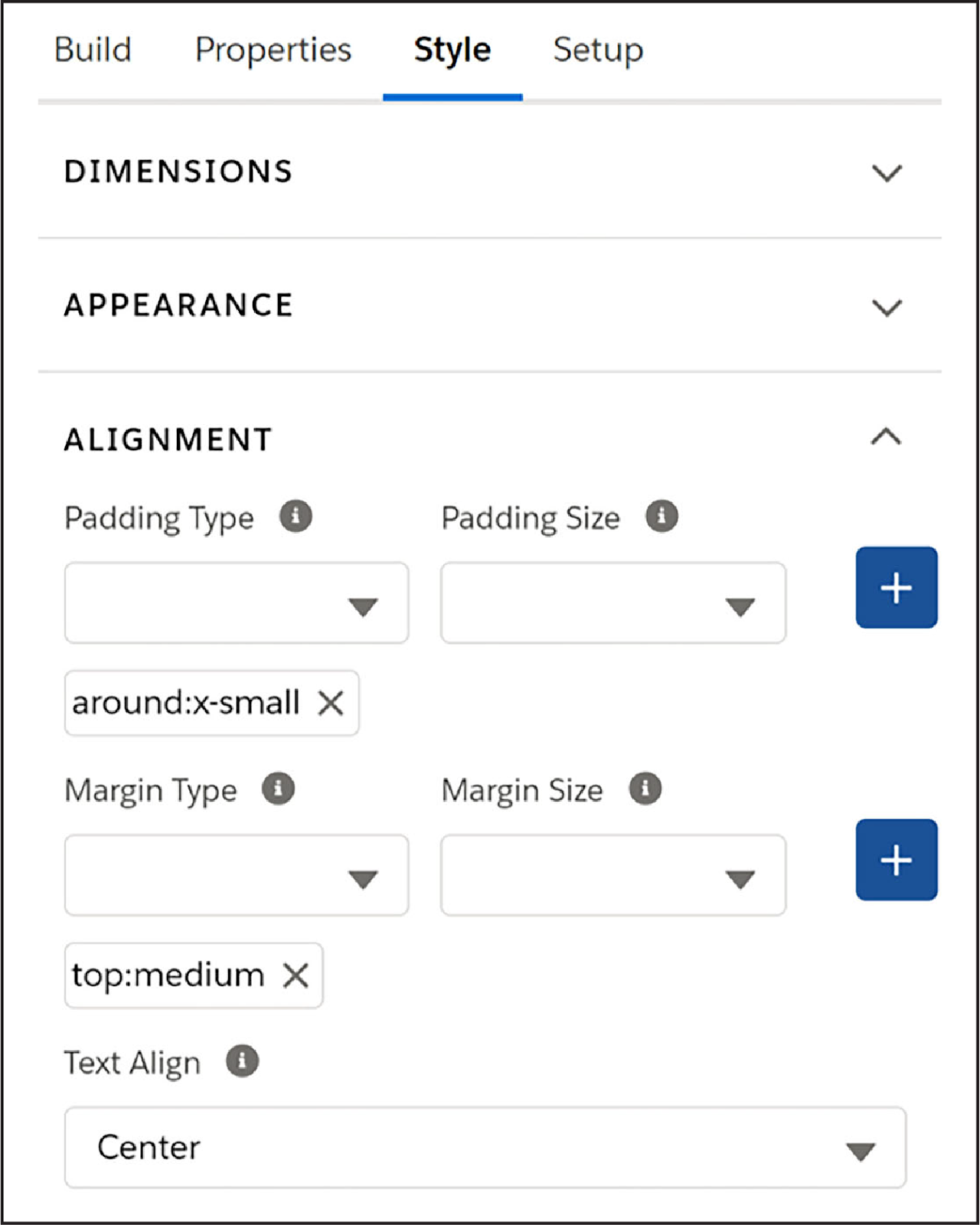
Use the WYSIWYG Editor to Control a Flexcard’s Layout and Style
The Flexcard Designer includes a WYSIWYG editor that lets you control Flexcard layout and style without needing templates.
To globally manage styles, use custom CSS or modify the style directly in the designer. You can set the style for each Flexcard element as follows.
- Set height and width.
- Add backgrounds, borders, and text.
- Set padding, margins, and text alignment.
You can review the styling changes immediately on the Flexcard canvas. When you style an element, you save the style for reuse across the Flexcard.
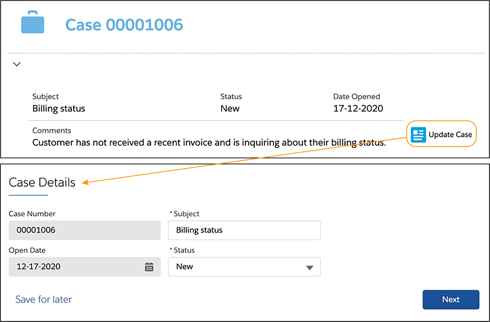
Flexcard Actions are Relevant to the Context of the Card
Clicking an action on a Flexcard launches a workflow that begins a guided process, such as recording a call. Other action types can show a flyout window with more information, go to another record, listen for an event from another Flexcard and reload the card when that event is fired, or notify another component on a page or application that an event has occurred.
In the screenshot example here, clicking the Update Case action opens a second tab for the Update Case Details guided interaction, which is an Omniscript.
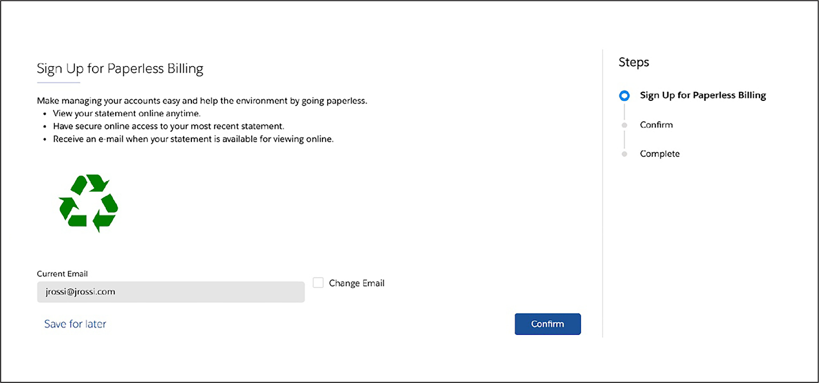
In this example, a rep clicked Enable Paperless Billing on one of Sophia Fournier’s policy cards to open a window with a guided interaction to sign up for paperless billing.
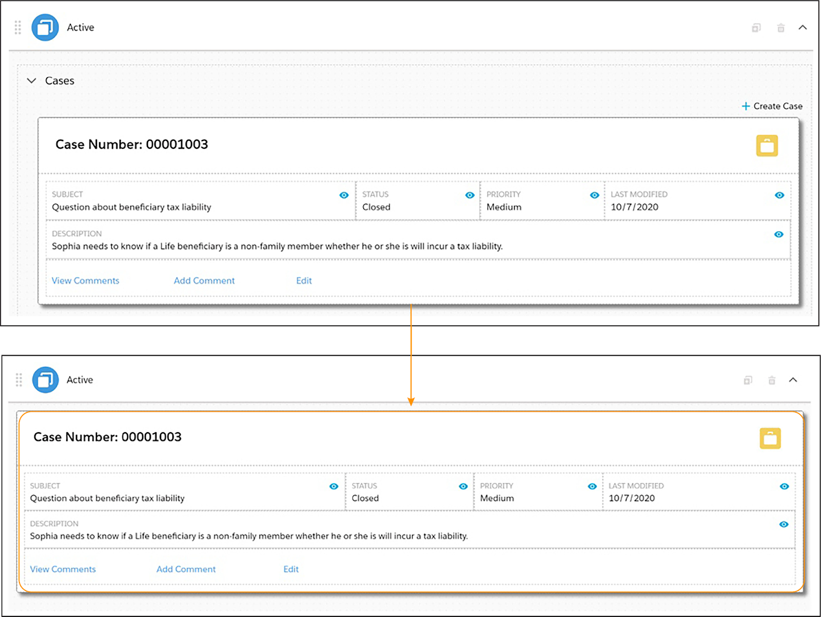
Embed Flexcards in Other Flexcards
You can embed Flexcards in other Flexcards using the child Flexcard element. You can also launch a child Flexcard from an action element.
Embedding a child Flexcard lets you have multiple data sources within one Flexcard. There’s no limit to how many child Flexcards you can embed, but they must be active.
In this example, a child Cases Flexcard is an element within a parent Cases Flexcard. The child displays case details and actions. Without it, the parent is merely a container with a Cases dropdown menu and a Create Case action.
Embed Flexcards Inside an Omniscript
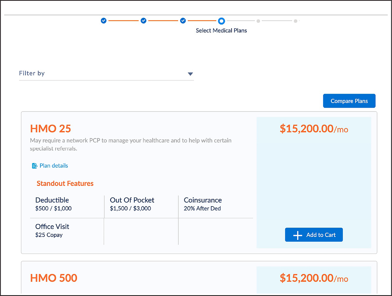
You can embed a Flexcard Lightning web component inside an Omniscript, which means the Flexcard displays as part of a guided interaction.
Here, the embedded Flexcard displays medical plans that the user compares before selecting one as part of the interaction.
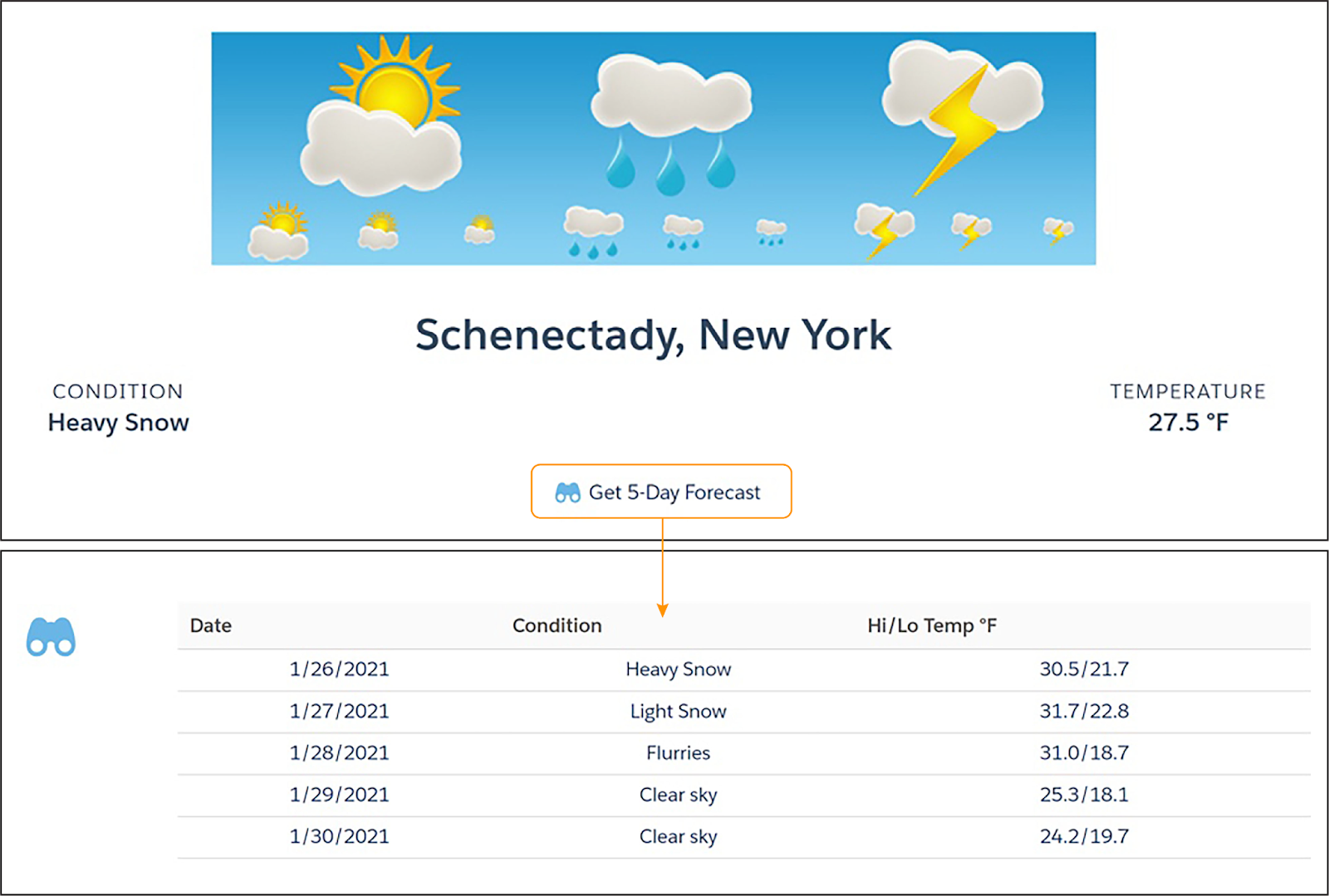
Display Details on Demand with Flyouts
A flyout is another Flexcard that appears when you select an action on a Flexcard. A flyout displays:
- Additional information or actions that cause too much clutter if displayed on the parent card.
- Secondary information or actions that aren't as important to show at the parent card level.
In this example screenshot, clicking Get 5-Day Forecast shows additional forecast information for this Weather Flexcard. The parent Flexcard displays current weather conditions only.
Display Multiple States Based on Conditions
Use Flexcard states to set up different appearances for a Flexcard based on the type or status of the information displayed. You can design multiple Flexcard states and set conditions that determine if, when, and how data appears on a Flexcard. In short, a Flexcard state determines what the user can see and do on the card.
For example, imagine a plan or subscription status such as active, past due, and nonexistent. A single Flexcard related to this subscription can have three different states. Conditions determine which state is displayed.
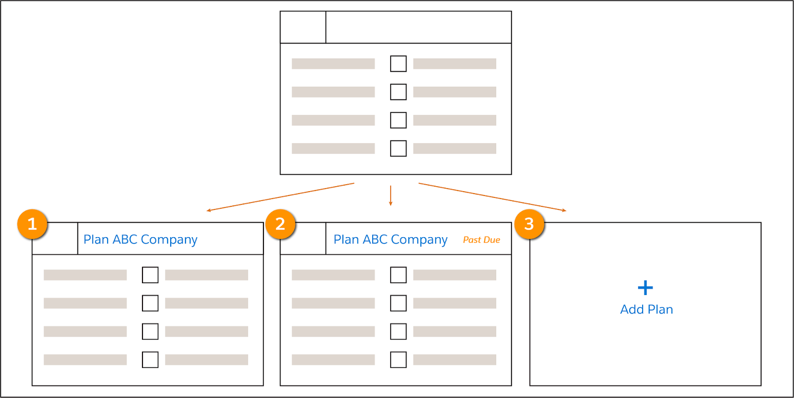
- Card 1 appears if the plan is active.
- Card 2 appears with an additional indicator if payment is past due.
- Card 3 appears if the subscriber currently doesn't have this plan, but offers the ability to add it.
Flexcards are pretty cool, if we do say so ourselves. Now that you have a sense of Flexcard basics, let’s check out Flexcard Designer in the next unit.
Resources
- Trailhead: Lightning Web Components Basics
- Salesforce Help: Flexcards (Omnistudio for Managed Packages)