Work with Child Flexcards
Learning Objectives
After completing this unit, you’ll be able to:
- Explain how and why to use parent and child Flexcards in Omnistudio for Managed Packages.
- Make a collapsible block.
- Describe how to configure data sources for child and parent Flexcards.
- Clone a Flexcard.

Before You Start
Before you start this module, make sure you complete this content. The work you do here builds on the concepts and work you do in that content.
Meet Child and Parent Flexcards
Omnistudio Flexcards display contextual information in an at-a-glance format and provide access to relevant tasks for the displayed data.
This module delves further into Flexcard elements and data sources in Omnistudio for Managed Packages and how you use states and conditions. You start by learning more about child and parent Flexcards.
When you define a Flexcard, toggling on the Is Child Flexcard setting marks the Flexcard as a child card. Child Flexcards are embeddable in other Flexcards, called parent Flexcards.
So, why use child Flexcards?
-
They’re reusable. Your team creates a child Flexcard that shows specific information. You can use this Flexcard in other Omnistudio projects, saving the time it takes to create new Flexcards or clone and change them for your needs.
-
They make multiple data sources on one Flexcard possible. A child Flexcard can have its own data source, independent of a parent Flexcard. There's no limit to the number of child Flexcards on one Flexcard, so this opens up the option to show data from many sources.
-
They are also used as flyouts. Flyouts help you organize how data displays. For example, if you want to have specific data accessible in a Flexcard but it isn't necessary to show it at all times, configure a flyout action to show it using a child Flexcard in a popover or window.
In this example, a Flexcard displays an account’s contacts. This is two Flexcards.

The parent Flexcard (1) holds the child Flexcard (2) inside it.
The Parent Flexcard
Here's the parent Flexcard with a header and an icon representing contacts. Underneath is empty space with a dropdown arrow where the child Flexcard is embedded. You learn more about that arrow and what it signifies shortly.

Let’s look at this parent Flexcard from a different perspective. What does it look like if you see just the elements used to build it? These are elements you’re already familiar with from the Flexcards in Omnistudio for Managed Packages module.

Note the State element at the top of the card. This is where you add the elements to build your card. Every Flexcard is generated with a state, a topic we cover more later on in this module.
The Child Flexcard
Now take a look at the child Flexcard configured to show contact information.

The elements you use to create the child Flexcard are the Block, Text, and Action elements.

The Flexcard Element
In order to embed a child Flexcard in a parent, you must first activate it by selecting Activate in the header. Then in the parent Flexcard, drag the Flexcard element onto the canvas and configure the child card properties.
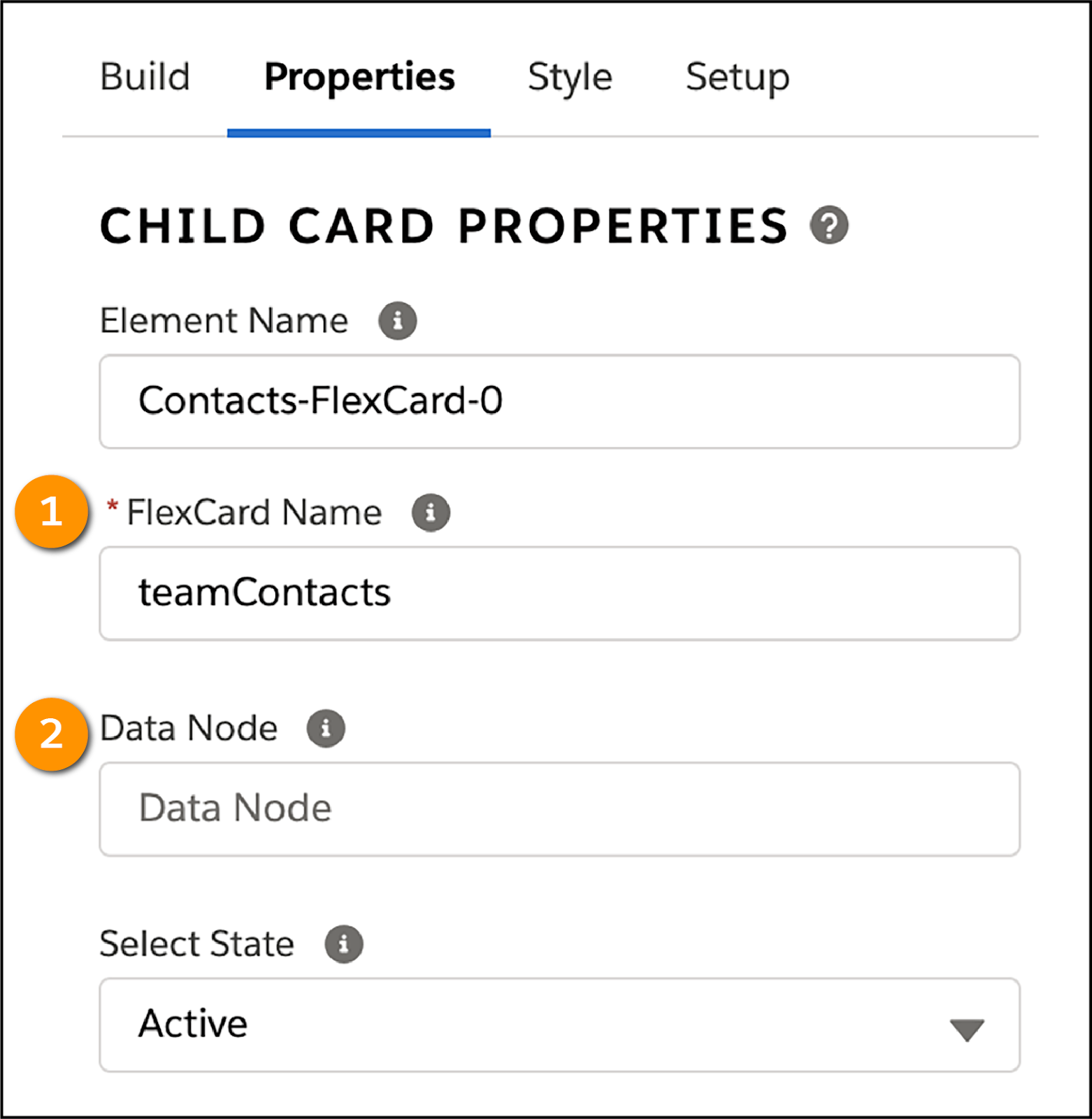
Use the Flexcard Name field (1) to select the child Flexcard you want to embed in the parent. The Data Node field (2) involves passing data from the parent to the child, which you’ll learn about soon.
Take another look at all of the elements used for both Flexcards when the child is embedded in the parent.
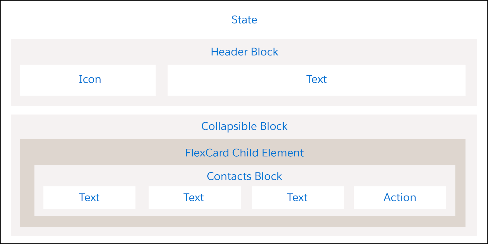
Note the collapsible block and Flexcard element. Let’s learn about that now.
Collapse a Block
Remember that dropdown arrow in the parent Flexcard example? It indicates that the block is collapsible—that is, users hide and expand information. Users select the arrow to expand the block and view the data.
How can you do this on your projects?
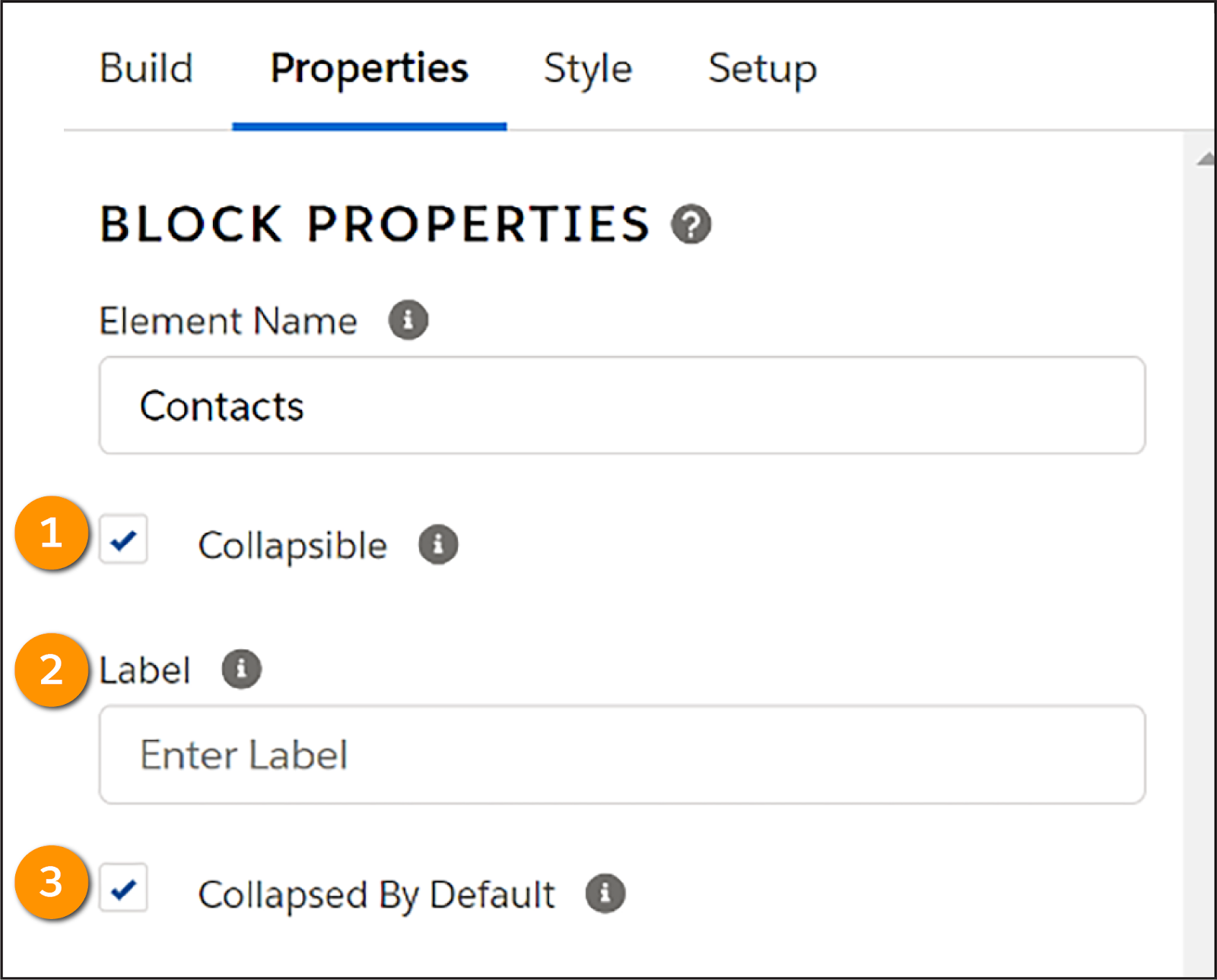
To make a collapsible block, select Collapsible (1) in a block’s properties to let users view and hide the block. There are two available options to further configure the collapsible block. Label (2) the collapsed block and select Collapsed By Default (3) to always hide the block when the Flexcard first displays.
Imagine you want to distinguish between different data on one Flexcard or a console displaying several cards. Making a collapsible block keeps the Flexcard clean and streamlined.
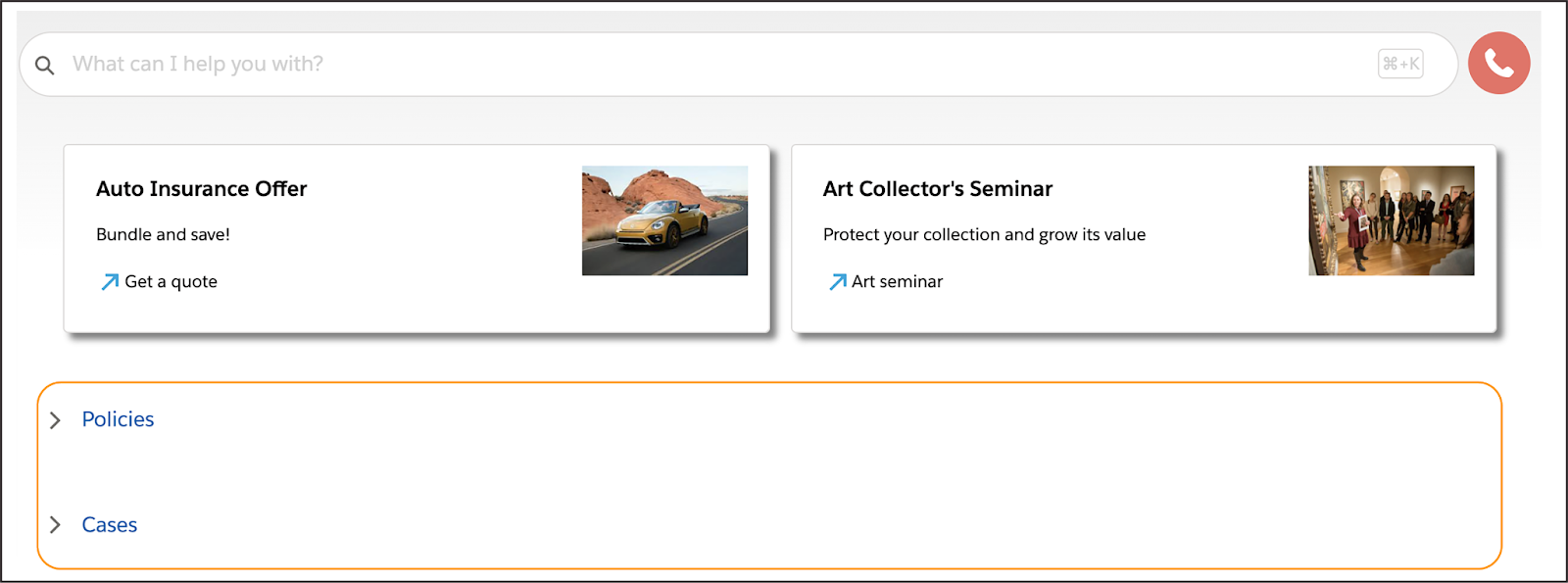
The image here shows part of a console with collapsed blocks. Note that the two collapsed blocks have the labels Policies and Cases. They are also collapsed by default.
You can expand a block to show more information, as shown in the Cases block in the next image. To create this look, group the elements inside the block and designate the block as Collapsible and Collapsed By Default. Use the Label field to name this block Cases.

Configure Data Sources for Parent and Child Flexcards
Flexcards can display data from multiple sources. This is possible because of child Flexcards. A child can use the parent Flexcard’s data source or an independent data source. If a child card and parent card use independent data sources, you configure them independently in the Setup panel.
Pass a Record or Array of Data to a Child
The example in the next image shows the Properties panel for the Flexcard element in the parent.
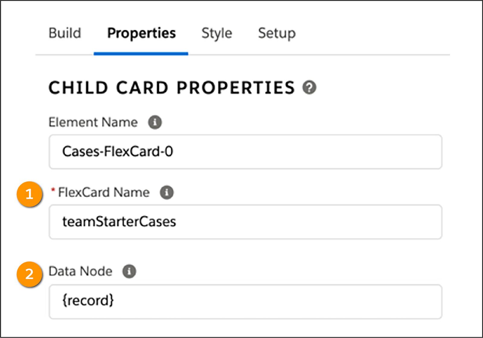
Select the child Flexcard in the Flexcard Name field (1) as usual. Note the Data Node field (2). This is where you select an available data node to pass a record or an array of records to the child Flexcard. In this Flexcard, {record} is selected, which sends the current record’s data to the child. Another data node is {records}, which sends all data. All of this is done in the parent Flexcard.
What needs to be done in the child Flexcard? If a child uses the parent data source, it doesn't matter if its data source is configured or set to None. Either way, the parent’s data source overrides the child’s data source if a data node is selected because the record is already set.
Pass a Data Field to a Child
What if you want to pass a specific data field to the child? You use the Attributes property. Enter an attribute to pass, and assign it a value.
Take a look at this example.

The parent has a Flexcard element for the child. The Data Node field is empty. Here, you want to pass an Id from the parent to child. You assign values to attributes in the Attributes (1) section. Enter Id as the Attribute (2) to pass, and {Id} as the Value (3).
Again, this is all done in the parent Flexcard. In the child Flexcard’s Setup tab, you must input the Id into its data source.
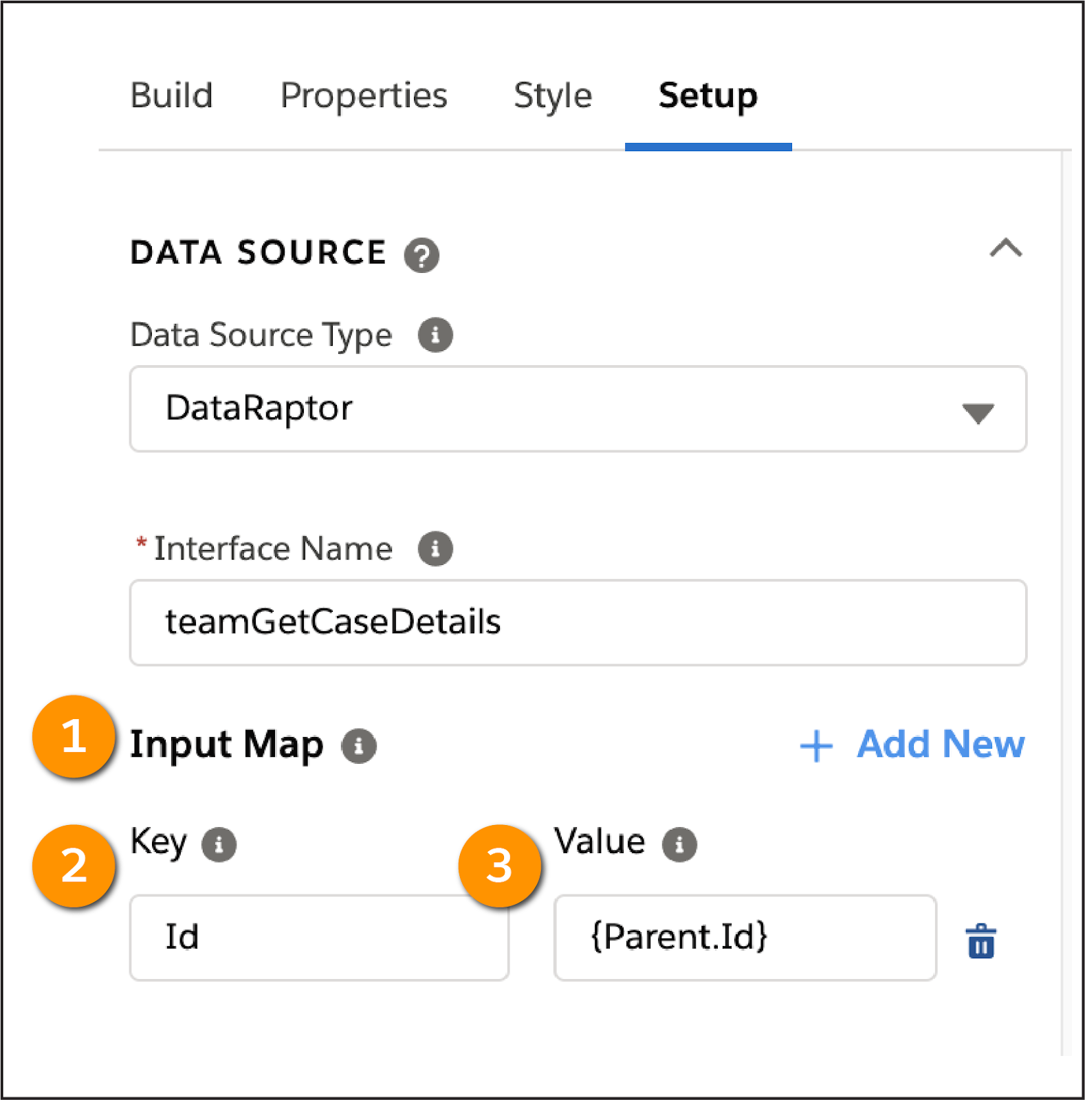
In this example, note the Input Map (1) section. The child Flexcard’s data source’s Input Map shows the Id (2) as the input. The Value field uses the parent’s Record Id as the value of the child’s contextId, {Parent.Id} (3).
Clone to Create a New Flexcard
Let’s take a slight detour to a different topic: cloning a Flexcard. One advantage of cloning a Flexcard is to save time. Cloning elements within a Flexcard also saves time.
For example, imagine that you have a Flexcard that looks very close to what you want, and just need some minor adjustments or additions. Cloning the Flexcard creates a new Flexcard copy with the layout or settings of the Flexcard you're cloning. Select Clone in the Flexcard you want to clone, and a window opens as shown in this image.

Cloning a Flexcard isn’t possible until you change the Card Name (1). In this example, Clone (2) is inactive because the name hasn’t been changed yet.
If you want to create an identical copy of an activated Flexcard without affecting the places it is used, create a new version. Versioning keeps the name and author the same, but lets you make edits and changes without affecting the active version used, so nothing will break while you make updates. Don’t worry—versioning is covered in more detail in a later unit.
Feeling confident about embedding Flexcards? Then head to the next unit, where you learn how to build Flexcards with external data.