Display External Data
Learning Objectives
After completing this unit, you’ll be able to:
- List potential external data sources for Flexcards in Omnistudio for Managed Packages.
- Configure a data source to show external data.
- Create a flyout action to show data.
- Create a table to show data.
- Add an image to a Flexcard.
Why to Use External Data
External data includes all data from outside a Salesforce org. When you need data that isn’t in Salesforce, you use an external data source. Displaying external data on a Flexcard is a common need for implementations.
External data sources include:
- Legacy data sources
- On-premises data sources
- API integrations
- Other third-party data and applications
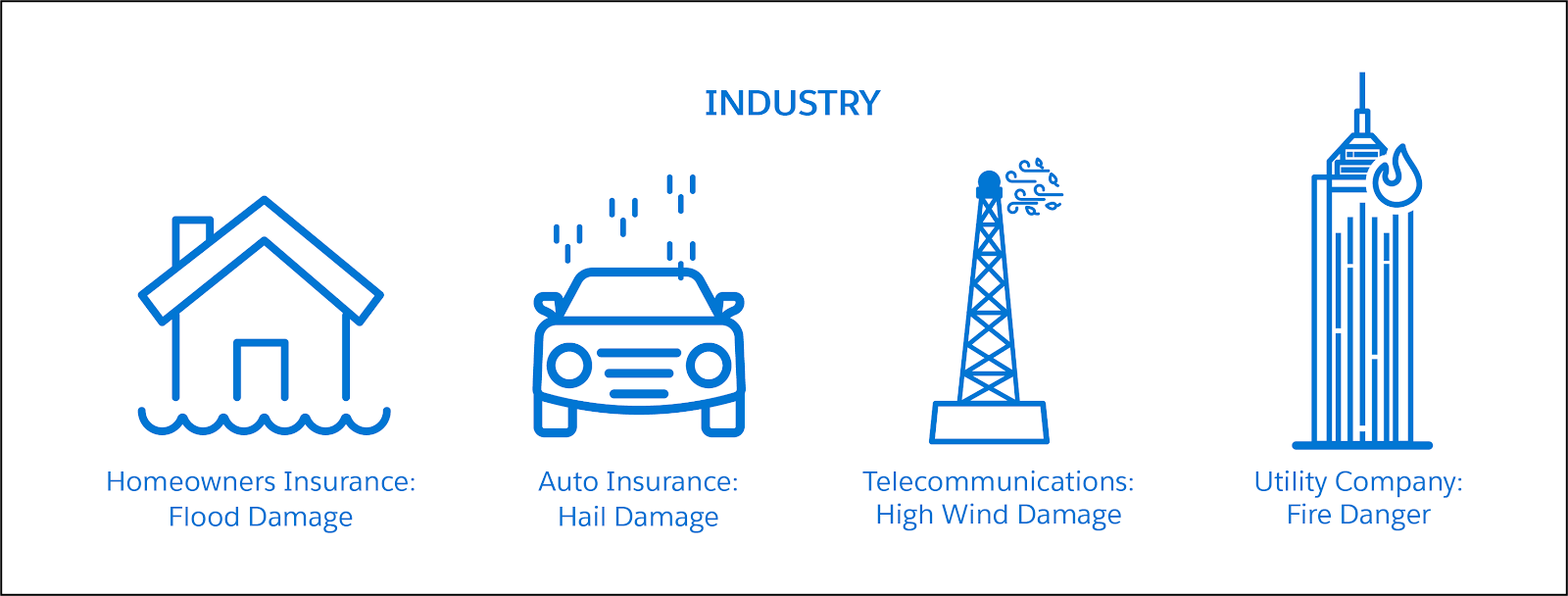
Using a weather API is a great way to practice getting data via a web API. There are lots of use cases for weather because severe weather is an important factor for many industries. Examples include weather damage to homes for insurance companies and service outages due to inclement weather for energy providers.
Display External Data in Flexcards
Let’s explore an example. This Flexcard contains the current weather and forecast for an account’s location, determined by the billing postal code.
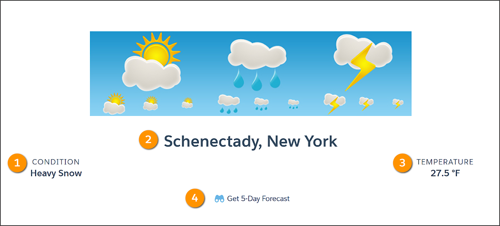
The current weather includes the current weather (1), the city and state (2), and the current temperature (3).
Wondering where the weather forecast is? It’s hiding. The Get 5-Day Forecast button (4) launches an action that displays the forecast.
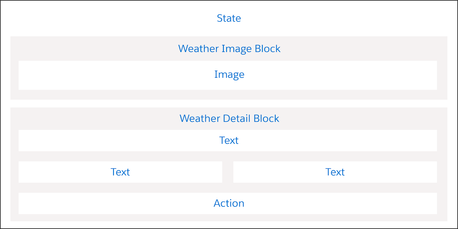
Here’s how the elements on this Flexcard are positioned to create this look. It has two Block elements on top of each other: the top block displays an image and the bottom block shows the weather data. Beneath the blocks is the Action element which launches the weather forecast data.
Let’s talk more about that Action element. By now, you’re familiar with displaying data on a Flexcard through elements such as Field and Text. Displaying data in a window or popover is ideal for saving space on a Flexcard and preventing clutter. So, how do you do that? With a flyout action.
Display Data in a Flyout
A flyout shows additional data with a simple mouse click.
A flyout can display:
- Information from long text strings that does not fit in the standard Flexcard field.
- Data from child records, such as open cases for an account, or additional actions.
The three flyout types are:
- Child Flexcard
- Omniscript
- Custom Lightning web component (LWC)
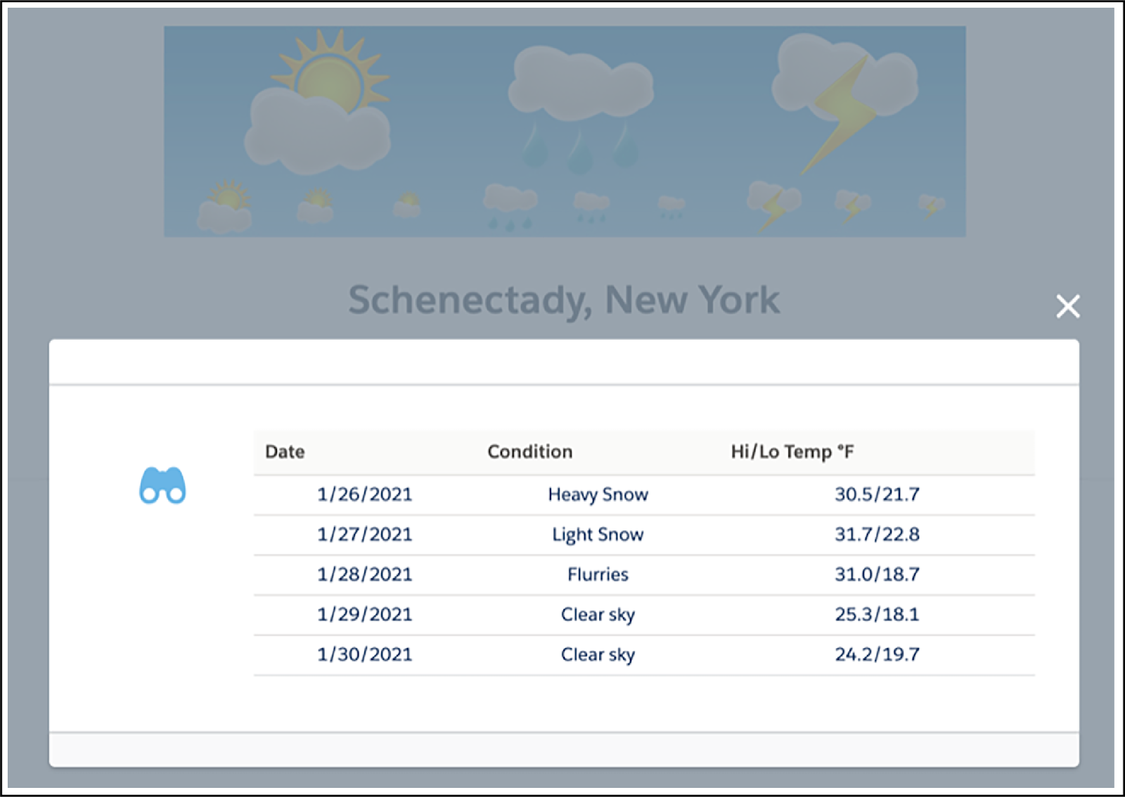
Flyouts are created with the Action element by selecting the action type of Flyout. Clicking the action in our example weather Flexcard displays a data table in a flyout in a modal window.
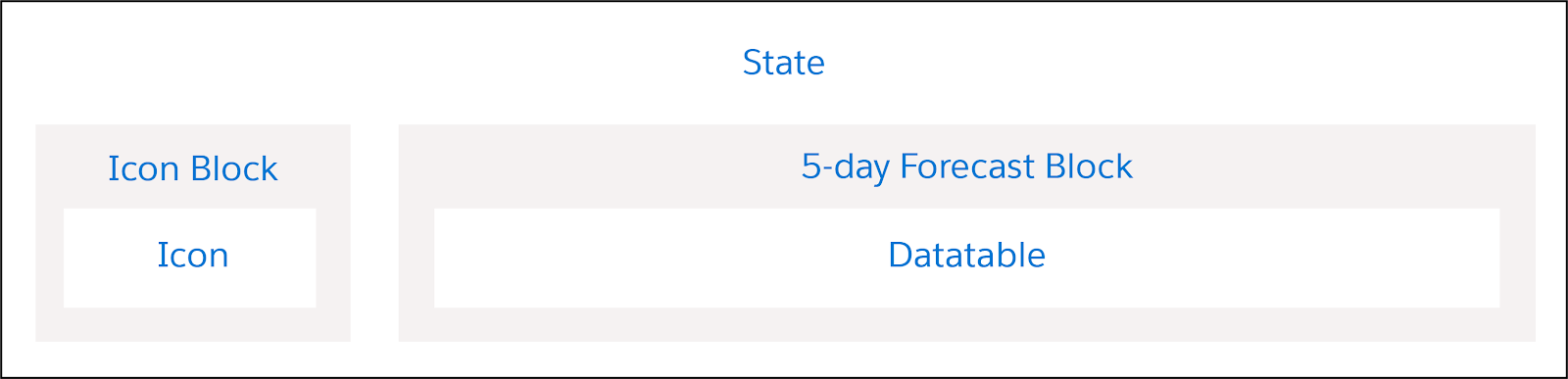
This example uses two Flexcards. The flyout type is a child Flexcard using a DataTable element. Take a look.
Here are the elements used to create this look for the flyout. The child Flexcard has two Block elements next to each other. The Icon Block has an Icon element and the 5-day Forecast Block has a DataTable element displaying the forecast data.
To create this flyout, you configure the Action element like this:
- Action Type: Flyout
- Flyout Type: Child Card
- Flyout: Select the activated child Flexcard to use as the flyout
- Open Flyout In: Modal
Fetch Multiple Days of External Data
The child Flexcard with the forecast data uses an Integration Procedure as an independent data source for displaying current and forecast weather data.
When configuring the data source, enter Input Map variables to determine what information is sent between the tools.
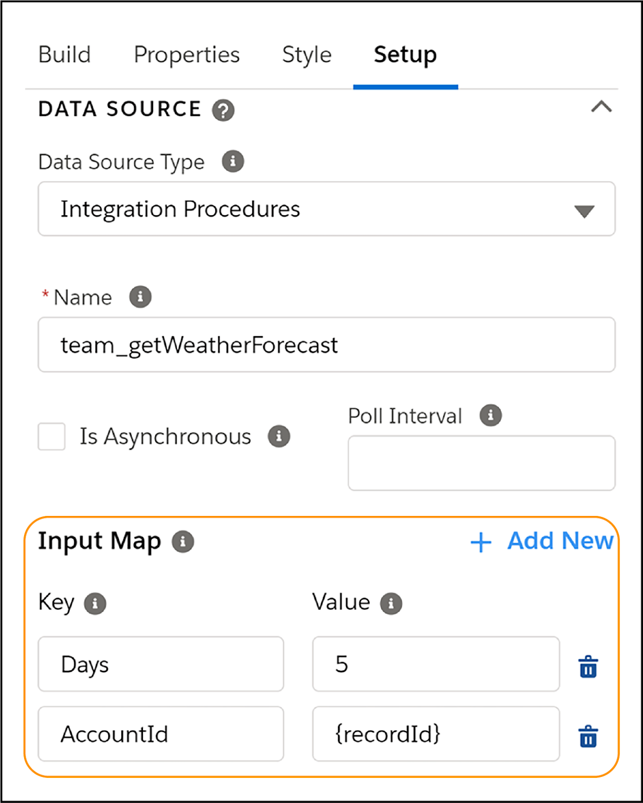
The Key value AccountId with the Value {recordId} tells the Integration Procedure to retrieve details from account records. To get forecast data—in this case 5 days of data—a second Key-Value pair is used: Days and 5.
Weather Data Array
In the example weather Flexcard, the Integration Procedure pulls both current and forecast data. The best practice is to use the Result JSON Path to trim the JSON to display only the current data.
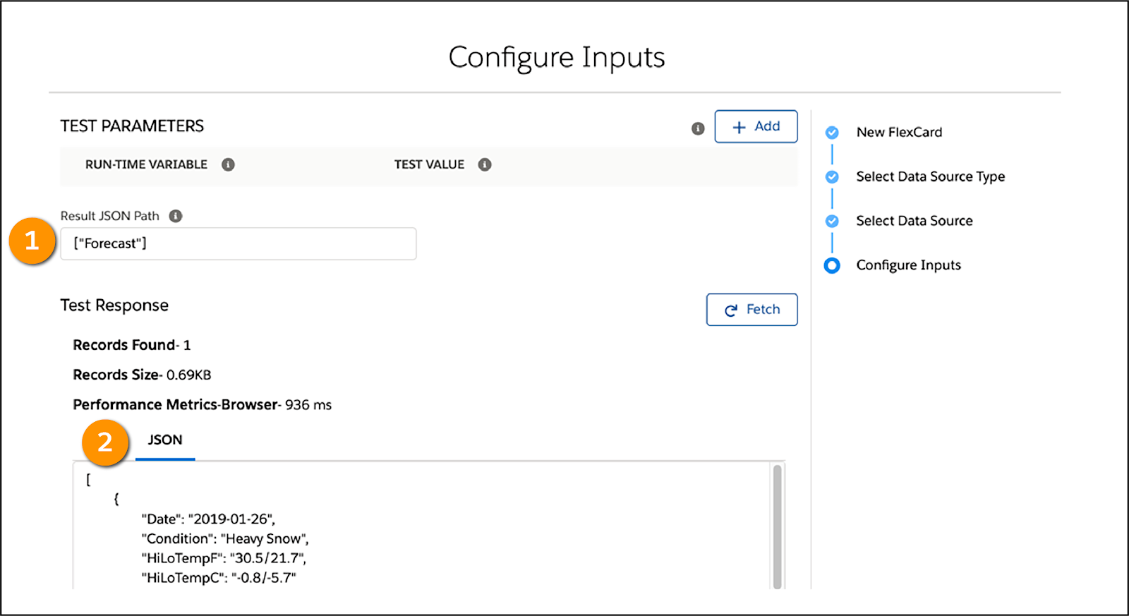
To show the current weather data, trim the JSON to only show current data using the Result JSON Path. For the 5-day forecast data, filter the JSON to only receive forecast data using the Result JSON Path (1). The trimmed JSON displays in the JSON tab (2).
Display Data in a Table
The DataTable element creates a tabular structure to show the data fetched from the data source.
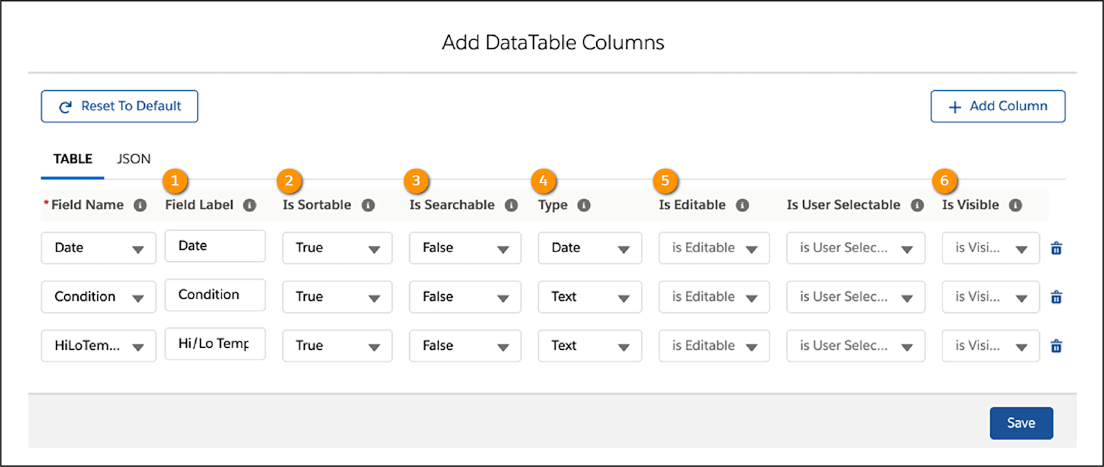
With a table you can:
- Add, delete, and update columns.
- Change Field Labels (1).
- Make columns Sortable (2).
- Make fields Searchable (3).
- Change field Type (4).
- Make fields Editable (5).
- Make fields Visible or hide fields (6).
Edit the table to configure it how you want it to look.
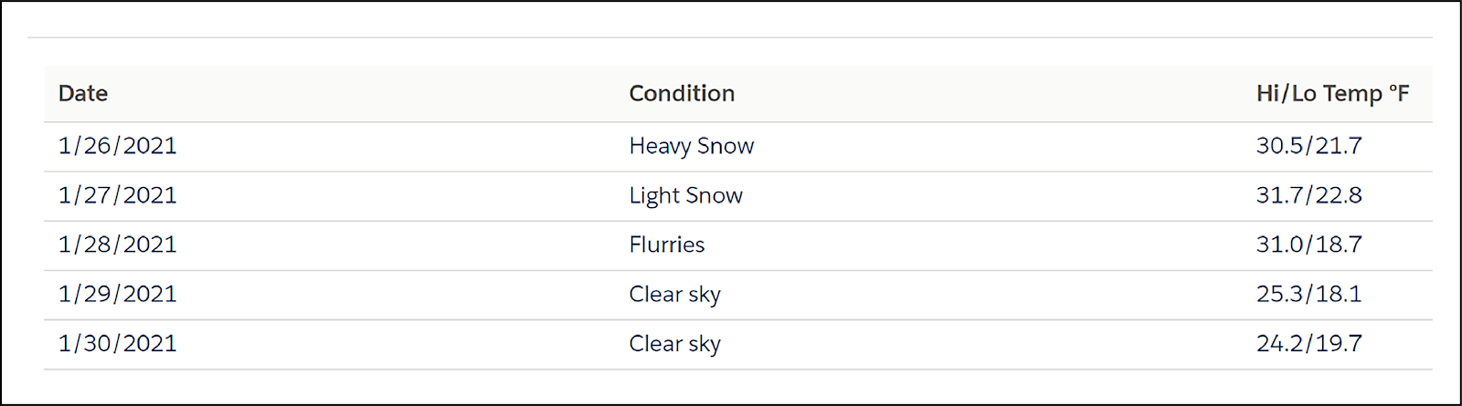
This is what the data table looks like with the settings from the previous image. It shows 5 days of forecast data, including the weather conditions and high and low temperatures.
This method lets you show a lot of data in a condensed table format.
Repeat Records
New Flexcards have Repeat Records enabled by default. When Repeat Records is enabled, this means that there'll be one Flexcard instance for each record in the array. For example, a data source that returns a list of active cases for an account on the Flexcard. Each record displays all fields added to a state in its own container.
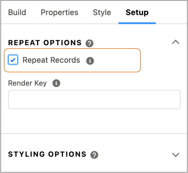
If Repeat Records isn’t selected, the entire array is available inside of one Flexcard, as in the table example. Repeat Records can be found in the Setup panel.
Data tables already loop over and list multiple records, so with DataTable elements, you must disable the Repeat Records feature. If not disabled, the table displays multiple times, depending on the data from the data source. In the example of a 5-day weather forecast, the table would show five times.
You should disable this feature in a few other instances:
- If you have a Chart element you want to display once
- If you have a child Flexcard you want to display once
- If you have a Custom Lightning web component that serves as a header for a Console App
Omniscript Support
You enable the Omniscript Support feature when the Flexcard interacts with an Omniscript.
For example, you can embed a Flexcard inside an Omniscript with the Omniscript Lightning Web Component element. You can also update an Omniscript with the Flexcard's Update Omniscript action element.
The Omniscript Support feature is in the Setup panel.
How to Use Image Elements
You probably noticed the nice image in the example weather Flexcard. Images are saved in the org’s library for later use. You also have the option to enter a URL for the image or a merge field from a data source.

After you add an image, adjust the image size relative to the canvas in the Properties and Style panels.
Beautiful! Images make your Flexcards stand out.
We continue the Flexcard fun in the next unit, where you learn all about Flexcard states and conditions. So, keep reading!
Resources
- Salesforce Help: Launch a Flyout from an Action on a Flexcard (Omnistudio for Managed Packages)
- Salesforce Help: Work With Data in the Flexcard Designer (Omnistudio for Managed Packages)
- Salesforce Help: Display Flexcard Data in a Tabular Structure (Omnistudio for Managed Packages)
- Salesforce Help: Repeat Options in the Flexcard Designer (Omnistudio for Managed Packages)
- Salesforce Help: Add an Image to a Flexcard (Omnistudio for Managed Packages)