Add States and Conditions
Learning Objectives
After completing this unit, you’ll be able to:
- Create a conditional state to display data.
- Explain Flexcard versioning.
Display Data Using Multiple Flexcard States
Every Flexcard is generated with a state. To create a new state, you add a State element to the canvas or clone an existing state. As you’ve seen, the state of a Flexcard controls what a user sees and does on the Flexcard.
In the simplest case, a Flexcard can have:
- An active state if there’s data to display
- A blank or open state if there’s no data and limited actions
There's no limit to how many states you can add to a Flexcard. But the order of these states on the canvas is important in determining which state shows.
Consider a situation that calls for different data to show on a Flexcard. For example, how do you create a Flexcard that shows insurance policy information but also displays a message if the account is past-due? To make this happen, you create a new state in the Flexcard and set conditions. These conditions determine if, when, and how data displays on the Flexcard.
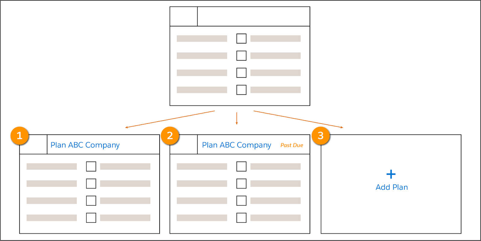
This single Flexcard has three different states. The first state displays information on an active plan. The second state displays if the plan is past-due. The third state displays if there's no active plan. It includes an action to add one. This third, blank state is made by selecting the Blank Card State checkbox in the State element’s Properties panel.
The order of the states and their conditions determine what data shows. From top to bottom, the first state that has true conditions is the one that displays. In this example, the state that displays is the last state because it's the first that is true. We recommend as best practice to have only one true state per record.
Remember our weather card from the previous unit? Let’s use it as an example. Imagine you want an alert to display for an account when there's bad weather, such as heavy snowfall.
You make two states, one that shows the weather and weather forecast, and another that shows an alert when there's bad weather. Since you want the weather alert to show if certain weather conditions are met, you place that state in first position and the current weather state second. If the condition for the alert isn’t met, the second state displays.
Cloning a State and Configuring Display Conditions
This is the weather Flexcard that shows the current weather for the account, based on the postal code.
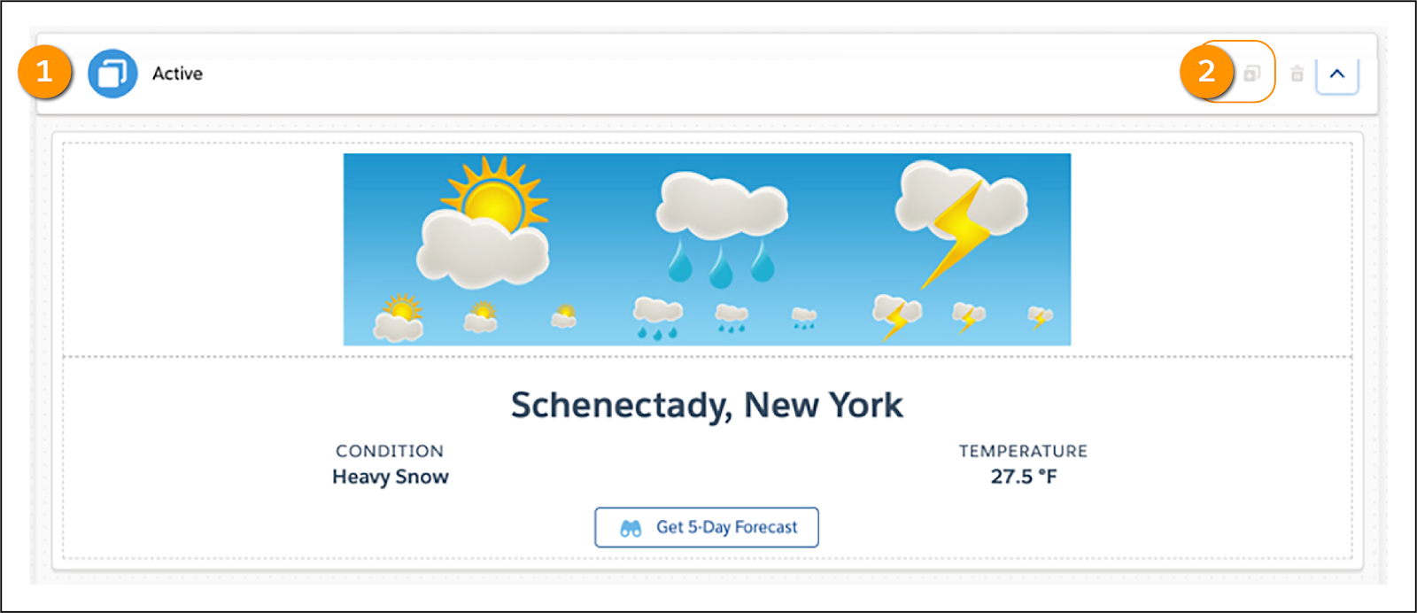
The state name is the default name Active (1). Clone (2) this state to create a new state that appears when set conditions are met.
Look at the elements that make up our beginning weather Flexcard.

Note the Active State at the top. Cloning this state copies all of these elements.

Upon cloning a state, you immediately see the option to configure the conditions that dictate when it displays. In this example, the Alert State displays if the Data Field Condition (1) is equal to (2) the Value Heavy Snow (3).
Let’s look at the clone of our weather Flexcard’s Active state, and note the changes to its appearance.

This state's name is Alert, and next to it's the Condition that must be met for it to display (1). The Weather Alert image (2) replaces the cheerful weather image that appears in the Active State. Also, while the same fields show the weather data (3), they have different styling. Finally, there's an extra button (4) that directs the user to a weather website when clicked.
Here’s the placement of the elements for the Alert state on the canvas. The same elements are used for both Active and Alert states: Blocks, an Image, Text, and Actions. The styling is what makes them look different from each other.
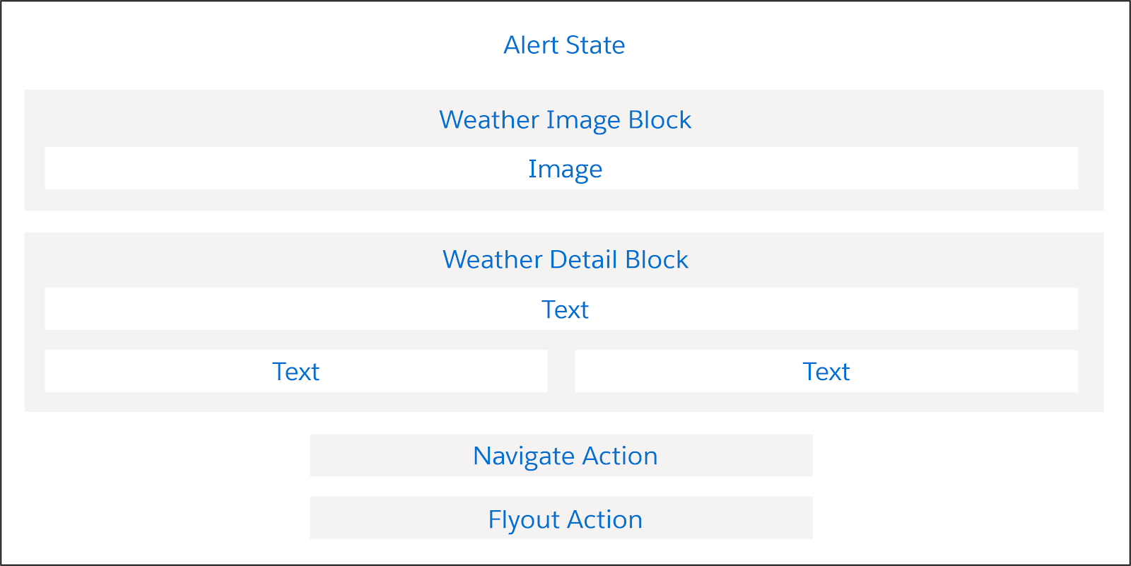
Notice the extra action in the Alert State: The Navigate Action, which is for the weather site button. The Navigate Action directs users from the Flexcard to external web pages or to pages within Lightning Experience and Lightning Communities. The page reference in the Target dropdown menu determines this.

In this example, the Action Type is Navigate (1), and users are directed to a Web Page (2) specified in the URL field (3).
Version a Flexcard
You learned about cloning Flexcards and elements, and touched upon versioning. Let’s dive deeper into versioning and examine when to version and why. Then, we’ll take a closer look at the difference between versioning and cloning.
Versioning is a way to change your Flexcard while retaining the existing Flexcard. 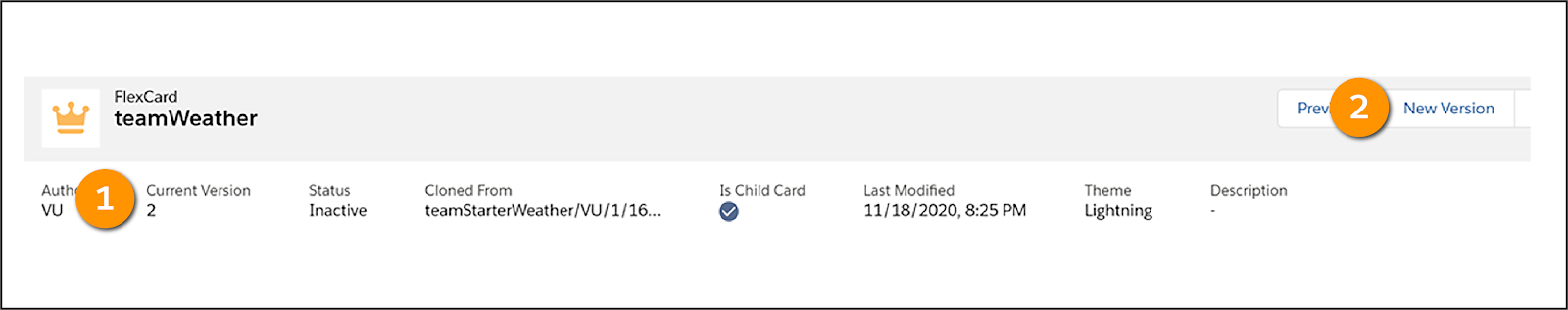
The Flexcard’s name and author remain the same, but the Current Version number (1) increments in the new version you want to edit. Select New Version (2) in the header of the Flexcard canvas when you want to version a Flexcard.
Only one Flexcard version is active at a time. When you activate the new version, it replaces the old version wherever it's being used.
So, when do you version Flexcards and when do you clone Flexcards? Here’s a table that can help you decide.
Version a Flexcard |
Clone a Flexcard |
|---|---|
|
|
There’s more Flexcard goodness to come! Get ready to activate and publish Flexcards in the next unit.