Activate and Publish Flexcards
Learning Objectives
After completing this unit, you’ll be able to:
- Describe the publishing options for an activated Flexcard in Omnistudio for Managed Packages.
- Add a Flexcard Lightning web component to Lightning and Experience pages.
- Use the standard Flexcard component for Lightning pages and Experience Pages.
Publish Options for Activated Flexcards
When you activate a Flexcard, you generate a Lightning web component (LWC) that can be published to a Lightning or Community page.
By setting Publish Options, you decide where the Flexcard Lightning web component can be published. You can also set what the Lightning web component is called when it appears in the list of available components for those pages. Remember that you can't add or edit elements on an active Flexcard.
Let’s take a closer look at the fields in Publish Options.
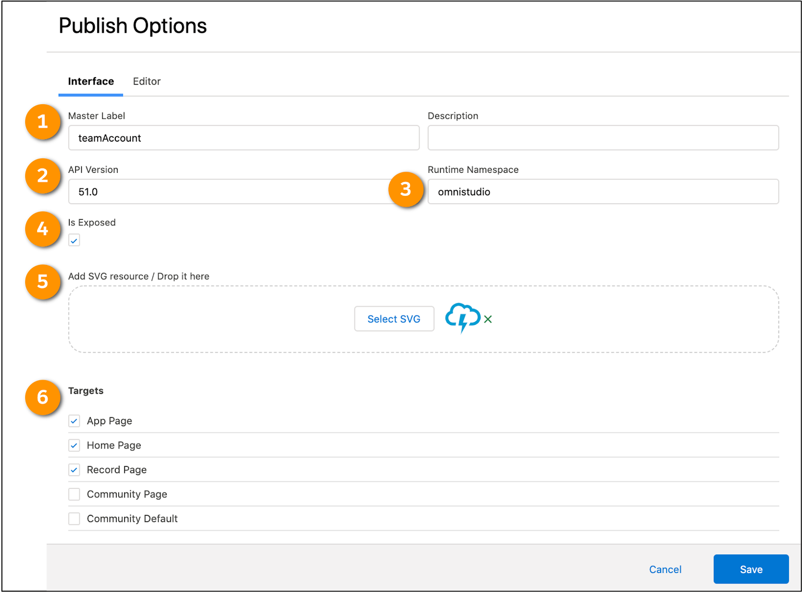
The Publish Options for this Flexcard show that this is a parent named teamAccount (1) and accessible for the Targets (6) App Page, Home Page, and Record Page. Flexcards are also accessible in a Community Page and a Community Page with configurable properties, Community Default.
There are several notable publishing options.
-
Master Label (1): Enter the visible name of your Flexcard component in the Lightning App Builder and Community Builder.
-
API Version (2): Select the API version of your Flexcard component. This defaults to the API version used when you created the Flexcard. When you create a new Flexcard, it defaults to the current API version.
-
Runtime Namespace (3): Enter the managed package namespace.
-
Is Exposed (4): Select this when you want your Flexcard component to be public.
-
Add SVG Resource/Drop it here (5): Add your own custom component SVG icon to identify your generated LWC in the Lightning App Builder and Community Builder.
-
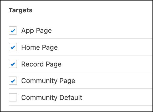
Targets (6): Select the places where your Flexcard component is available for publishing. Targets aren't set for a child Flexcard by default, as child Flexcards are typically embedded only in parents or used in actions, such as the flyout.
Add a Flexcard to a Lightning Page
After creating and activating your Flexcard, use the Lightning App Builder to publish your generated Flexcard Lightning web component to a Lightning page. We use the Lightning App Builder to build industry-specific consoles.
In the Lightning App Builder, drag your Flexcard component onto the canvas area of a record, Home, or App Page, depending on what targets you set for the components in Publish Options.
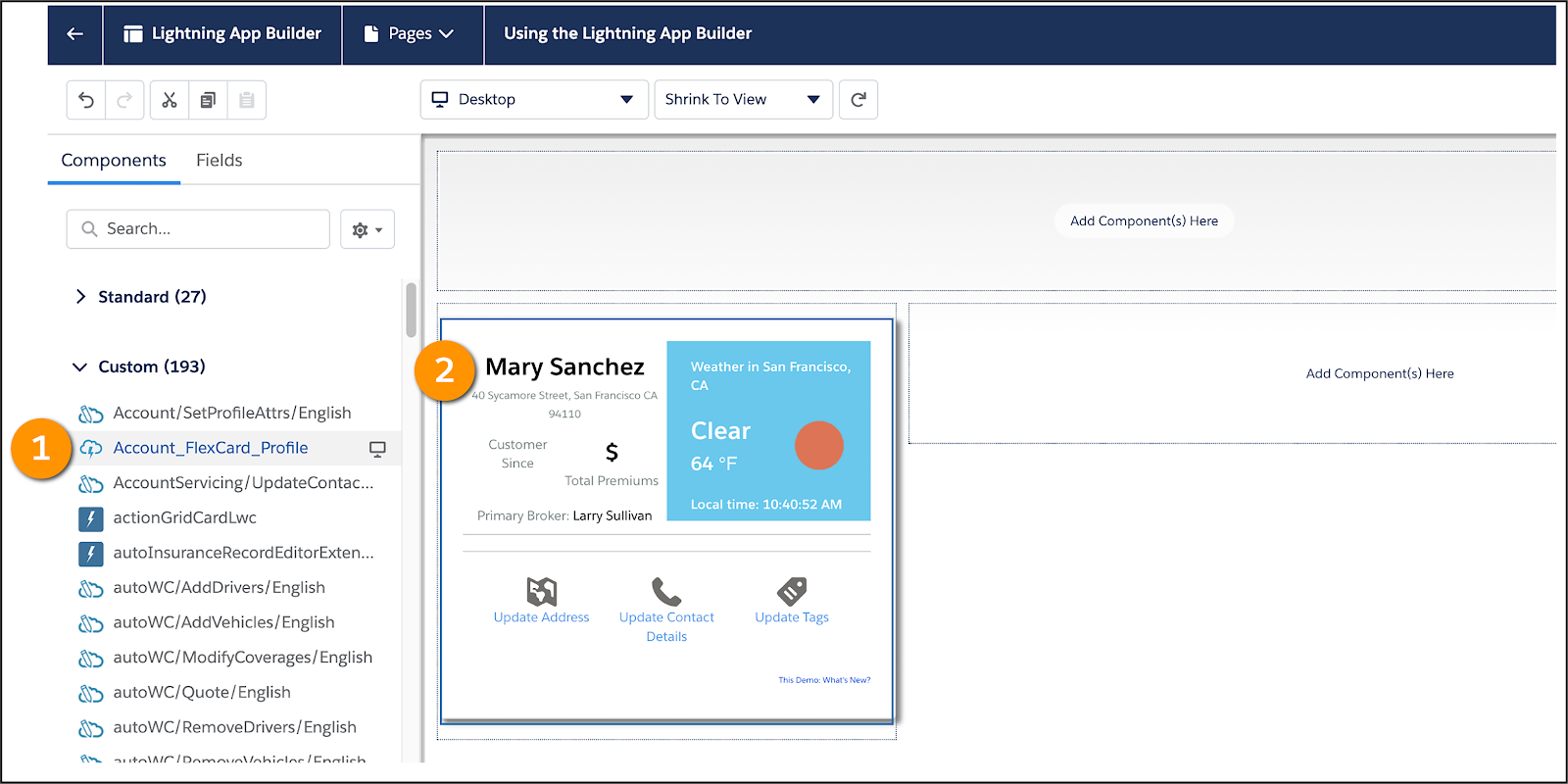
In this example, the Account_Flexcard_Profile component (1) is added to the canvas area of the page (2).
If you can’t find a Flexcard component in the Custom Components list, return to the Flexcard Designer and make sure the Flexcard is active and the correct targets are set.
Add a Flexcard to an Experience Page
After activating your Flexcard and making it available to Community pages (Experience Pages), use the Experience Builder to publish the generated Lightning web component to a Community page.
The Experience Builder is similar to the Lightning App Builder. It has a Components list where you select the Lightning web component and drag it to the canvas area.

In this example, the sampleAccount component (1) is added to the canvas of the page (2).
Thanks to Flexcards and all of their fantastic features, we get a 360-degree view of the customer through building customer-centric, industry-specific User Experience (UX) components and applications on the Salesforce Platform.
Enable the Standard Flexcard Component for Lightning Pages and Experience Pages
The two methods shown in the sections above provide the ability to make Flexcards appear in the Custom Components sections for both Lightning Pages and Experience Pages. This is based on the checkboxes within the Targets section of Publish Options within a Flexcard as shown in the image here.
If you have Omnistudio that uses the standard data model, you can use the Flexcards standard component to display a Flexcard on a Lightning page from the Lightning App Builder. You can either add an active Flexcard you've created or an out-of-the-box uneditable Flexcard available as part of your industry license. Standard Flexcard components run natively in your Salesforce org. Therefore, you don't need to install the Omnistudio package to add active Omnistudio components to a Lightning page. Whereas, custom Flexcard components run from an installed managed package.
To know whether you can turn on this feature, check whether your org uses Omnistudio sObjects (standard objects).
- Select
 and then Setup.
- In the Quick Find box, type
Omni Interaction Configuration, and select Omni Interaction Configuration.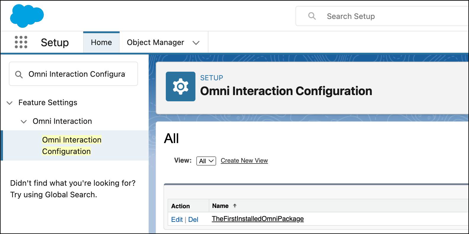
If an entry named TheFirstInstalledOmniPackage is present, your org uses Omnistudio sObjects (standard objects), and the standard component feature can be enabled.
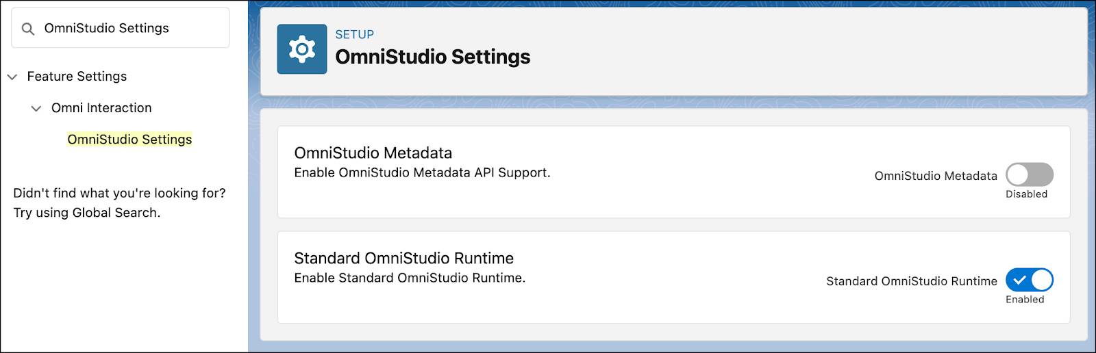
After you've verified that your org uses Omnistudio sObjects (standard objects), you can now turn on the standard component.
- Select
 and then Setup.
- In the Quick Find box, type
Omnistudio Settings, and Omnistudio Settings.
- Enable Standard Omnistudio Runtime.
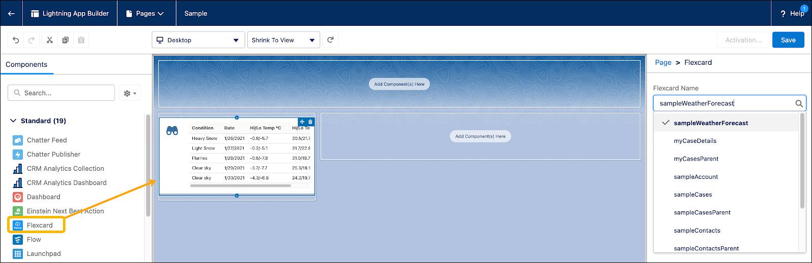
With this feature now enabled, you can go back to Lightning App Builder or Experience Builder and see the Flexcard option under Standard components.
From within Lightning App Builder, drag a Flexcard element to the page.
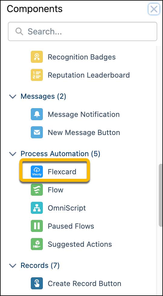
The Flexcard option appears in Experience Builder under Process Automation.
While having these as standard options are great, be aware that there are some features not supported within the standard components. Refer to Omnistudio Standard and Omnistudio for Vlocity Products and Features Support to see what is supported and what isn't.
Resources
- Trailhead: Lightning App Builder
- Salesforce Help: Experience Builder Overview
- Salesforce Help: Add a Flexcard to a Lightning Page (Omnistudio for Managed Packages)
- Salesforce Help: Add a Flexcard to an Experience Page (Omnistudio for Managed Packages)