Test and Activate Flexcards
Learning Objectives
After completing this unit, you’ll be able to:
- Explain how to preview and test a Flexcard.
- Describe how to activate and publish a Flexcard.
- Review the best practices on how to use Flexcards.
Test a Flexcard
The Flexcard Designer provides some important features right on the layout that can help you get additional information and test your Flexcard. This on-the-go testing helps you save time and deploy your Flexcards with confidence.
The in-product help feature contains a  icon for each element and field on the designer interface panels. Move your cursor over the
  icon to show inline information about specific properties.
Next comes the Omnistudio Design Assistant, which you can open by selecting  . The Design Assistant provides real-time feedback, alerts, and reports on Flexcard health, design quality, complexity, performance, and best practices during the design stage.
To preview a Flexcard’s appearance and test it out before publishing it to a Lightning page or Experience site, select Preview in the toolbar. You can review how the Flexcard looks on multiple devices and test the functionality of interactive elements such as actions. You can also debug the Flexcard’s data output, events, actions, and more.
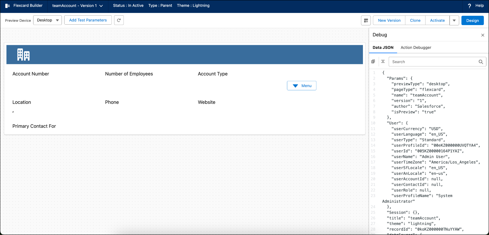
In Preview mode, click Add Test Parameters and enter data in the Key and Value fields to test your Flexcard with sample data. You can also select the Preview Device dropdown menu to see how your Flexcard looks on multiple devices such as desktop, tablet, and mobile. The Debug pane consists of the Data JSON tab that shows how your data source populates the elements on the rendered cards of your Flexcard component. Also, use the Debug pane to detect potential issues at run time. The Debug pane also includes an Action Debugger to help you inspect response data and other details of client and server-side action calls.
Activate and Publish a Flexcard
After your Flexcard configuration and testing is complete, click Activate in the toolbar to activate your Flexcard. Once you activate it, you can add it to a Lightning page or an experience site.
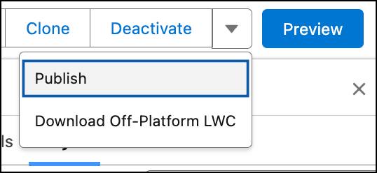
Use the Publish settings to define metadata values, such as the pages where your Flexcard is visible. Click the dropdown beside Deactivate and select Publish to make it available in the various Salesforce pages.
In the Publish Options window, configure your Lightning web component’s metadata values, such as where it’s published (Targets).
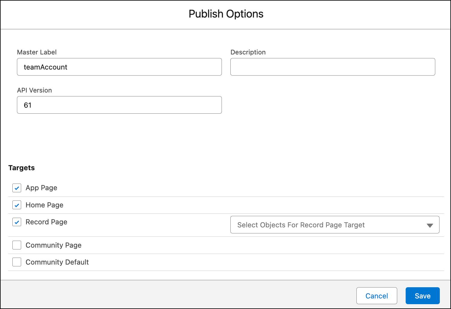
You can select any of the target pages to deploy Flexcard Lightning web components in them.
You can also run a Flexcard outside the Salesforce platform on an external site or app. Select Download Off-Platform LWC to download the Flexcard Lightning web component and add it to an OmniOut project. You can then integrate it into your app or site and deploy the Flexcard.
Flexcard Best Practices
To make the most out of Flexcards, you should follow certain best practices. Here are some of the best practices that you can refer to while using Flexcards.
Flexcard Data Sources
You can embed Flexcards into other Flexcards, but many have their own data sources. Doing this can lead to conflicts with data retrieval for the Flexcard. It's best to retrieve all the data from the parent Flexcard and pass down the data needed to the child cards. Consolidate Data Mappers and other services in a single Integration Procedure and place it only on the parent Flexcard. Then, pass the list node to the child Flexcards as needed.
Flexcard Naming Conventions
Flexcards in Omnistudio have strict naming conventions for names and authors. Use only alphanumeric characters and underscores, and avoid using spaces, dashes, consecutive underscores, and other nonalphanumeric characters. We recommend that you use camel, pascal, or snake case for the Flexcard name. The general guideline is prefixObjectDetail.
Here are some examples of Flexcard names that adhere to these naming conventions:
- Camel case:
teamAccountOverview - Pascal case:
TeamAccountOverview - Snake case:
team_account_overview
Single-Language and Multilingual
Avoid having both multilingual and single-language-only versions of the same components. This helps to save data storage space and avoid confusion for developers and support personnel. Remember to remove any unused versions.
Flexcard States
Use Flexcard States when there are several elements on the card that have similar conditions or are laid out differently based on a condition. States help load the Flexcards faster. They also make sure elements that aren't in one row on the Flexcard are formatted correctly. Consider using states over conditional displays of elements in a single state.
Readability of Designs
When building Flexcards, be sure to set meaningful placeholders for Output Fields. This helps developers understand what is where when designing and to get a feel for what the card will look like with data.
Repeat Flags
The Repeat Flag is set to true by default on Flexcards. Be sure to uncheck the Repeat Flag for elements that require fetching all records, like data tables or charts in a Flexcard so you can avoid unexpected results.
Group Similar Conditional Items in Blocks
Group elements with similar conditions together using blocks. This can help improve Flexcard performance and also load it faster. Plus, blocks make the card easier to develop and manage. If you want to show additional information or fields, use flyouts or collapsible blocks.
Avoid Single Text Block Child Flexcards
If you ever have a Flexcard that only has a single text block—especially if it's a child Flexcard, consider consolidating it into the Parent Flexcard or Child Flexcard to reduce embedded components. Use Flexcard States or Conditions as needed when embedding into the other Flexcard.
Wrap Up
In this badge, you learned about the basics of Omnistudio Flexcards. You learned about the advantages and best practices of Omnistudio Flexcards. You explored the Omnistudio Flexcard designer and its features. You also discovered some best practices for Omnistudio Flexcards.
Now, think about how you can use Flexcards to build interactive UI components for your business needs, including providing helpful information to reps and users in a simple, easy-to-use format.