Create Lightning Web Components
Learning Objectives
After completing this unit, you'll be able to:
- Describe the contents of each component file.
- Create JavaScript methods for a Lightning web component.
- Use Lifecycle Hooks in the component lifecycle.
Play Time
Say you want to build a data display element, independent of a specific object in Salesforce. A good example is the productCard component in the ebikes sample repo. Let's examine that card component, and build our own version from scratch so you can see how it evolves into a full-fledged Lightning web component. You'll quickly get the basics when you build up the parts of a component and explore more samples.
Step up to an Org
In this unit, we develop a Lightning web component using Visual Studio Code with the Salesforce extension.
What You Need
As stated in the first unit, you need some familiarity with Salesforce DX to continue. To complete this unit, you need:
- Visual Studio Code(VS Code) with the Salesforce Extension Pack
- Salesforce CLI
To meet these requirements, complete the Quick Start: Lightning Web Components project.
A Look Into the HTML File
Lightning web component HTML files all include the template tag. The template tag contains the HTML that defines the structure of your component. Let's look at the HTML for a simplified version of the productCard component from the ebikes repo.

Follow along by pasting these examples in VS Code.
- Create a project by selecting SFDX: Create Project from the Command Palette in VS Code. Accept the standard template and give it the project name
bikeCard.
- Under force-app/main/default, right-click the lwc folder and select SFDX: Create Lightning Web Component.
- Enter
appfor the name of the new component.
- Press Enter and then press Enter again to accept the default
force-app/main/default/lwc.
- Paste the following into app.html (replacing any existing HTML in the file).The identifiers in the curly braces
<template> <div> <div>Name: {name}</div> <div>Description: {description}</div> <div>Category: {category}</div> <div>Material: {material}</div> <div>Price: {price}</div> <div><img src={pictureUrl} alt={name}/></div> </div> </template>{}are bound to the fields of the same name in the corresponding JavaScript class.
- Paste the following into app.js.
import { LightningElement } from 'lwc';
export default class App extends LightningElement {
  name = 'Electra X4';
  description = 'A sweet bike built for comfort.';
  category = 'Mountain';
  material = 'Steel';
  price = '$2,700';
  pictureUrl = 'https://s3-us-west-2.amazonaws.com/dev-or-devrl-s3-bucket/sample-apps/ebikes/electrax4.jpg';
}
- Save the files.
Now let's play with a real-world example. Say you want to display data, but you know it can take some time to load. You don't want the user wondering what's up. You can use lwc:if and lwc:else conditional directives within your template to determine which visual elements are rendered.
- Paste the following into app.html. The content in the “display”
divtag doesn't appear until the value ofreadyistruein the HTML file.<template> <template lwc:if={ready}> <div id="display"> <div>Name: {name}</div> <div>Description: {description}</div> <div>Category: {category}</div> <div>Material: {material}</div> <div>Price: {price}</div> <div><img src={pictureUrl} alt={name}/></div> </div> </template> <template lwc:else> <div id="waiting">Loading…</div> </template> </template>
- Paste the following into app.js. This holds our data values and sets a 3-second timer. After 3 seconds, the content should appear. (Of course, this is only for testing purposes.)
import { LightningElement } from 'lwc';
export default class App extends LightningElement {
  name = 'Electra X4';
  description = 'A sweet bike built for comfort.';
  category = 'Mountain';
  material = 'Steel';
  price = '$2,700';
  pictureUrl = 'https://s3-us-west-2.amazonaws.com/dev-or-devrl-s3-bucket/sample-apps/ebikes/electrax4.jpg';
  ready = false;
  connectedCallback() {
    setTimeout(() => {
      this.ready = true;
    }, 3000);
  }
}
- Save the files.
Base Lightning Web Components
Now, you don't want to build all your components from the ground up. So let's explore using a base Lightning web component. And of course, there are lots of components, including field types, display controllers, navigation items, and more. All of them are listed in the Component Reference.
Let's make the details of the bike stand out. In the app.html file, replace the div tags for material and category in the last example with a lightning-badge component. Here's the HTML.
<template>
  <template lwc:if={ready}>
    <div id="display">
      <div>Name: {name}</div>
      <div>Description: {description}</div>
      <lightning-badge label={material}></lightning-badge>
      <lightning-badge label={category}></lightning-badge>
      <div>Price: {price}</div>
      <div><img src={pictureUrl} alt={name}/></div>
    </div>
  </template>
  <template lwc:else>
    <div id="waiting">Loading…</div>
  </template>
</template>
Save the file.
The words Steel and Mountain appear as badges. It's that simple.
Component Build Structure
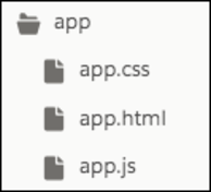
A component simply needs a folder and its files with the same name. They're automatically linked by name and location.
All Lightning web components have a namespace that's separated from the folder name by a hyphen. For example, the markup for the Lightning web component with the folder name app in the default namespace c is <c-app>.
However, the Salesforce platform doesn't allow hyphens in the component folder or file names. What if a component's name has more than one word, like “mycomponent”? You can't name the folder and files my-component, but we do have a handy solution.
Use camel case to name your component myComponent. Camel case component folder names map to kebab-case in markup. In markup, to reference a component with the folder name myComponent, use <c-my-component>.
For example, the LWC Samples repo has the viewSource folder containing the files for the viewSource component. When the hello component references the viewSource component in HTML, it uses c-view-source.
OK. Let's look at the JavaScript.
Working with JavaScript
Here's where you make stuff happen. As you've seen so far, JavaScript methods define what to do with input, data, events, changes to state, and more to make your component work.
The JavaScript file for a Lightning web component must include at least this code, where MyComponent is the name you assign your component class.
import { LightningElement } from 'lwc';
export default class MyComponent extends LightningElement {
}
The export statement defines a class that extends the LightningElement class. As a best practice, the name of the class usually matches the file name of the JavaScript class, but it's not a requirement.
The LWC Module
Lightning Web Components uses modules (built-in modules were introduced in ECMAScript 6) to bundle core functionality and make it accessible to the JavaScript in your component file. The core module for Lightning web components is lwc.
Begin the module with the import statement and specify the functionality of the module that your component uses.
The import statement indicates the JavaScript uses the LightningElement functionality from the lwc module.
// import module elements
import { LightningElement} from 'lwc';
// declare class to expose the component
export default class App extends LightningElement {
  ready = false;
  // use lifecycle hook
  connectedCallback() {
    setTimeout(() => {
      this.ready = true;
    }, 3000);
  }
}-
LightningElementis the base class for Lightning web components, which allows us to useconnectedCallback().
- The
connectedCallback()method is one of our lifecycle hooks. You'll learn more about lifecycle hooks in the next section. For now, know that the method is triggered when a component is inserted in the document object model (DOM). In this case, it starts the timer.
Lifecycle Hooks
Lightning Web Components provides methods that allow you to “hook” your code up to critical events in a component's lifecycle. These events include when a component is:
- Created
- Added to the DOM
- Rendered in the browser
- Encountering errors
- Removed from the DOM
Respond to any of these lifecycle events using callback methods. For example, the connectedCallback() is invoked when a component is inserted into the DOM. The disconnectedCallback() is invoked when a component is removed from the DOM.
In the JavaScript file we used to test our conditional rendering, we used the connectedCallback() method to automatically execute code when the component is inserted into the DOM. The code waits 3 seconds, then sets ready to true.
import { LightningElement } from 'lwc';
export default class App extends LightningElement {
  ready = false;
  connectedCallback() {
    setTimeout(() => {
      this.ready = true;
    }, 3000);
  }
}Also, notice that we used the this keyword. Keyword usage should be familiar if you've written JavaScript, and behaves just like it does in other environments. The this keyword in JavaScript refers to the top level of the current context. Here, the context is this class. The connectedCallback() method assigns the value for the top level ready variable. It's a great example of how Lightning Web Components lets you bring JavaScript features into your development. You can find a link to good information about this in the Resources section.
Decorators
Decorators are often used in JavaScript to modify the behavior of a property or function.
To use a decorator, import it from the lwc module and place it before the property or function.
import { LightningElement, api } from 'lwc';
export default class MyComponent extends LightningElement{
  @api message;
}
You can import multiple decorators, but a single property or function can have only one decorator. For example, a property can't have @api and @wire decorators.
Examples of Lightning Web Components decorators include:
-
@api: Marks a field as public. Public properties define the API for a component. An owner component that uses the component in its HTML markup can access the component's public properties. All public properties are reactive, which means that the framework observes the property for changes. When the property's value changes, the framework reacts and rerenders the component.
-
@track: Tells the framework to observe changes to the properties of an object or to the elements of an array. If a change occurs, the framework rerenders the component. All fields are reactive. If the value of a field changes and the field is used in a template—or in the getter of a property used in a template—the framework rerenders the component. You don't need to decorate the field with
@track. Use@trackonly if a field contains an object or an array and if you want the framework to observe changes to the properties of the object or to the elements of the array. If you want to change the value of the whole property, you don't need to use@track.
-
@wire: Gives you an easy way to get and bind data from a Salesforce org.
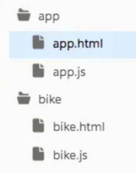
Here's an example using the @api decorator to render a value from one component (bike) in another component (app). The file structure looks like this:
The app component uses the following HTML.
<!-- app.html -->
<template>
  <div>
    <c-bike bike={bike}></c-bike>
  </div>
</template>
The app component uses the following JavaScript.
// app.js
import { LightningElement } from 'lwc';
export default class App extends LightningElement {
  bike = {
    name: 'Electra X4',
    picture: 'https://s3-us-west-2.amazonaws.com/dev-or-devrl-s3-bucket/sample-apps/ebikes/electrax4.jpg'
  };
}
The bike component uses the following HTML.
<!-- bike.html -->
<template>
  <img src={bike.picture} alt="bike picture" />
  <p>{bike.name}</p>
</template>
The bike component uses the following JavaScript.
// bike.js
import { LightningElement, api } from 'lwc';
export default class Bike extends LightningElement {
  @api bike;
}
We're moving fast and you've been able to work with some code in VS Code. In the next unit, we will deploy some code and talk more about the environment where the components live.
Resources
- Lightning Web Components Developer Guide: Reactivity
- Lightning Web Components Developer Guide: Reference (includes HTML Template Directives, Decorators, and more)
- MDN web docs: this
- Salesforce Lightning Design System 2 (SLDS): Named Value List