Add Styles and Data to a Lightning Web Component
Learning Objectives
After completing this unit, you'll be able to:
- Use CSS and Lightning Design System with a component.
- Get data from a Salesforce org.
- Deploy your app to an org and test it.
Adapt Your Component
We've almost wrapped up our introduction to Lightning web components, but let's get a taste of how we can control a component's appearance and pull in live data. We can adapt the look and feel to the Lightning environment, and use live data in the org. In this unit, we liven up the appearance of some of the text and draw in a name dynamically from a record in your org.
Use the Bike Selector App files from the previous unit to complete this one.
CSS and Component Styling
The implementation of CSS for Lightning Web Components adheres to the W3C standard. You can create a style sheet in the CSS file, and it's automatically applied to the corresponding HTML file.
Lightning Web Components encapsulates components, keeping them separate from the global DOM. We do this through a mechanism called Shadow DOM. Shadow DOM is a common implementation that allows a component's elements to live in a “sub tree” of the DOM (learn more about Shadow DOM in the link provided in the Resources section). The component can keep its appearance and behavior within other apps or as a child of another component.
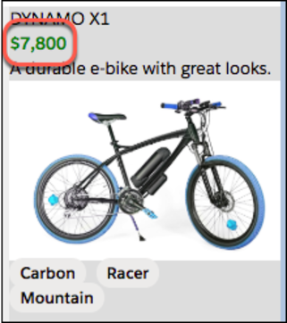
For example, let's set the price of a bike to display as bold, green text. Add the following .price entry to the detail.css file.
body{
  margin: 0;
}
.price{
  color: green;
  font-weight: bold;
}
Save and deploy your files.

In your org, you might need to refresh the Bike Selector App page to see the changes in case it is cached. Then, when you select a bike, the price is green and bold.
Applying Lightning Design System Styles
Salesforce Lightning Design System (SLDS) is a CSS framework that provides a look and feel that's consistent with Lightning Experience. Lightning web components that live in Lightning Experience or in the Salesforce mobile application can use SLDS without any import statements or static resources.
For example, you can use the SLDS heading styles to give the detail component text that looks more like the standard Lightning text. Update the detail.html file to use the slds-text-heading_small and slds-text-heading_medium font settings as follows.
<template>
  <template lwc:if={product}>
    <div class="container">
      <div class="slds-text-heading_small">{product.fields.Name.value}</div>
      <div class="price">{product.fields.MSRP__c.displayValue}</div>
      <div class="description">{product.fields.Description__c.value}</div>
      <img class="product-img" src={product.fields.Picture_URL__c.value} alt={product.fields.Name.value}/>
      <p>
        <lightning-badge label={product.fields.Material__c.value}></lightning-badge>
        <lightning-badge label={product.fields.Level__c.value}></lightning-badge>
      </p>
      <p>
        <lightning-badge label={product.fields.Category__c.value}></lightning-badge>
      </p>
    </div>
  </template>
  <template lwc:else>
    <div class="slds-text-heading_medium">Select a bike</div>
  </template>
</template>
Save and deploy your files.
Now try the component in your org and see the difference (you'll need to refresh the page).
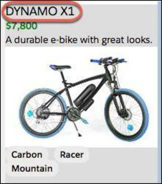
Looks great! Now we have the look and feel ready to go. (We'll leave further markup changes and SLDS styling as an exercise for you after you finish this module. See Mobile-Friendly Markup for some ideas, and use this app for experiments!)
So far, we've been using static data pulled from the data component. Let's add one more shiny thing to our page... dynamic data.
Get Salesforce Data
This is a Salesforce app after all, and what you really want is to be able to pull dynamic data from a Salesforce org. Lightning web components use a reactive wire service, which is built on Lightning Data Service. We walk through an example of pulling a name into our app, dynamically.
The Wire Service Brings Data to Your App
The wire service is part of our platform and delivers a stream of data. The @wire decorator, which we mentioned briefly before, implements the wire service for your app. To use the wire service, do the following.
- Import a wire adapter in the JavaScript file.
- Decorate a property or function with the
@wiredecorator.
Here's the syntax.
import { adapterId } from 'adapter-module';
@wire(adapterId, adapterConfig) propertyOrFunction;-
adapterId(Identifier)—The identifier of the wire adapter.
-
adapter-module(String)—The identifier of the module that contains the wire adapter function.
-
adapterConfig(Object)—A configuration object specific to the wire adapter.
-
propertyOrFunction—A private property or function that receives the stream of data from the wire service. If a property is decorated with@wire, the results are returned to the property's data property or error property. If a function is decorated with@wire, the results are returned in an object with a data property and an error property.
And here's how to add it to the selector.js file in the project we've been working on to pull the current user's name from your org.
import { LightningElement, wire } from 'lwc';
import { getRecord, getFieldValue } from 'lightning/uiRecordApi';
import Id from '@salesforce/user/Id';
import NAME_FIELD from '@salesforce/schema/User.Name';
const fields = [NAME_FIELD];
export default class Selector extends LightningElement {
  selectedProductId;
  handleProductSelected(evt) {
    this.selectedProductId = evt.detail;
  }
  userId = Id;
  @wire(getRecord, { recordId: '$userId', fields })
  user;
  get name() {
    return getFieldValue(this.user.data, NAME_FIELD);
  }
}- Line 1 imports the
wireservice fromlwc.
- Line 2 imports the adapterId and adapter-modules for
getRecordandgetFieldValuefromlightning/uiRecordApi.
- Line 3 imports the current User Id using the
@salesforcemodule.
- Line 4 imports the
@salesforceschema forUser.Name.
- Line 12 uses the
@wiredecorator to use the wire service to callgetRecordpassing in theuserIdand getting thefields.
- Line 13 sets
useras the receiver for the@wirecall.
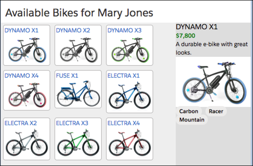
You can try this out by also editing the selector.html file to include the name. For example:
<template>
  <div class="wrapper">
    <header class="header">Available Bikes for {name}</header>
    <section class="content">
      <div class="columns">
        <main class="main" >
          <c-list onproductselected={handleProductSelected}></c-list>
        </main>
        <aside class="sidebar-second">
          <c-detail product-id={selectedProductId}></c-detail>
        </aside>
      </div>
    </section>
  </div>
</template>
When you save and deploy the selector component files to your org (make sure that your deployment includes the selector files), you should see the following with your name instead of Mary Jones. You might need to refresh the page.
Mobile-Friendly Markup
The markup for the Lightning components that make up the Bike Selector app is clean and streamlined, designed to keep you focused on learning the basics of Lightning web components. It is not, however, mobile friendly. Give it a look in the Salesforce Mobile app, or check it out in a mobile preview. Everything works, but it's not a great mobile experience.
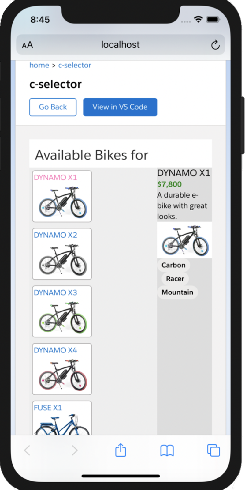
One of the benefits of using SLDS is that, with only a little effort, you get designs that look and work great on both desktop and mobile. We'd love to go into more detail, but this module already covers a lot of ground. See Resources at the end of this unit to learn more about additional tools and techniques for creating Lightning components that will make your mobile users happy.
While we're setting mobile aside for now, we strongly recommend that, when you start developing “real” Lightning components, you do the opposite. Consider mobile details and designs, right from the start. With SLDS and our mobile preview tools, it's easy to build for both mobile and desktop, together from the word go.
If you don't mind us “going meta,” this module is an example of the danger of not considering mobile early. When we received feedback that the Bike Selection app didn't look good on mobile devices, we jumped at the chance to make some changes, because we thought it would be just a little bit of work. But even though the app's markup is clean and semantically well thought out, we've decided that retrofitting mobile onto it isn't the right thing to do. We want to rework not just the markup, but also the explanations of it, and the hands-on challenges. And, indeed, the very structure and flow of this module! It's more work now, because we didn't do a little work up front.
And, sometimes that's OK! Every technology system implementation involves trade-offs. You need to make the right trade-offs for your teams and projects. Keep this trade-off in mind for your projects. Forewarned is forearmed.
Conclusion
This is only the beginning, and you can do a lot with the Lightning Web Components model. The model includes support for testing, security, Apex integration and more. Keep exploring, try new things, keep building. As the W3C web components standard evolves, so will our model.

Resources
- Lightning Web Components Developer Guide: Introducing Lightning Web Components
- Developers: Code Samples and SDKsTrailhead Sample Gallery
- Trailhead: JavaScript Skills for Salesforce Developers
- Lightning Web Components Developer Guide: Create Mobile-Ready Components
- Lightning Web Components Developer Guide: Style Components with Lightning Design System
- Lightning Web Components Developer Guide: Preview Lightning Web Components on Mobile
- Lightning Web Components Developer Guide: Shadow DOM
- Lightning Web Components Developer Guide: Use the Wire Service to Get Data
- Lightning Web Components Developer Guide: @salesforce Modules