Analyze Your Data with Reports and Dashboards
Learning Objectives
After completing this unit, you’ll be able to:
- Understand the relationship between reports and dashboards.
- Create and read Lightning reports.
- Create and view Lightning dashboards.
Discover Reports and Dashboards
Reports and dashboards answer questions about key business metrics so you can track your pipeline and cases, close deals, and see where your business is headed. Create reports that reveal the information you’re looking for, then add dashboards that draw on the data that you’ve revealed to tell a compelling visual story.
Build a Report
Now that you know how to find your favorite reports in Lightning Experience, let’s build a new one. On the Analytics tab, select Create | Report, or on the Reports tab, click New Report. Choose a report type (How about Opportunities?) and click Start Report. The report type is important because it determines what fields and objects are available in your report.

The report builder opens and you’re ready to start grouping, filtering, and charting data. Here’s a quick visual overview of how to analyze your data in the Lightning Experience report builder.

- Filter records from your report until you get exactly what you want (1).
- From the menu bar, undo or redo actions, show or hide a chart, save, and run the report (2).
- Rename the report (3).
- Create and customize a report chart (4).
- Group rows and columns (5). Grouping is required for charts and other important report and dashboard features, so it's a good idea to add at least one grouping to all of your reports.
- Add or remove report columns (6).
- Add a bucket column to group records based on conditions you define, or evaluate report data with summary or row-level formulas (7).
- Perform actions on a selected column (8).
- Show or hide row counts, detail rows, subtotals, and the grand total (9).
Read a Report
Reading isn't quite the right word. Yes, you can read a report to learn, say, the value of closed opportunities over time. But you can do so much more than just read.

Here are some of the things you can do while reading a report on the report run page.
- Review individual records and sort them by clicking each column heading (1).
- If the report includes a chart, get more details by hovering over the interactive chart (2).
- Customize your workspace with toggles (3). Show or hide the chart
 or filters panel
 . Refresh the report to see the most up-to-date information
 . Click Edit to edit the report in the report builder (4). Or click the action menu dropdown icon
  to copy, save, subscribe, export, or delete the report.
- Filter the report differently (5). Click a filter to edit it. Except for standard filters, you can also remove a filter. After you edit a filter, be sure to click Apply.
There’s no need to worry about permanently changing the report and confusing your coworkers. Changes you make while reading a report aren’t saved unless you click  then select Save.
What about printing? There are two ways to print a report in Lightning Experience. One way is to use your browser’s print function. The other is to export the formatted report by clicking the action menu dropdown icon  , then selecting Export | Formatted Report | Export. The report downloads as an .xlsx file. Open the file and then print it.
Build a Dashboard
A dashboard is a visual display of key metrics and trends for records in your org.
After you’ve built a few reports, bring them together in a dashboard. Get started from the Analytics tab by selecting Create | Dashboard, or from the Dashboards tab by clicking New Dashboard.
After you name and create your dashboard, the dashboard builder opens as a blank canvas that's ready for your analytic masterpiece.
Dashboards consist of widgets, each of which presents the data from a source report as a table, chart, or metric.
- To add a widget, click + Widget, select Chart or Table, and choose a report from the Select Report menu.
- In the Add Widget window, select a display format and set up the properties for the widget. The chart and metric display options are available for source reports that include at least one grouping.

- After adding widgets, resize and move them around on the dashboard to maximize their visual impact and tell a compelling story.
- To filter the data that viewers see, click + Filter and then choose a field and filter values.
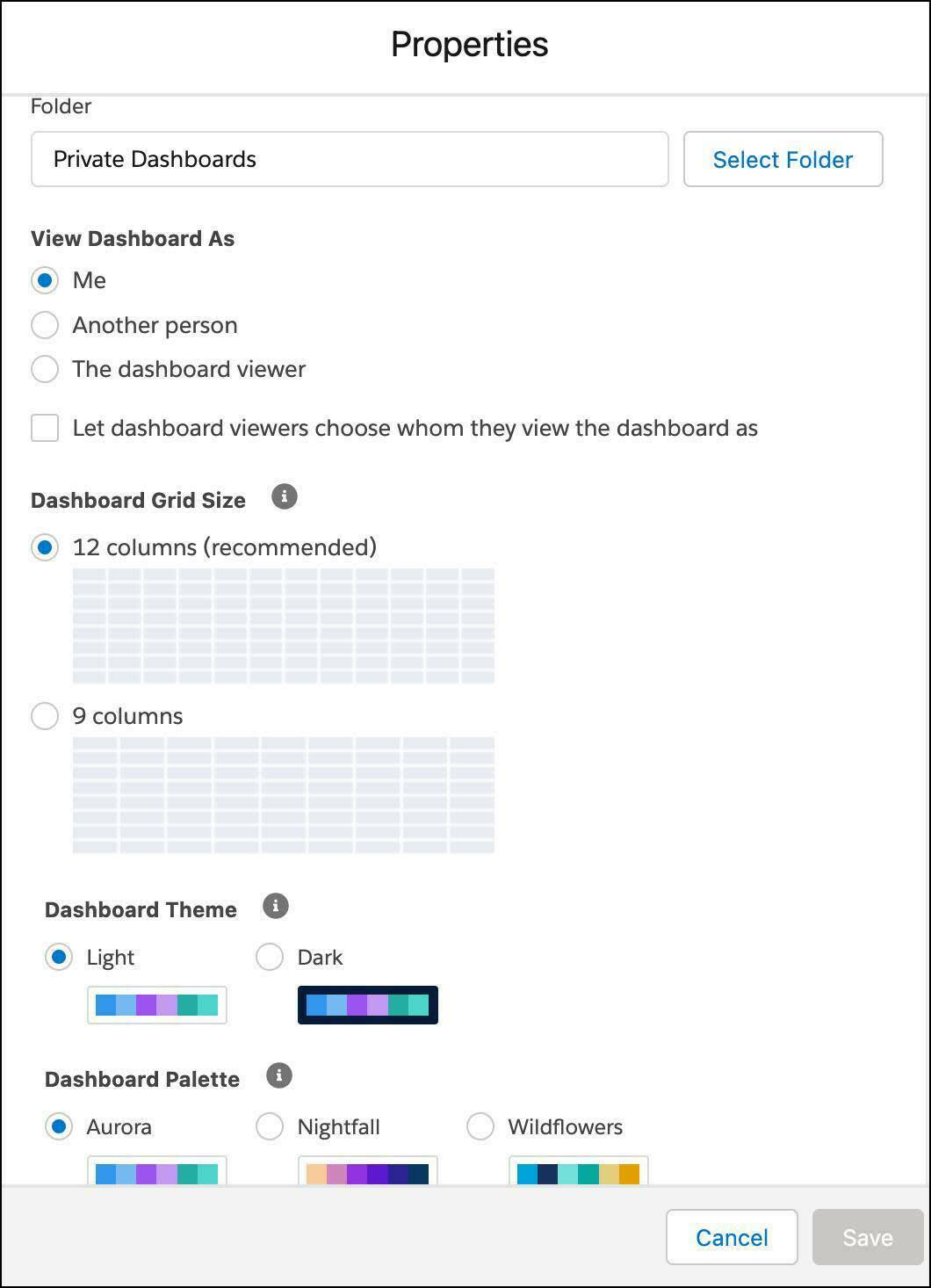
For properties that apply to the whole dashboard, click  .
.
- Change the dashboard name and description.
- Move the dashboard into a different folder, and set “view as” options.
- Under Dashboard Grid Size choose a 12- (default) or 9-column layout.
- Under Dashboard Theme and Palette, choose the light or dark theme and the color palette for all the widgets in the dashboard. If you want to use a different theme for a specific widget, edit its widget properties.
View a Dashboard
Here’s what you can do while viewing a dashboard.

-
View dashboards as other people (1). If the dashboard builder configured the dashboard to display as the dashboard viewer and allowed viewers (that is, you) to change whom they view the dashboard as, then you can do just that. Click Change to view the dashboard as someone else.
-
Refresh, edit, collaborate (2). Perform common tasks, like refreshing dashboard data, from the toolbar.
-
View source reports (3). To view a widget's source report, click View Report. Any filters applied to the dashboard, including chart filters, get applied to the source report.
-
Interact with charts (4). Hover over chart segments to see more details. Click a chart segment or data point to open the source report filtered by your selection.
-
Expand a widget (5). Want to get a bigger picture? Click
 to expand a widget. Works great to present your data in meetings!

Keep Your Team Looped in with Feeds and Subscriptions
Reports and dashboards are ideal for collaborating on measured goals, like meeting a quota or closing cases. It’s easy to loop in your team with feeds and subscriptions.
Once your Salesforce admin turns on feed tracking for reports and dashboards, each report and dashboard features its own feed. Open it by clicking the collaborate button  . In the feed, you can mention people and groups to ensure everyone stays aligned.
To call attention to or ask a question about a specific widget, you can also post a widget snapshot to the feed while viewing the dashboard.
To share a dashboard widget, first expand it by clicking  . Then, click
  , compose a post, and click Share.
Subscriptions let you refresh reports and dashboards, then automatically email them on a schedule that you set. Got a Monday morning Sales Ops meeting? Need to give an update about the opportunity pipeline? Subscribe to your Sales Pipeline dashboard and set it to refresh on Monday morning at 8:00am. The dashboard is ready and in your email inbox when you arrive in the office. Want your team to review it before the meeting? Subscribe them as well!

Resources
- Video Series: Get Started with Reports and Dashboards - Lightning Experience
- Trailhead: Reports & Dashboards for Lightning Experience
- Salesforce Help: Reports and Dashboards
- Salesforce Help: Build a Report
- Salesforce Help: Build a Lightning Experience Dashboard