Use Event Monitoring Analytics to Get Insights Into Your User Activity
Learning Objectives
After completing this unit, you’ll be able to:
- Use prebuilt dashboards to find answers to audit questions.
- Drill down in dashboards to explore your data.
- Get email notifications when key performance indicators (KPIs) hit specific limits.
Gain Key Insights and Take Action with Event Monitoring Analytics
As the Salesforce Admin for DTC Electronics, you’ve set up Event Monitoring Analytics. It’s working the way you want, so now it’s time to get ready for your upcoming meeting with the chief information officer (CIO) in a couple of days. Let’s take your dashboards for a test drive.
You use the prebuilt dashboards to get answers to these questions.
- Are there report download trends we should be concerned about?
- Who has downloaded the most reports?
- Are there any reports that have performance problems?
And you know that your CIO, Julie Chavez, has an inquiring mind, so try to anticipate other questions she can have and answer them before she even has to ask. You also explore some of the other cool things that the app lets you do. Along the way, you discover just how easy it is to use Event Monitoring Analytics to gather key insights and take action on them.
Spot Problems with Report Usage
Let’s use the Reports prebuilt dashboard to see the top viewed reports, spot performance problems, and identify who uses the reports.
- Open your Analytics for CIO app, if it’s not open already.
- Select the Dashboards tab, and click Reports.

Take a look at the Report Trends by User area in the dashboard. The chart tells us the number of reports downloaded by different users in the last 30 days. Hmm… it looks like Bob Bandit downloaded many reports on November 1. Let’s investigate further.

Let’s look at the Report Names by User area in the dashboard.

High Net-Worth Contacts is a popular report with a single user—who can it be? Hover over the report name in the grid to see who accessed it. It’s Bob Bandit!
It looks like Bob accessed the report a total of 150 times during November—definitely noteworthy info to discuss with your CIO in your upcoming meeting.
See How Reports Are Performing
Now that we’ve spotted some report download trends and possible security breaches, let’s turn to a milder topic: how to spot performance problems with reports in your org. You don’t want your users to be frustrated with report performance, and you also don’t want your overall org performance to suffer with super long queries. Let’s take a look at the Reports dashboard again.

The Report Performance area shows the ratio of DB_TOTAL_TIME to maximum CPU_TIME. What do these mean?
- DB_TOTAL_TIME is the time in nanoseconds for a database round trip.
- CPU_TIME is the CPU time in milliseconds used to complete the request. This measure indicates the amount of activity taking place in the app server layer.
Compare the DB_TOTAL_TIME to CPU_TIME to determine whether performance issues are occurring in the database layer or your code. In the example above, you can see that the CES Top Prospects report has a high database time and a high CPU time. The report might benefit from query optimization.
Set Your Performance Alarms
In the previous section, you learned how to spot report performance problems using the Reports dashboard. Perhaps you also noticed that the database and CPU time are reported as key performance indicators (KPIs) at the top of the Reports dashboard.

Cool, huh? Now that you know what DB time and CPU time mean, you can spot performance problems by reviewing the KPIs periodically.
But what if you don’t have time to drill into the dashboards every day? Well, there’s an easy way to get notified by email when a KPI measure goes outside a limit you set. It’s called set notification. (If you want other users to be notified, they must set up their own notifications.)
Let’s send an email when our maximum CPU time reaches 600 ms (shown as 0.60 in the KPI).
- On the KPI, hover over Max CPU Time, click the menu arrow, and select Set Notification.

- In the notification area, enter
0.60as the threshold value, change the operator to Is greater than, and leave the other values as is. Keep the default notification time and day.

- Click Save.
Got Data?
When you created your Event Monitoring Analytics app, you manually started the dataflow to get DTC Electronics data in your app. To ensure that your app uses up-to-date DTC Electronics data, schedule the dataflow to be rerun every day.
Salesforce generates and uploads event log files in the early morning, usually at 3 am in the time zone where your Salesforce instance (like NA7) is. Schedule the dataflow a couple of hours after that. This way, the app has the latest data, and the dataflow doesn’t interrupt your use of the app. To make sure that the app has the latest data, schedule the app refresh to run a few hours after the event log files are generated. Large datasets take longer to upload, so schedule more time for them.
Let’s schedule it to run automatically at 8 am every day.
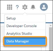
- Click the gear icon in the upper right, and select Data Manager.
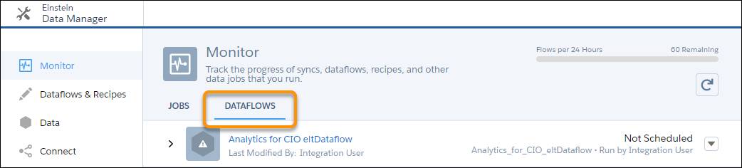
- At the bottom of the sidebar, select Manage Dataflows.

- Select the Dataflows tab.
- Find the app Analytics for CIO.
- Open the menu on the far right of the screen next to the app icon and name. Select Schedule, and set the time to 8 am, which is outside your business work hours so the dataflow won’t interrupt business activities. Run every 24 hours, every day.

- Click Save.