Explore Insights Into Your Data
Learning Objectives
After completing this unit, you’ll be able to:
- Explain what a data insight is.
- Define the types of data insights that Einstein Discovery generates.
- Navigate data insights and interpret them.
What Are Data Insights?
An insight is a finding in your data. When you create a model version, Einstein Discovery thoroughly analyzes your data and generates insights based on its analysis.
Einstein Discovery produces lightning-fast insights that are impartial, objective, and statistically meaningful. It uses charts and fact-filled explanations to make it easy for you to digest and interpret the insights. Insights provide a starting point for you to investigate the relationships among your model's explanatory variables and its goal. Your job is simply to flip through the insights to find the ones that are the most relevant to the outcome you want to improve.
Types of Insights
Einstein Discovery generates these kinds of insights.
Type |
Description |
|---|---|
Descriptive |
Derived from historical data using descriptive analytics involving statistical analysis. Descriptive insights show what happened in your data. |
Diagnostic |
Derived from the model. Diagnostic insights show why it happened. Diagnostic insights drill deeper and help you understand which variables most significantly drive the business outcome you’re analyzing. Note: The term why refers to a strong data pattern, not necessarily a causal relationship. |
Comparative |
Derived from the model. Comparative insights explain the difference in the outcome variable by comparing two specific subgroups. With comparative insights, you isolate factors (categories or buckets) and compare their impact on the outcome with other factors or with global averages. Einstein Discovery shows waterfall charts to help you visualize these comparisons. |
View Data Insights
In the left navigation panel, click Data Insights. Einstein Discovery displays the data insights screen.

- The model summary (1) shows the model goal, the total rows analyzed, the average outcome, and any difference from the previous version. The Explore a Variable button toggles the variables panel.
- The variables panel (2) shows the list of explanatory variables in your model and their correlation to the model outcome, starting with the highest correlation. The higher the correlation, expressed as a percentage, the stronger the statistical relationship. In our model, Opportunity Type has the highest correlation to winning opportunities, followed by Lead Source and Industry.
- The insight summary panels (3) show the top positive and negative impacts on the outcome variable. In our model, the highest opportunity win rate is when the lead source is from a Partner Referral and the Opportunity Type is New Business / Add On. The lowest win rate is when Opportunity Type is Existing Business and the amount is below 21,810. In this case, the observed win rate is 0.8% which means that only about 8 out of 1,000 opportunities are won.
Next, let’s look at each of the different kinds of insights that Einstein Discovery produced. In this unit, you learn about descriptive, diagnostic, and comparative insights.
Explore Descriptive Insights
The first insights you see are descriptive insights. Descriptive insights are the primary insights. They give an overview of what factors contributed to the outcome, based on a statistical analysis of your dataset. Einstein Discovery uses bar charts to show differences, trends and significance in the values.
Scroll down past the Insight summary to see your first insight in the list of descriptive insights. Insights are ordered by statistical significance. The top insights had the strongest impact on the model outcome.

Each insight has:
- A title (1) of what is being measured
- A chart (2) that visually displays the results
-
Explanatory text (3) that describes the results and interactions with other variables in the dataset
Because you gave Einstein a goal (maximizing opportunity wins), each insight indicates whether something “was better” or “was worse” in relation to that goal. A green circle with an arrow indicates a condition that takes you closer to your goal. A red circle with an arrow indicates a condition that takes you further from your goal.
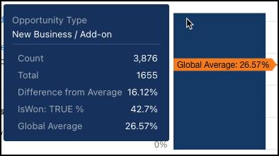
This insight shows you that, among opportunity types, the New Business / Add-on has the highest win rate, while Existing Business has the lowest.
In the graph, hover over a bar to view a popup that shows underlying details.

In the explanation text, if you hover over a hyperlink, the corresponding bar in the chart is highlighted in a different color. 
If you want, scroll down to review other descriptive insights in the list.
Drill Down to a Single Variable (First-Order Insights)
To filter the insights list, click Opportunity Type in the variables panel.

The insights list shows insights that are associated with Opportunity Type only. The filter selector above the insight shows the variable you're investigating.

The first insight in the list shows how the Opportunity Type is associated with the outcome. It represents a summary of all values associated with the variable. For descriptive insights, this is also known as a first-order insight, because it examines how one variable (Opportunity Type) explains variation in the outcome variable (IsWon TRUE).
Explore Subgroups (Second-Order Insights)
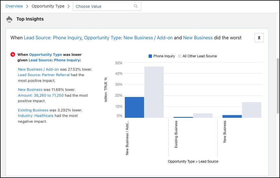
Scroll down to the next insight in the list. 
This insight shows how a combination of variables (subgroups) are associated with the outcome variable. In this example, the lead source of Phone Inquiry is highlighted for doing worse than other lead sources, particularly when it’s an add-on opportunity. The chart shows the magnitude of how different Phone Inquiry (blue columns) compares with all other lead sources (gray columns) across Opportunity Types. What’s the takeaway? That cold calling isn’t an effective way to generate new business!
If you want, scroll down to examine other insights in the list. Next, let’s dive into diagnostic insights.
Explore Diagnostic Insights
While descriptive insights tell you what happened, diagnostic insights tell you why it happened. Diagnostic insights help you take a deeper look into the factors that led to an outcome. Einstein Discovery derives diagnostic insights from the model it produces during model creation. Einstein uses waterfall charts to visualize diagnostic insights.
Note: Remember the term why refers to a strong data pattern, not necessarily a causal relationship.
To see diagnostic insights, select a variable (Lead Source) from the Variables panel and then, from Choose Value, select a value for the variable (Partner Referral).

Einstein shows you a summary of how the selected value performs. 
Einstein then shows you the diagnostic insight for when Lead Source is Partner Referral. 
This waterfall chart is packed with a lot of information. Let’s break it down.
Let’s start with the blue bars.
- At the top, is the Global Average, or the average for all variables and values.
- At the bottom, is the Average of the selected variable and value. It shows you just how different it is compared with the global average (the net effect).
Now let’s look at the green and red bars in the middle. These bars are the Specific Drivers, or the individual effects, which indicate how individual factors or groups of factors are associated with the outcome. The green bars represent an improvement, while the red bars represent a worsening.
-
Small Terms Related is the aggregated effect of all terms interacting with the selection that do not appear in the other bars shown previously. There are many factors impacting the outcome for the selected variable. The chart can't possibly contain all of them. It shows only the most impactful ones. The remaining impacts are grouped together in small terms. This is done specifically to differentiate them from these two groups.
-
Unexplained quantifies the gap that this model hasn’t been able to attribute to different drivers. The drivers in diagnostic insights together bridge the gap between the observed outcome for LeadSource Partner Referral and the global average. Keep in mind that these drivers are generated with a predictive model, and that no model is perfect. If Unexplained were 0, it would mean that the model always perfectly predicted the win ratio for LeadSource is Partner Referral, which would be unrealistic and can only mean the model is overfit!
There’s a lot more we could learn here (try hovering on the drivers to see all their scores), but it’s time to move onto comparative insights.
Explore Comparative Insights
Comparative insights are a special case of diagnostic insights. Remember that a diagnostic insight breaks down the difference between a particular subgroup and the global average into contributing factors. A comparative insight does the same, but this time between two different subgroups. Einstein Discovery derives comparative insights from the model it produces. Einstein Discovery shows waterfall charts to help you visualize these comparisons.
To see comparative insights, select a variable (Lead Source) from the Variables panel. From Choose Value, select a category for the variable (Partner Referral), and then choose a second category (Phone Inquiry).

Einstein displays the comparative insight. 
Let’s unpack some of the information on this screen.
- The title (1) states which category does better in relation to the outcome.
- The summary (2) shows how each category is correlated to the outcome and shows the difference between them.
- The subtitle (3) describes exactly what is being compared.
- The waterfall chart (4) shows you the main differences between the two categories.
- Average when Lead Source is Phone Inquiry (top blue bar)
- Average when Lead Source is Partner Referral (bottom blue bar)
- Factors when Phone Inquiry does better (red bars)
- Factors when Partner Referral does better (green bars)
What Else Can You Do with Insights?
In addition to reviewing and interpreting the data insights in your model, you can:
- Bookmark insights that you want to return to, and filter the insights list to see only bookmarked insights.
- Filter insights associated with sensitive variables when analyzing your data for bias.
What’s Next?
Now that you’ve explored insights, let's deploy our model.
Resources