Learn the Elements of an Accessible Webpage
Learning Objectives
After completing this unit, you’ll be able to:
- Describe how good design makes the web more accessible.
- Create an accessible heading structure for your design.
- List the strategies used to convey meaning to nonsighted users.
Accessibility Is a Catalyst for, Not a Barrier, to Innovation
One of the biggest misconceptions when it comes to design and accessibility is that an accessible product is an ugly, boring, or cluttered product. This module teaches you that not only is the opposite true, but that by better understanding accessibility and accessible design constraints, you can design products that are more consistent and more usable for all of your users. Knowledge of accessible design increases your opportunities to creating innovative design.
Design and accessibility are partners with a shared goal, ensuring that all of your users enjoy using your products. Designers partner with research teams to ensure certain user personas are considered. Designers should also partner with accessibility to consider personas that can inform accessibility in design.
Much More Than the Mouse
It may seem obvious, but as a designer, you are responsible for much more than mouse clicks and visual positioning of content on the screen. While it’s important to consider mouse interaction and visual layout of a design, you must also consider other factors.
- Complete interaction models for flows.
- How a feature works exclusively with a keyboard.
- Consideration for touch enabled laptops and tablets.
- Users who switch between input modes, going from mouse to keyboard, to touch, perhaps to voice input.
As you read through this module, remember that you don’t want to design for your peers, but for your users. Design for users with varied needs who will interact with your products. Users have different ways of interacting with products and different ways of receiving information from products.
Users can include people who are blind, color-blind, or have low vision; those who are deaf or hard of hearing; people with low mobility, which may be temporary or permanent; or people with cognitive disabilities. Design for people who are young, old, power users, casual users, and those who just enjoy a quality experience.
To knowingly exclude an accessibility-focused constraint from your design is to knowingly exclude people from your products. Embrace accessibility guidelines as you would any set of design constraints. They are part of the challenge and impetus of creating amazing products.
Understand the User Interface (UI)
When users first view a website or web application, they take a few moments to orient themselves to all of the information on the screen. They learn what is possible and this informs their next steps. Sighted users might visually skim the page to get the general layout, decide where to start, and start digging into certain parts of the app. They may see different visual groupings, large headlines, lists, and other familiar user experience (UX) patterns such as cards, tabsets, tables, or trees.
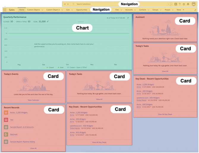
Visual users may break down the Lightning Experience home page in a way similar to the screenshot below. Here, navigational items are highlighted with yellow, a large chart in green, and several informational cards are highlighted in pink.
Blind users rely on a good page structure that incorporates headings and landmarks, as well as other semantic structures, to gain a holistic understanding of a page. Below, the main page navigation and the clear visual headings on the same Lightning Experience page are outlined in red. While engineers ultimately expose this information to users, as a designer it’s important to include clear landmarks and headings, understanding their purpose and communicate them as a requirement to engineering teams.

Layout
Just as sighted users may have different techniques for familiarizing themselves with a new website, screen reader users may also employ different approaches. While it is often slow, some screen reader users might choose to have an entire page read out to them when viewing a website or app for the first time. Others may skim the page by navigating all the headings or landmarks.
Similar to identifying chapters in a book, articles in a magazine, or outline sections for a research paper, headings give structure to your webpage. However, instead of using Roman numerals, letters, and numbers, webpages use headings tags, <h1> through <h6> to create this structure programmatically.
When pages are coded properly, users can successfully use a common screen reader feature that brings up a list of all the headings on a page. They can also navigate by heading individually by pressing a shortcut key. In the screenshot below, a screen reader user has requested a list of all the headings on the page. There’s a single level 1 heading, Home, and the rest of the headings are level 2. There is a level 2 heading for each card on this Lightning Experience page.

When you have a logical heading structure, users can understand the outline of a page’s content. Additionally, having clear, visual headings also helps users understand the page’s hierarchy. This is especially helpful for some people with cognitive disabilities.
In addition to logical heading structure, we want engineers to use semantic HTML landmarks to help people identify where they are on a page. These include:
- Header
- Navigation
- Main content area
-
Articles
-
Asides (tangentially related content, often used for sidebars or call-outs)
- Body
- Footer
Screen readers identify landmarks and also allow users to navigate by region with keyboard shortcuts. As a designer, you have the ability to design clear landmarks and identify them to engineers, so that they are properly included in the code.
In the example below, the page has just one landmark, which is the Global Navigation navigation region.
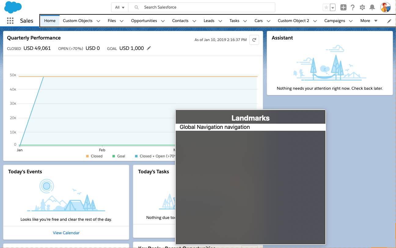
You can see that some other potentially helpful landmarks such as Search, Header, Main, and Article are missing.
Icons and Images
Some blind people use screen readers or digital braille keyboards, but these assistive technologies read out only text—they don’t automatically read out icons and images, meaning that it’s up to you to build them correctly.
There are two types of icons, which screen readers handle differently: decorative (skip over) and informational (convey content to the user). As a designer, you should understand the difference, choose which one works best for your use case, write preliminary labels (if needed) for content experience to review, and inform engineers so they can code the icon properly.
Decorative
Decorative icons and images don’t add any relevant information or functionality. Redundant icons and images also fall into this category because they reinforce adjacent text’s meaning but don’t add new information. Screen readers should not read these out to users because it adds unnecessary verbosity. Icons don’t need anything special to mark them as decorative, but images need an empty alt tag, which forces screen readers to skip over them. If a screen reader encounters an image without an empty alt tag, it reads out the image src tag, which often looks something like: /images/weji2362iofweio6.png.
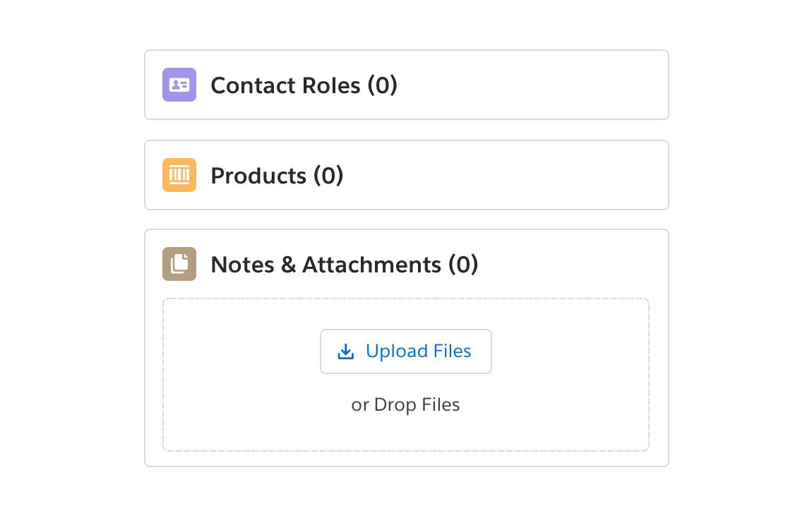
The Contact Roles, Products, and Notes & Attachment icons in the image below are decorative because they are redundant. Each one has adjacent text describing the same information (files icon next to Notes & Attachments (0)).
Informational
Informational icons and images convey important information that the surrounding text doesn’t. Icon buttons and stand-alone avatars are common examples. Icons need assistive text or an aria-label, and images need an alt description. Write what the icon or image does and not what it looks like (for example, Upload File instead of paperclip).
In the screenshot below, the icon buttons in the top global navigation are all informational because they’re all icon buttons, and you need to know what they do in order to interact with them.

What about the following icon? Even though it has text adjacent to it, it’s still informational because the icon indicates that the object is an Account and the text is the account name. Without the icon, users would not know if it was a contact, opportunity, or different kind of object.

Let’s Sum It Up
Design and accessibility are partners with a shared goal, ensuring that all of your users enjoy using your products. By considering the structure and layout of your designs, and including text alternatives for images and other non-text content, you are providing a strong scaffolding for users with disabilities. In the next unit, we discuss how to help users better perceive and understand content in your designs.
Resources
- Article: A Web for Everyone
- Article: Accessible Landmarks
- Article: Designing for Screen Reader Compatibility