Learn About Visual State Indicators
Learning Objectives
After completing this unit, you’ll be able to:
- Explain the importance of visual focus.
- Define a helpful error message.
- Describe how to design an accessible form.
What Are Visual Focus States?
Consider a user who has good vision, but cannot use a mouse. People like this are often referred to as sighted keyboard users because they have vision but possibly limited motor control and only use a keyboard or switch device for navigating computers and web applications.
While a sighted mouse user can move the cursor to a button they want to click, a sighted keyboard user may use a combination of Tab and Arrow keys to navigate to the same button. For this reason, it’s vital to always visually display the current state of keyboard focus so the user knows where they are at all times. In fact, it’s a requirement in WCAG 2.4.7 Focus Visible.
The example below contains a list of hyperlinks. The link Brand is currently in focus. Visually, Brand is underlined and has a blue rectangular outline. These two visual focus states together make it very obvious to the user where they currently are when keyboard navigating the page. As the user presses the Tab key, this underline and rectangle combo moves down the list.

Once the user sees this visual focus on the desired item, they know they can press Enter to activate the link.
Browsers have built-in visual focus by default. Chrome and Safari use a blue halo, while Internet Explorer and Firefox use a thin dotted outline. If you don’t like the way the default visual focus looks, or want to standardize the visual focus across browsers, you’re more than welcome to design your own.
When you do design your own visual focus states, you want to take into account the updated WCAG 2.1 requirements for non-text contrast. If you overwrite a browser’s default focus visuals, the ones you create must meet or exceed a 3:1 color contrast ratio. This document explains this requirement in fantastic detail. Essentially, if you have a gray background, you can’t put a light gray halo around a gray button and call that visual focus. Many people can’t see that, even those with good vision.
Various Component States
In some cases, you need to visually indicate the state of a component. Let’s consider a checkbox and its various states.
- Unchecked—rounded, raised, gray square
- Checked—rounded, raised, gray square with black check mark inside
- Unchecked and Disabled—rounded, unraised, lighter gray square
- Checked and Disabled—rounded, unraised, lighter gray square with gray check mark inside
- Unchecked and Focus—rounded, raised, gray square, surrounded by blue halo
- Checked and Focus—rounded, raised, gray square, black checkmark inside, surrounded by blue halo

This is important if you decide to completely change the way a user sees a component. Let’s consider the SLDS Visual Picker component’s checkbox variant.
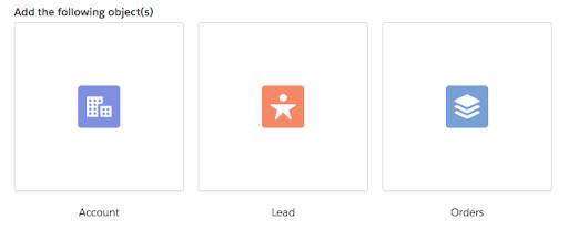
In the example below, the Visual Picker contains three horizontally aligned options.

Each option contains an icon wrapped in a box with a gray border and a label below it. Semantically, each of these options is an HTML checkbox under the hood, so users can Tab between them and press their Spacebar key to toggle whether each one is selected.
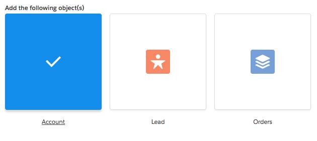
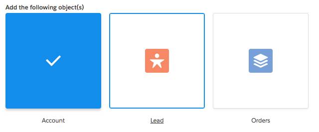
What distinct visual states would we need to consider for this element?
- Default (Not Hovered, Not Focused, Not Selected)
- Focused, Not Selected
- Focused, Selected
- Not Focused, Selected
Default: Icon wrapped in a box with a grey border and a label below it.
Focused, Not Selected: Border is blue and label is underlined.

Focused, Selected: Entire box is blue with a checkmark in the middle, label is underlined.
Not Focused, Selected: Entire box is blue with a checkmark in the middle, label has no underline.

In the screenshot below, the first option is selected but not focused, the second option is focused but not selected, and the third option is neither selected nor focused.
 Notice each state is visually distinctive. How might hover styles play into this? Hover adds a blue border but doesn’t underline the text. So this component follows a convention of:
-
Focus: Blue border and underlined label
-
Hover: Blue border
-
Selected: Blue box with check mark
All three of these states have a distinct visual element which can be mixed and matched to visually convey the overlap of states.
One thing we didn’t show here is the disabled states for check and unchecked visual pickers. Following the existing patterns, how would you differentiate these two additional states? Refer back to the SLDS guidelines to see how we did it.
Forms
Forms may seem simple, but there are many things to consider when designing forms that everyone can successfully use.
Always Include Visible Labels
Designers sometimes want to use placeholder text instead of actual labels. However, there are two issues with that.
- Placeholder text must meet a 4.5:1 color contrast ratio, which makes the form field look like it’s already filled in.
- After the user has completed the form, without visible labels, the purpose of each field may be unclear. Users are multitasking and don’t always complete an entire form in one flow.
Pretend that you’ve filled out this form, stepped away to answer an email, and then came back to this:
The original form looked like this:

It’s better to have visible labels so that users know the purpose of each form field at all times:

Design Helpful Error Messages
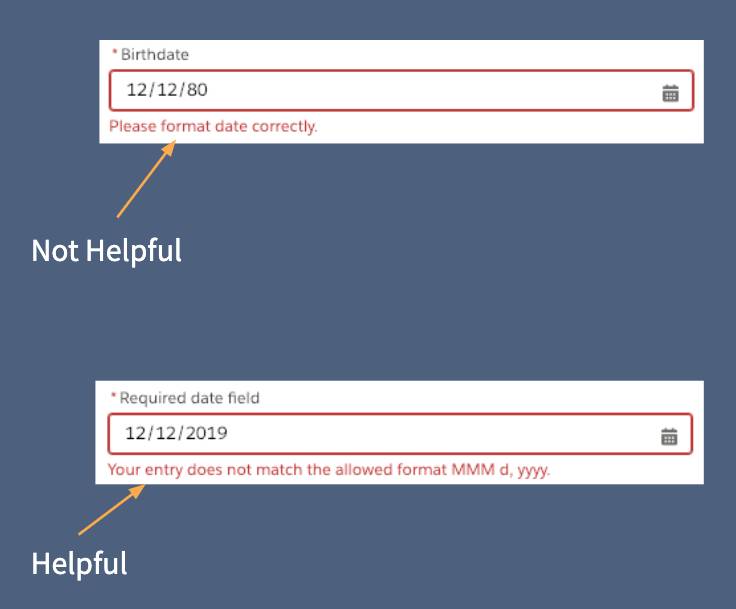
When a form field has an error, a red outline around it isn’t enough of an indication. Users who are color-blind may not be able to see it, and a red outline alone isn’t super helpful. Make sure to include error text below the field that explains how to fix the error.
 In the screenshot below is another example error message. Instead of saying, This date is invalid, it’d be more helpful to explain the required format for entering a date.
Guide the User in Completing the Form Successfully
If forms are poorly designed, the user’s feelings toward them can range from annoyance to anxiety and confusion. Poorly designed forms can even block users from completing their work.
For longer forms, set clear expectations up front of how many steps are involved or approximately how long the form takes to complete. If a user is in the middle of the process, show them which step they’re on (for example, page 3 of 5).
Avoid setting time limits on completing forms. If you have to use a time limit, inform the user how much time they have before they start the process and allow users to extend the time.
Provide Safeguards
Users are often multitasking or have other distractions. Provide ways for users to go back to edit their form input, save along the way, or restart the form entirely. Also, when creating a form for making legal or financial transactions, provide a way for users to either review, confirm, or reverse any charges or changes. This is vital for everything, including:
- Online purchasing
- Money transfers (including online banking, PayPal, Venmo, and so forth)
- E-contracts, such as DocuSign and the Adobe Document Cloud
Let’s Recap
Interactive controls and form inputs are vital to interactive product design. It is important to design visual differences for all the states of these controls. This way users will know when they are in focus, selected, disabled, and so on. Designing forms with clear guidance and safeguards not only removes barriers for people with cognitive disabilities but provides a more enjoyable experience for everyone.
Resources
- Article: WCAG 2.4.7 Focus Visible
- Article: Give Your Site Some Focus! Tips for Designing Useful and Usable Focus Indicators
- Article: Webaim Creating Accessible Forms