Explore the Standard Dashboards
Learning Objectives
After completing this unit, you’ll be able to:
- Identify key components on all B2B Marketing Analytics dashboards.
- Explain what each dashboard shows.
Components on All Dashboards in B2B Marketing Analytics
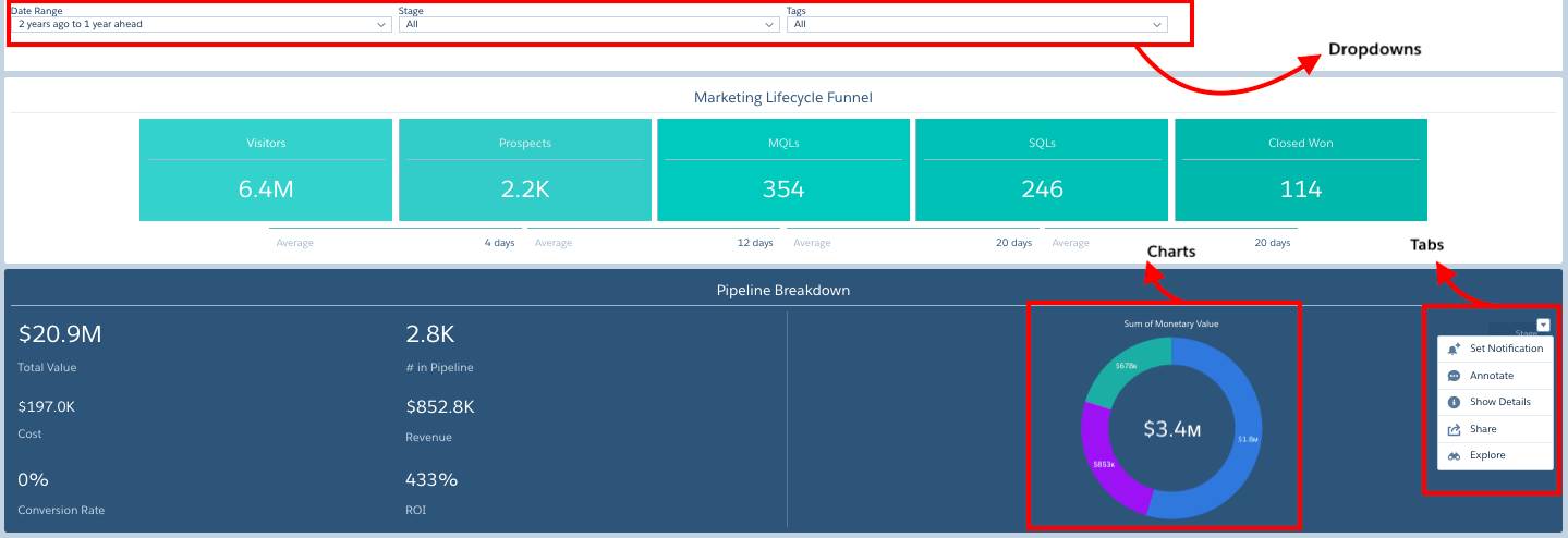
You’ve got your datasets. You’ve got your lenses highlighting specific analyses of those datasets. Now you can arrange all that information in dashboards to clearly convey it. A dashboard is a curated set of charts, metrics, and tables based on the data in one or more lenses. All dashboards in the analytics app have certain components in common.
-
Dropdown menus: Use these to adjust the data or to open a lens for more detailed information on your data.
-
Charts: Click these to explore your data
-
Tabs: Use these to focus on the specific data you’d like to see (for example, how many marketing-qualified leads are currently in your Pipeline).
Now let’s take a look at the four standard dashboards that you get with your B2B Marketing Analytics license.
The Engagement Dashboard
This dashboard is ideal for exploring your marketing engagement data to see connections between specific marketing assets and sales results. It focuses on the top three marketing assets in Pardot: list emails, forms, and landing pages.
The Engagement dashboard reveals information about how your strategy, content, and collaboration are resonating with your prospects. It shows how individual assets are contributing to visits, sales, and the closed-won opportunity lifecycle. But the real value of this dashboard lies within its four available filters. They let you dig into your data based on year, quarter, campaign, and tag.
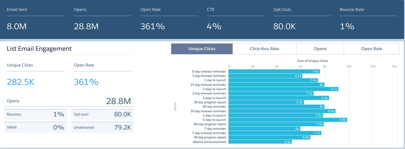
The List Email Engagement filter on the dashboard provides an overview of all your email engagements: total emails sent, the open rate, number of unique clicks, bounces, opt outs, and undelivered messages.
The Form Engagement chart on the dashboard provides information on submission rates, visitor to prospect rates, and views.

The Landing Page chart on the dashboard provides information on unique views, total submission rates, total submits, and total views.

You can share the Engagement dashboard with others via URL, Chatter, or as a downloaded image.
The Pipeline Dashboard
This dashboard is ideal for sales and marketing leaders. It presents sales and marketing data in one convenient place, offering valuable insight into the effectiveness of strategy and content. It provides a visual end-to-end view of your marketing pipeline by diving into:
- Pipe dollars
- Lead volume
- Return on investment
- Conversion rates
The Pipeline dashboard displays visitors first, so you can see how many of your unidentified visitors are converting and becoming prospects. Of the prospects who convert, the dashboard reveals how many are reaching a marketing qualified lead (MQL) threshold and becoming assigned to a sales representative. And it reveals how many of the MQLs become sales qualified leads (SQLs), and become associated as a contact role on an opportunity. Finally, the dashboard show how many closed-won opportunities you have, representing revenue for your business.

The Pipeline dashboard gives you visibility into your lifecycle Funnel.
-
Visitors: The total number of visitors, from the Pardot Visitors dataset
-
Prospects: The total number of prospects, from the Pardot Opportunity dataset
-
Marketing qualified leads: The total number of MQL prospects, from the Pardot Opportunity dataset
-
Sales qualified leads: The total number of SQL prospects, from the Pardot Opportunity dataset
-
Closed-won: The total number of closed-won opportunities, from the Pardot Opportunity dataset
-
Velocity figures: The average velocity at each stage of the pipeline for a prospect to arrive at each stage
This dashboard also shows a breakdown of your Pardot campaigns, giving you insight into the connections between prospects associated with a given campaign and the opportunities in your database. Access which Pardot campaigns are representing the most closed opportunities and potential revenue. Access which lead sources are generating the most opportunities that are not won or lost. Identify the accounts with the largest opportunity value that are in the visitor, prospect MQL, or SQL status.
For each component on the dashboard, you can click the dropdown arrow to dive deeper into your data. For example, you can set a notification to alert you if something about your data changes. You can specify when and how often to be notified of these changes. You can even edit the name of the notification so it’s clear at a glance what the notification is about. And you can create an annotation to give context about the data to others when you share the data.
You can drill deeper into your data to see which dataset a lens is using. You can also see the measures, the dimensions, and more within the same dataset. You can use the pencil icon to reformat and move pieces on the dashboard, or add new ones. And you can save, preview, and share the dashboard, just like you can individual lenses.
The Marketing Manager Dashboard
This dashboard surfaces the most important relevant data about pipeline, campaigns, and engagement to offer a quick view into the health of your business. It comes with two filters, year and quarter, which reveal overall marketing pipeline health using time as a benchmark.
The dashboard provides insight into how marketing efforts affect sales. You can analyze the performance of previous campaigns to determine what was most successful, what generated the most revenue based on closed-won opportunities, and what may have missed the mark. In addition, you can use those insights to make data-driven decisions when developing new marketing initiatives. And you can access both the Pipeline and Engagement dashboards directly from this dashboard.
The Marketing Manager dashboard provides an overview of the opportunities in the pipeline, cost, revenue, close-won rates, lead volume, conversions, and campaign return on investment.

Multi-Touch Attribution Dashboard
It is valuable for every marketer to understand how their campaigns impact revenue. Now you can track your campaign influence via the Multi-Touch Attribution Dashboard. Pardot clients with Sales Cloud get three standard attribution models: first touch, last touch, and distribution. Depending on your marketing goals, these models can inform your campaign strategy. For example, you can use the first touch model to see how effective a campaign is at generating new leads, whereas the last touch model can help you understand which campaigns close the most deals.
The Multi-touch Attribution dashboard can help you zoom into these out-of-the-box models, as well as any custom attribution models that you create on your own. Using that information, the Multi-Touch Attribution dashboard shows you which of your campaigns are performing well. For example, you may see that certain campaigns have a great return on investment. You can then decide to invest in similar campaigns in the future. Or you may see that certain campaigns have been unsuccessful and decide to cut them from your marketing strategy.
Resources
- Knowledge Article: B2B Marketing Analytics Dashboard
- Knowledge Article: Optional Uses for Dashboards