Follow Dashboard Best Practices
Learning Objectives
After completing this unit, you’ll be able to:
- Explain the value of properly presenting analysis.
- Explain the three categories of dashboard design best practices.
- Explain the vizzes used in this module.

Before You Start
Before you start this module, make sure you complete Detailed Data Analysis. The work you do here builds on the concepts and work you do in that module.
Build Better Dashboards
Chefs have long told us we eat with our eyes. A meal served with a beautiful presentation tastes better than the same meal thrown at a plate willy-nilly. Data analysis is the same. Even if all the elements of analysis don’t change, taking the time to tweak and adjust the presentation makes a huge difference for the recipient.
As with cooking and baking, there’s a lot of artistry involved in presentation. (Developing that flair is beyond the scope of this module, though we highly encourage you to explore what’s out there on Tableau Public. Go find your inner data storytelling artist!) But remember what the judges often say in The Great British Bake Off—what we don’t want is “style over substance.”
The whitepaper 10 Best Practices for Building Effective Dashboards has three categories of best practices for designing dashboards.
-
Thoughtful planning, which includes knowing your audience and building efficient displays.
-
Informed design, which includes limiting the focus and encouraging exploration with interactivity.
-
Refinement, which includes using elements like tooltips and minimizing clutter.
In the following units, you learn the substance, the how-to, and mechanical aspects of building a refined dashboard. The style is up to you after nailing the substance.
Explore the Analysis
Up to this point you’ve worked with the ratings and viewership data. Now it’s time to shake things up and switch to an exploration of how bakers perform on the show. Because this module is all about presenting and telling a story with data, you use some prebuilt vizzes to construct a dashboard, set up interactivity, and refine things like labels and other text.
There are tons of fan theories that try to predict or explain patterns for how the contestants on the Great British Bake Off perform. Let’s dive into a few of these.
- The Star Baker is cursed.
- Winning Star Baker for Bread Week means the baker will win.
- Doing well in technical challenges is a consistent predictor of being Star Baker.
Let’s explore the vizzes you'll work with.
Tracking Star Baker
This viz looks only at bakers who were Star Baker at least once and tracks their status across episodes, from Star Baker at the top of the y-axis down to Eliminated at the bottom. Star Baker status is indicated in yellow.
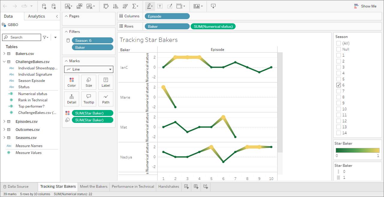
To get an axis for the line chart, a calculation was created that translates each status to a numeric value.
- Star Baker or Winner as 2
- Did well or Runner up as 1
- Safe as 0
- At risk as -1
- Eliminated as -2
The actual values don’t matter; they simply need to be in that order.
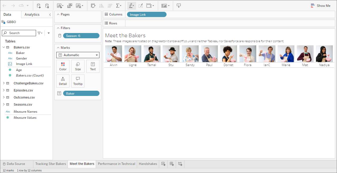
Meet the Bakers
The Meet the Bakers viz uses the image link field to show the headshots of bakers from thegreatbritishbakeoff.co.uk. (The Image Role feature calls the images hosted on that website. Salesforce does not host the images and isn’t responsible for the content.) This viz will be used as a visual filter.
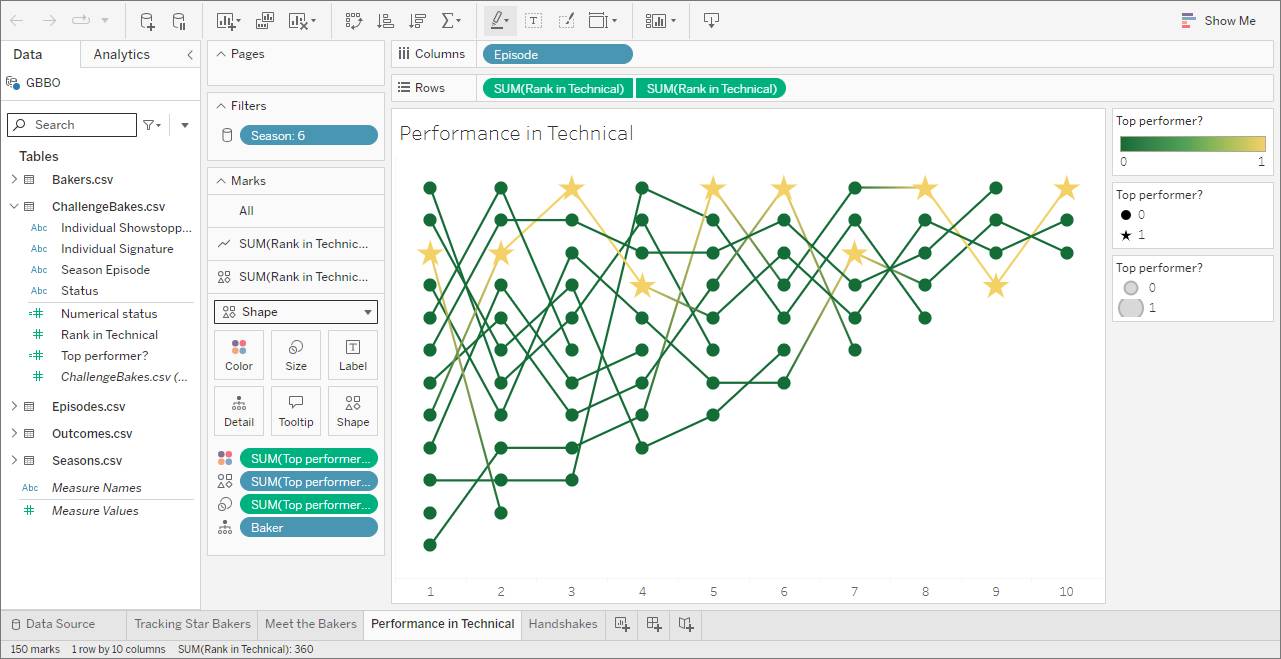
Performance in Technical
This viz has a line for each baker that tracks their rank in the technical challenge. The x-axis is each episode. The top of the y-axis is first place in the technical challenge. Yellow stars indicate the baker who received Star Baker that episode.
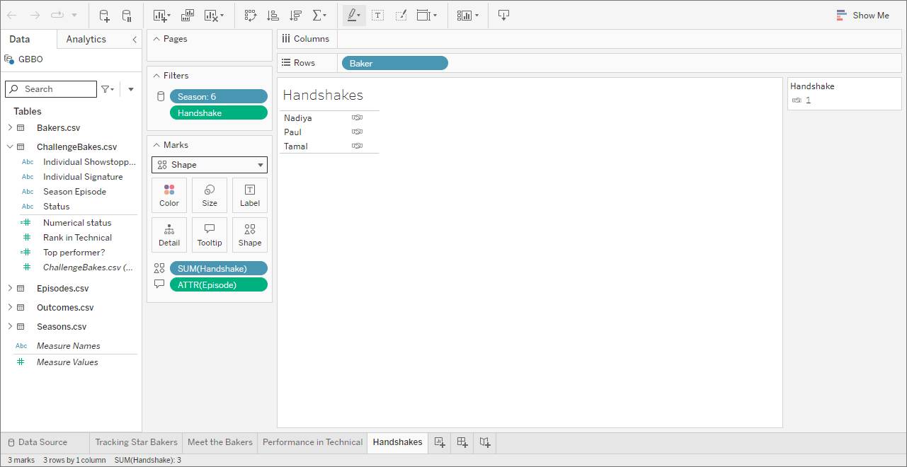
Handshakes
Bakers are listed with a handshake icon to indicate they received a handshake from Paul Hollywood—a sign he was a huge fan of their bake.
Resources
- Tableau Desktop and Web Authoring Help: Visual Best Practices
- Tableau: Blog: 7 tips and tricks from the dashboard experts
- Trailhead: Module: Data Presentation and Publication in Tableau Desktop
- Trailhead: Module: Data Visualization in Tableau Cloud
- Trailhead: Module: Tableau Visualization Formatting on the Web