Build a Story
Lesson Objectives
After completing this unit, you'll be able to:
- Describe what a story is in Tableau.
- Describe the best practices for creating a story.
- Create and format a story.
You have done some great analysis work and put all the views together in an interactive dashboard. Now, share your findings with the larger team. Together, you might reevaluate selling machines in certain states.
Instead of having to guess which key insights your team is interested in, and including them in a presentation, you decide to create a story in Tableau. This way, you can walk viewers through your data discovery process and answer any questions that come up during your presentation.
Know the Story
In Tableau, a story is a sequence of visualizations that work together to convey information. You can create stories to tell a data narrative, provide context, demonstrate how decisions relate to outcomes, or to simply make a compelling business case.
A story is a collection of sheets, so the methods you use to create, name, and manage worksheets and dashboards still apply. It arranges sheets in a sequence. Each individual sheet in a story is called a story point.
Best Practices for Telling a Story
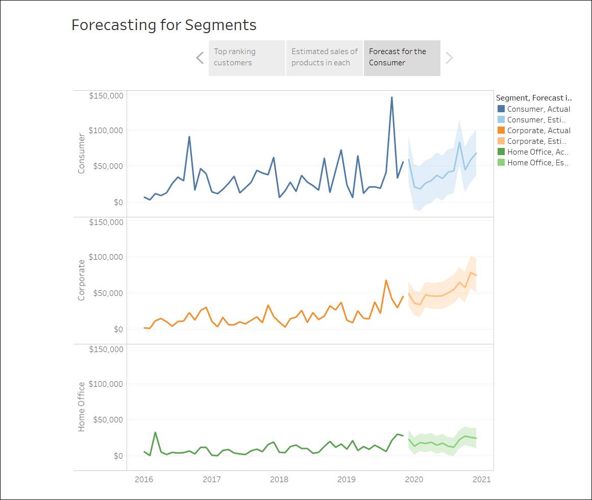
The following is an example of a story that shows product sales in various segments of the market, and also forecasts product sales for the upcoming year.
A good data story brings data and facts to life. Use the following best practices when creating a story.
-
Know the Story’s Purpose
Before you build your story, take some time to think about the purpose and what you want your viewers’ journey to be. Is it a call to action, is it a simple narrative, or are you presenting a case?
If you're presenting a case, decide whether you want to present data points that lead up to a conclusion at the end, or start with a conclusion then show the supporting data points. The latter approach works well for a busy audience.
Finally, sketching out your story first on paper or a whiteboard can help you quickly identify problems with your sequence.
-
Keep It Simple
A common error is trying to cram too many views and dashboards into a single story. The result is too many points for your viewers to take in. The clarity of each story point is also important.
Take a step back and consider your story from the perspective of someone who’s never seen it. Every element should serve a purpose. If captions, titles, legends, or grid lines aren’t necessary, get rid of them!
-
Use 'Fit to' in Your Dashboards
Dashboards are a common ingredient in Tableau stories. For dashboards that you plan to include in your story, use the Fit to option under Size on the Dashboard pane. It will resize your dashboard so that it’s the right size for the story you’re creating.
-
Plan for Fast Load Times
The most wonderful story in the world won’t have much impact if it takes too long to load. People find long waits frustrating. Some of the most critical performance decisions you make begin before you even create your first view or story, in the data preparation stage.
Create a Story
Use stories to show how facts are connected, and how decisions relate to outcomes. You can then publish your story to the web, or present it to an audience.
Each story point can be based on a different view or dashboard, or the entire story can be based on the same visualization seen at different stages.
Let’s create a story to present your dashboards to the larger team.
Create Your First Story Point
For the presentation, start with an overview.
- Launch the Trailhead Simulator.
- Click Create Your First Story Point.
- Click Begin.
- Click the New story button
 . You’re presented with a blank workspace that reads, Drag a sheet here. This is where you create your first story point. Blank stories look a lot like blank dashboards. And like a dashboard, you can drag worksheets and dashboards over to present them.
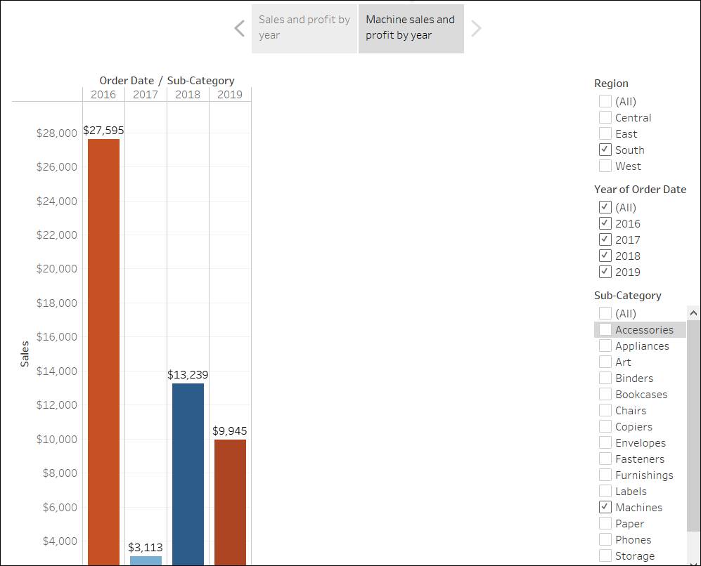
- From the Story pane on the left, drag the Sales in the South worksheet onto your view.
- Add the caption
Sales and profit by year.
- Then press enter (PC) or return (Mac).
- Click the scroll bar to see the full view in the story.
 This story point is a useful way to acquaint viewers with your data. But you want to tell a story about selling machines in North Carolina, so it’s time to take a step in that direction.
- Click Next Exercise.
Add Additional Points to the Story
To bring machines into the picture, you can use the Sub-Category filter included in your Sales in the South bar chart.
- Ensure that you’re in the Add Additional Points to the Story simulation. If not, launch the Trailhead Simulator and click Add Additional Points to the Story.
- Click Begin.
- In the Story pane, click Duplicate to duplicate the first caption. Continue working where you left off, but know that your first story point will be exactly as you left it.
- Since you know you’re telling a story about machines, on the Sub-Category filter to the right of the bar chart, clear the selection for (All).
- You see a blank screen because no Sub-Category is selected. Select Machines. Now your viewers can quickly identify the sales and profit of machines by year.
- Add a caption to underscore what your viewers see, in this case,
Machine sales and profit by year - Then press enter (PC) or return (Mac).
- Click the scroll bar to see the entire view.
 You’ve successfully shifted the focus to machines, but you realize that something seems odd: In this view, you can’t tell which state is contributing to the loss.
You address this in your next story point by introducing your map.
- Click Next Exercise to continue to the next exercise.
Add Your Findings to the Story
The bottom line is that machines in NC lose money. You discovered that in the dashboard you created. Looking at overall sales and profit by year doesn’t demonstrate this point alone, but regional profit can.
- Ensure you’re in the Add Your Findings to the Story simulation. If not, launch the Trailhead Simulator and click Add Your Findings to the Story.
- Click Begin.
- In the Story pane, click Blank.
- Drag your dashboard Regional Sales and Profit onto the canvas. This gives viewers a new perspective on your data—negative profit catches the eye.
- Add the caption
Underperforming items in the South.
- Then press enter (PC) or return (Mac). So far your story should look like the following.
 To narrow your results to just North Carolina, because it is the least profitable on the map, start with a duplicate story point.
- Select Duplicate to create another story point with your Regional Profit dashboard.
- Select North Carolina on the map.
- Let’s show the profit for 2019. Scroll on the Year of Order Date filter card to select 2019.
- Add the caption,
Profit in NC 2019 - Then press enter (PC) or return (Mac).
- Click Next Exercise to continue to the next exercise.
Format and Describe Your Story
On this story point, which focuses on data from 2019, you want to describe your findings. You need more than just a caption.
- Ensure that you’re in the Format and Describe Your Story simulation. If not, launch the Trailhead Simulator and click Format and Describe Your Story.
- Click Begin.
- In the left-hand pane, select Drag to add text and drag it onto your view.
- Enter the description
Introducing machines to the NC market in 2019 resulted in losing a significant amount of moneyfor your dashboard.
- Then press enter (PC) or return (Mac).
- Click OK.
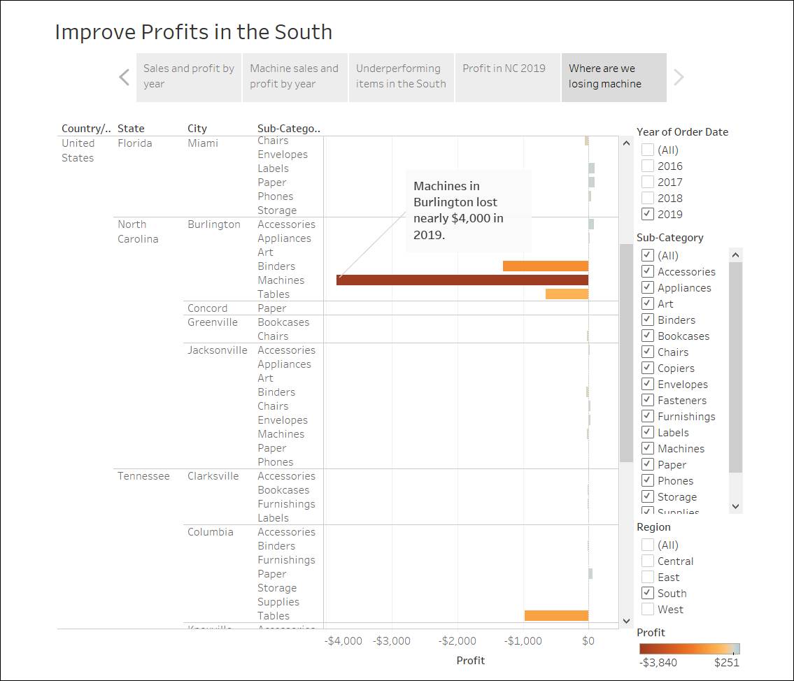
- For the final slide, drill down into the details. In the Story pane, click Blank.
- From the Story pane, drag Negative Profit Bar Chart to the view.
- In the Year of Order Date filter card, narrow the view down to 2019 only. First uncheck All.
- Then select 2019 to see the results from 2019.
- Click the scroll bar to scroll down and see that the loss of machine profits was solely from Burlington, NC.
- In the view, right-click the Burlington mark (the bar), click Annotate and then select Mark.
- In the Edit Annotation dialog box that appears, type
Machines in Burlington lost nearly $4,000 in 2019.
- Then press enter (PC) or return (Mac).
- Click OK.
- In the view, you can drag the annotation and adjust where it appears. Click anywhere to continue.
- Click the scroll bar to scroll up to see the caption.
- Give this story point the caption:
Where are we losing machine profits in NC? - Rename your story. Double-click the Story 1 tab on the bottom toolbar
 .
.
- Enter
Improve Profits in the South - Then press enter (PC) or return (Mac).
- Review your story by selecting Window from the menu and then clicking Presentation Mode.
- Click Home to restart the activity or Exit to continue.
Your presentation went very well. Your team is convinced there is work to be done to increase profit in Burlington, NC. Plus, they’re curious to know why machines did so poorly in the first place. Your manager has now asked you to share all your findings with the team. That would be the next step in your journey.
Resources