Share Your Insights with Stories and Dashboards
Learning Objectives
After completing this unit, you'll be able to:
- Explain what stories and dashboards are.
- Explain the use cases for stories and dashboards.
- Use and interact with stories and dashboards.
So far, you’ve created some views and modified some existing views to answer key questions about low-performing products in your company. Imagine that you’re ready to share these findings with your manager and teammates. There are several ways to tell a story or persuade others with the data insights you’ve found in your views.
Dashboards
A dashboard is a collection of several worksheets and supporting information shown in a single space so you can compare and monitor different data simultaneously.
To open a new sheet and start creating a dashboard, click the New Dashboard icon at the bottom of the workbook:
The Dashboard area appears on the left and lists the sheets in your workbook. You can add one or more views to a dashboard; add objects like web pages, blank space, and layout containers; or add interactivity to associate different views on your sheet.
Filters in Dashboards
In addition to displaying multiple visualizations simultaneously, dashboards provide opportunities for your audience to make data discoveries. Many interactive features allow users to ask questions of the data, and then to interact with visualizations directly to find answers and insights. The most common interactive feature is filtering. Filters allow a user to visually isolate subsets of the data. You can apply filters to individual worksheets in a dashboard or to all sheets in a dashboard.
Create a Dashboard
Imagine that you created views that show which products are underperforming in different regions. Now you want to create a dashboard with these views so that your team can view and interact with the data and look for additional insights of their own.
- Launch the Trailhead Simulator.
- Click Create a Dashboard.
- Click Begin.
- The Furniture Profit workbook is open. Click the New dashboard icon
 .
. - Next, to automatically resize the dashboard for different devices, under Size, click the dropdown arrow next to Desktop Browser (1000 x 800), and then select Automatic from the picklist.
- Click the box again to close the dropdown list, and then take the following steps to place the Furniture Profit bar chart at the top and the Profit by Segment highlight table at the bottom of your dashboard.
- From the Sheets list on the left, drag Furniture Profit to the empty canvas area. (The first view automatically takes up the whole dashboard. Any subsequent views, though, can be placed in specific areas of the screen.)
- Next, drag Profit by Segment below Furniture Profit.

- Adjust the Profit by Segment view width by taking these steps.
- Click the Profit by Segment view. Notice the buttons to the right of the view.

- Click the More Options
 dropdown next to the view and click Fit | Fit Width. Notice that the view now fills the entire width of the container and most of the data is visible.
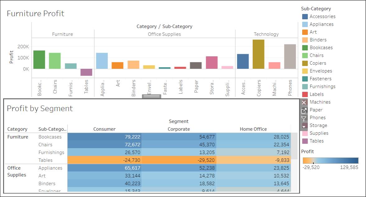
- You can create more space in the dashboard by removing the titles. Click Profit by Segment.
- Click the
 next to the view. The Title option has a check mark next to it. Uncheck Title.
 - Repeat the same steps to remove the title for Furniture Profit.
- You can also remove the Sub-Category legend next to the chart and table to gain some additional space. Click the Sub-Category legend, and then click the Remove
 icon.
icon.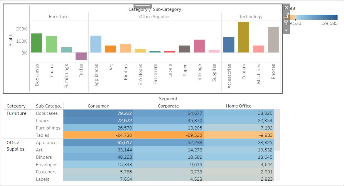
- You can also add interactivity to your dashboard. Let’s use Furniture Profit as a filter for Profit by Segment. Click the Furniture Profit Bar Chart view to select it.
- In the top right corner, click the Use as Filter icon
 . When you select (activate) this icon, it is filled in
  .
. - Test the filter by clicking the Sub-Category bar for Chairs. Now you can see Profit by Segment for Chairs.

You created a dashboard and added some interactivity to it. Another way to share your insights with others is to create a story.
Stories
Dashboards enable you to share multiple views at the same time, informing others and allowing them to explore the data on their own. But what if you have a particular insight you want to share? You can create stories in Tableau to tell a data narrative, provide context, demonstrate how decisions relate to outcomes, or simply make a compelling business case.
Watch this one minute introduction to learn about stories in Tableau.
As shown in the video above, a Tableau story consists of visualizations or dashboards used in a sequence to create a narrative about your data.
A story is a collection of sheets, so the methods you use to create, name, and manage worksheets and dashboards still apply. Each individual sheet in a story is called a story point. Each story point can be based on a different view or dashboard, or the entire story can be based on the same visualization seen at different stages, with different filters and annotations.
Create a Story
Imagine that profits in the Furniture department of your company are very low, despite the fact that the sales are high compared to other departments. After analyzing the data, you find out that Tables in the East region are deeply discounted. Create a story to share your findings.
- Ensure you’re in the Create a Story simulation. If you’re not there yet, launch the Trailhead Simulator and click Create a Story.
- Click Begin.
- Double-click the Story Title at the top, enter a new title
What’s happening with Tables in the East?and then press enter (Windows) or return (Mac). - Click OK.
- To create a new story point for Table transactions in the East region, click the Blank button in the left pane.
- Double-click the Profitable States worksheet to bring it to the view.
- To see the profits on tables, click the Select a Category dropdown button, and then select Tables.
- Enter a new caption. In the gray box at the top, type
Profitability on Tables in East is a concern.and then press enter (Windows) or return (Mac). You created a new story point to show that the East region is least profitable.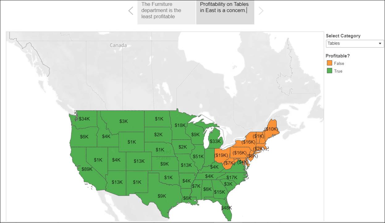
- Create another story point to show deep discounts for tables in the East region by clicking Blank.
- Double-click the Profitability on Tables dashboard to bring to the view.
- Specify a new caption. Type
Comparing average Discount by Category and State.and then press enter (Windows) or return (Mac). - Click the scroll bar to see the complete view.

- Click the state Pennsylvania, and see the discounts on Tables. It’s clear that Tables are deeply discounted in the East region, and this is contributing to the low profits despite the high sales. Your story is complete and you’ve provided data that reducing the discount on Tables in the East region can improve profitability.
- Click Home to restart the activity or Exit to close the simulation.
Great job! You built a dashboard and a story to share some key insights with your team and leadership. After the great presentation, your team members are looking forward to collaborating with you on some of the views and getting additional insights.
Resources
- Tableau Help: Dashboards
- Tableau Help: 7 tips and tricks from the dashboard experts
- Tableau Help: Stories