Know When and How to Use Tables, Maps, and More
Learning Objectives
After completing this unit, you’ll be able to:
- Identify when text tables are the appropriate visualization method.
- Recognize when to use maps and their visualization best practices.
- Be confident in using different chart types to make comparisons.
- Describe visualization best practices for readable and accessible visualizations.
When Detail Matters
While graphs can help you understand your data efficiently, there are times when you want to make comparisons with individual numbers.
Tables
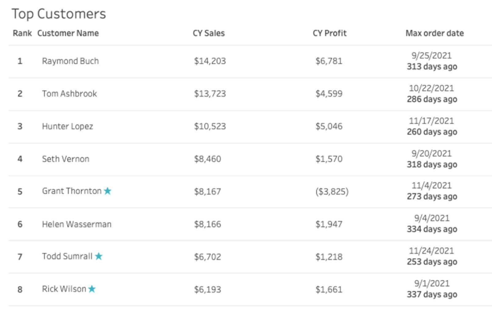
Tables let you make detailed comparisons and look up individual values when needed.
Highlight Tables
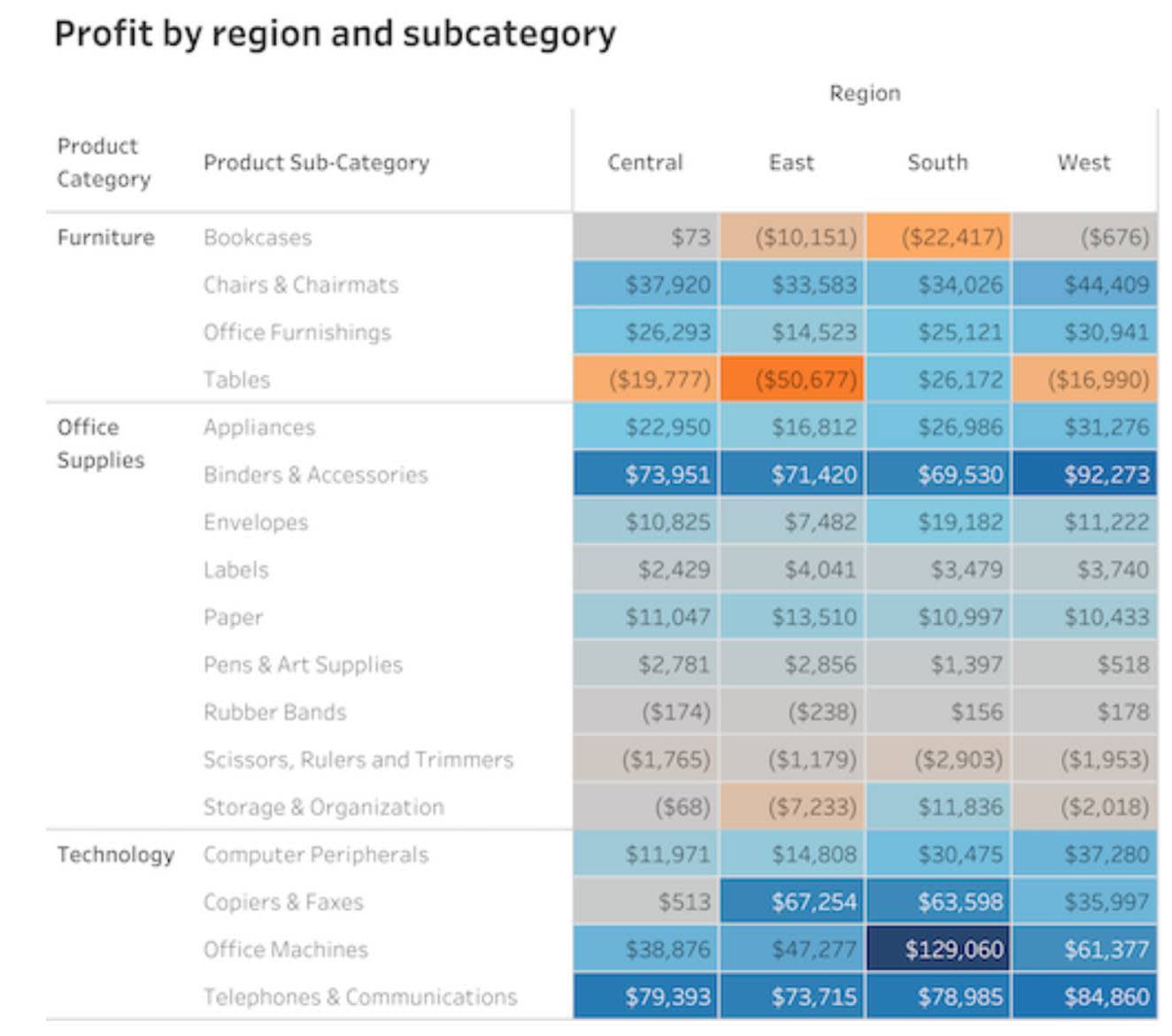
Highlight tables add color to tables and lets you see differences in values easier.
Make Comparisons with Maps
In the first unit, you learned that one of the first known visualizations was a map. All of us have used a map to help navigate traffic or find the best route to our destination. When location is key to understanding your data, you can use maps to make many comparisons using color, and sized bubbles to show quantitative values on maps.
Choropleth
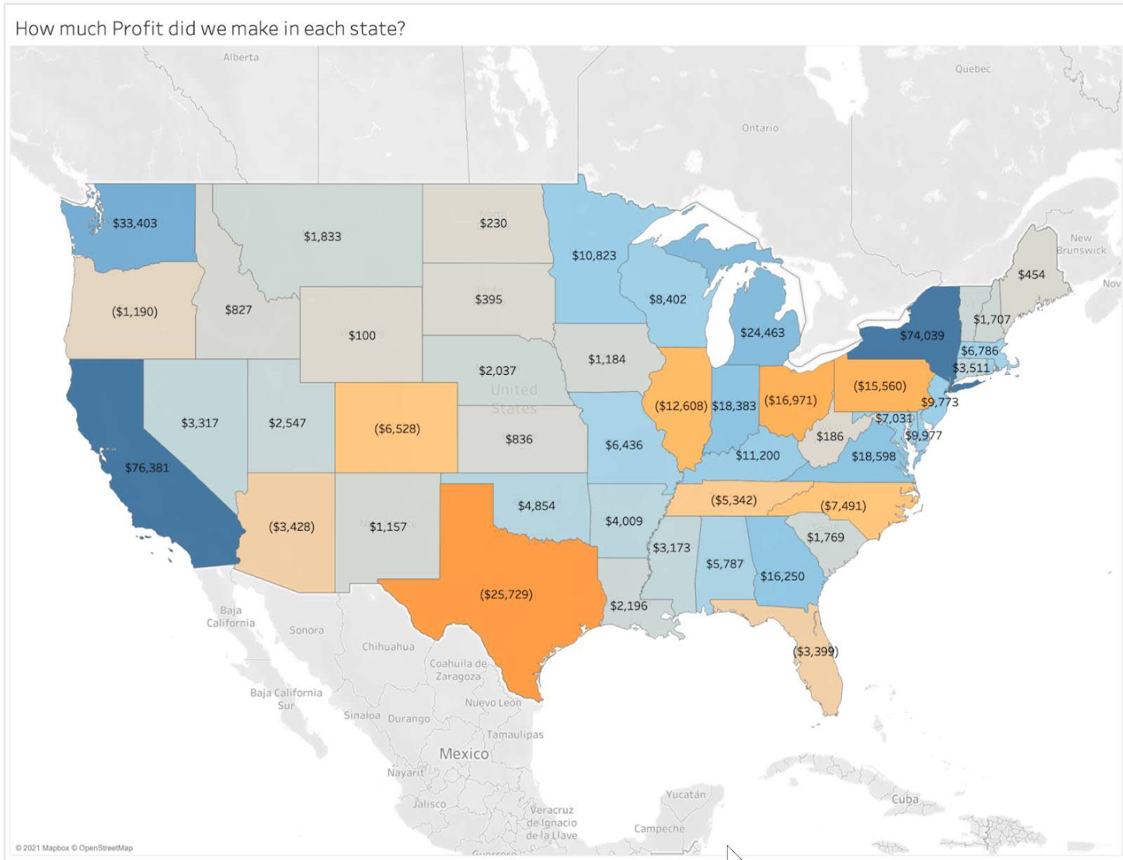
Choropleth maps, also called filled maps, are one of the most common ways to compare data over regions. The region boundaries are determined by the geographic location and each region is filled with a color or hue representing quantitative values. In the following example, darker blue means higher profit, while darker orange denotes higher loss.
Symbol Maps
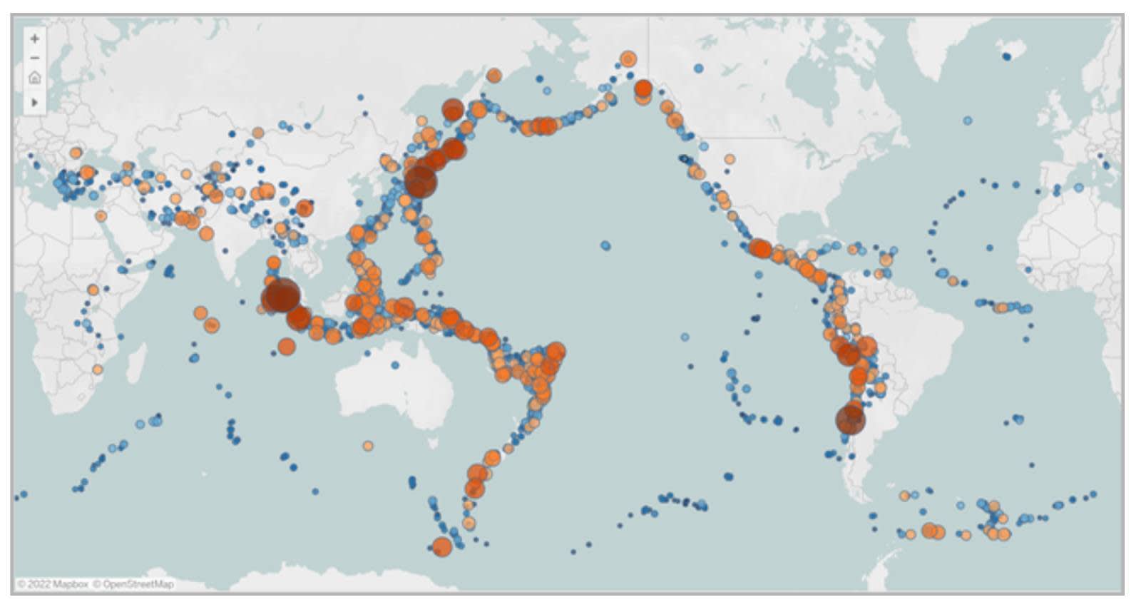
With symbol maps, instead of filling in the regions with a color or intensity, size and/or color-encoded shapes are used to show quantitative values.
In the next example, the size and color of each circle represent the magnitude for each earthquake that has occurred between 1981 and 2013.
Density Map
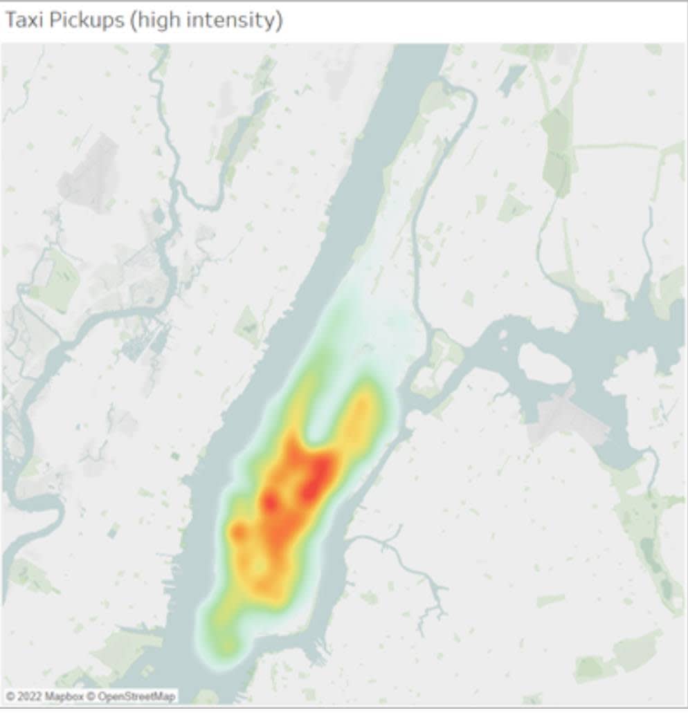
Density maps, sometimes called heatmaps, are used when you want to show data that may be clustered in specific areas. The density of color represents how many data points occur at a location. Unlike the symbol map, a density map lets the viewer easily see places where there are many data points.
In the next example, the density map shows where ride pickups are clustered in Manhattan, NY.
Present the Message
Accessible Visualizations
Now that you learned the best charts for displaying comparisons, keep in mind that good design practices make charts accessible and easier to understand.
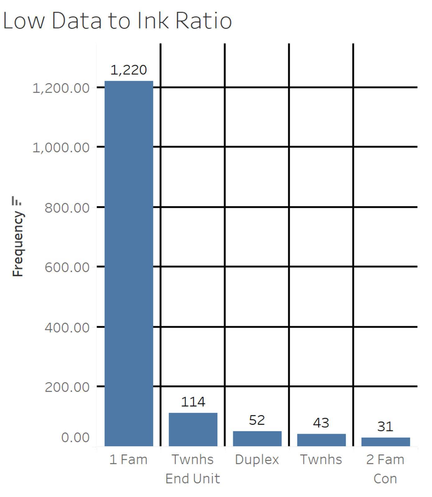
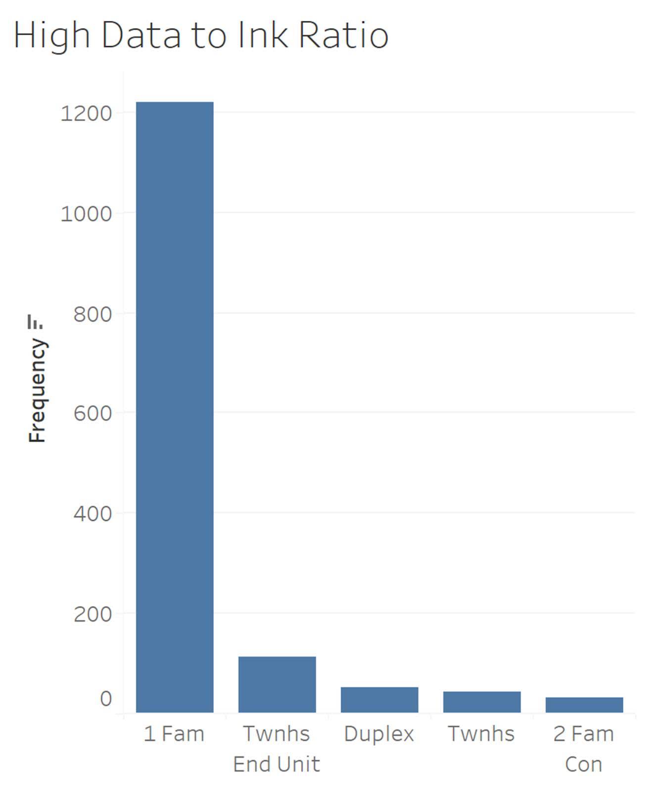
Data to ink ratio: Visualization expert Edward Tufte suggests that graphs should maximize the “data to ink ratio” and minimize “non-data ink.” Practices such as excessive grid lines should be minimized.
Proper labeling and titles: The title of the chart should clearly describe what the chart is showing, and axes and legends require labels showing units of measurement (for quantitative variables) or category names (for qualitative variables).
Colorblind-friendly: Color blindness affects about 4.5% of the population and means they cannot distinguish some colors such as red and green. Use colorblind-friendly color palettes whenever possible.
Recognize and prevent misleading charts: Software tools today are powerful, and you can create some beautiful and compelling visualizations that influence our audiences. When creating charts, take great care to recognize and avoid misleading chart design practices. Guidelines to Recognize Misleading Charts gives you a checklist named SCAM (check the source, chart type, axis, and message) to use when reading charts and helps you spot misleading charts.
Interpreting, exploring, and creating visualizations is important work, and it’s important to practice. Review the charts that you encounter on a daily basis. Are the charts presenting the data in the best way? Are there more questions to answer?
You now have a new set of tools to help you and your community read and create data visualizations!
Resources
- Lovelytics Blog Post: 6 Design Tips for Better Business Dashboards in Tableau
- Tableau Website: A Guide to Highlight Tables and Heatmaps
- Tableau Website: Choropleths, Isopleths, and Area Maps
- Trailhead: Guidelines to Recognize Misleading Charts
- Tableau Blog Post: How to Spot Misleading Charts, A Checklist
- Tableau Public: Visualization BBC Style Guide
- Trailhead: Fundamentals of Maps
