Discover Why We Need Charts
Learning Objectives
After completing this unit, you’ll be able to:
- Describe the importance of using charts.
- Discover how charts help you ask and answer questions.
- Understand the importance of good-quality data when used in charts.
Why Do We Use Charts? A Bit of History
Humans have been creating charts to visualize data for a very long time. People created city and town maps thousands of years ago, such as the map of the city of Nippur circa 1400 BCE. Other manuscripts, like ones created by Ptolemy in the second century, used visuals to describe astronomy principles.
Today, we continue to use charts as a way to represent data and have continuously improved our ability to tell the story of our data.
Think about a car’s dashboard. While driving, you see how fast you’re going, how much gas you have left, and trust that you’ll be warned if any system needs attention. Designers of the car dashboard give much care when deciding the placement of numbers, labels, and dials so that the dashboard shows you the most important data at the moment you need it.
Similarly, data visualizations help you make comparisons, see trends, monitor situations and progress, and draw conclusions that help you solve problems and make better decisions.
Types of Charts
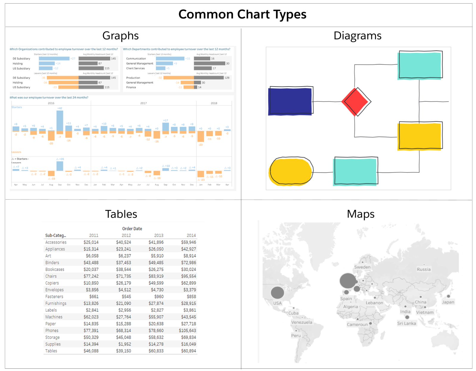
According to the Cambridge Dictionary, charts are defined as “a drawing that shows information in a simple way, often using lines and curves to show amounts.” Charts help you identify relationships or patterns in data more quickly than what might be possible when reviewing raw data points. Just as there are many types of data, there are many types of charts to help visualize the data, including graphs, tables, diagrams, maps, and so on.

Charts Help You Ask and Answer Questions
Ask Great Questions
The Data Literacy Basics module outlines the importance of asking the right questions. When exploring data, the questions you ask determine the direction of our analyses and the conclusions you make from those analyses. If you want to use your data to help make better decisions, you need to ask the best questions in order to get the best answers.
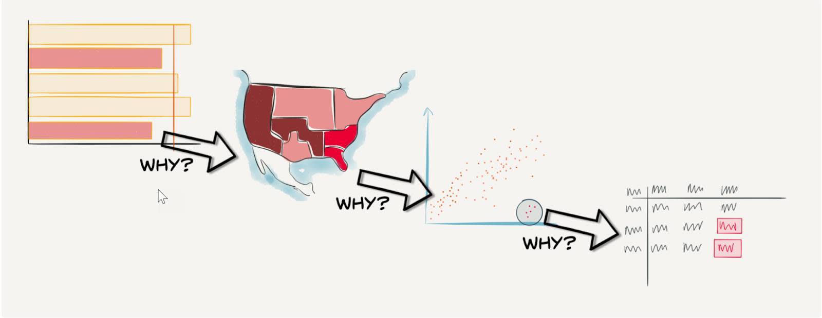
In the blog post Find Hidden insights in your data: Ask why and why again, Andy Cotgreave, senior technical evangelist, Tableau at Salesforce, describes how interacting with charts and continually asking new questions of your data can lead to discovering the root cause of a problem so that best actions can be taken.

The Visual Analysis Cycle
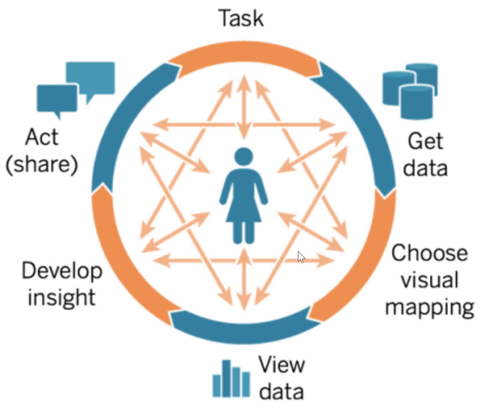
Using charts to continually ask questions can be considered part of the visual analytics cycle, a cycle that is a key component of analytics best practices.
The entrance point of the cycle is a specific task or business question, followed by getting data, visualizing data to discover insights, sharing and acting on those insights, and asking new questions as the cycle continues. At any point in the cycle, it can be determined that a different question needs to be answered. Asking good questions guides the analysis cycle and leads to better insights.
Why is this important? Because businesses that follow analytics best practices are better able to use their data to gain the most business impact.

Make Comparisons to Explore Data
When using charts to ask and answer questions, you are making comparisons. You may ask questions such as: How much is profit changing over time? Is one product more profitable than another? Which marketing campaign is working better? These questions lead to making comparisons with your data.
How do you best make these comparisons? By using charts, of course! But which charts should you make? Similar to the designers of the car dashboard, chart designers give great care in deciding which charts to use when visualizing data. Using visualizations that help people see comparisons and answer questions leads users to quicker insights and helps them ask better questions as the cycle of analysis continues.
Data visualization experts have studied visual perception of the human brain and learned how specific types of charts can aid our understanding of data visualizations. When you use graphs to effectively visualize data, you can see patterns or trends in your data and notice outliers or anomalies that you would not normally be able to see using text or tables.
Charts as Art
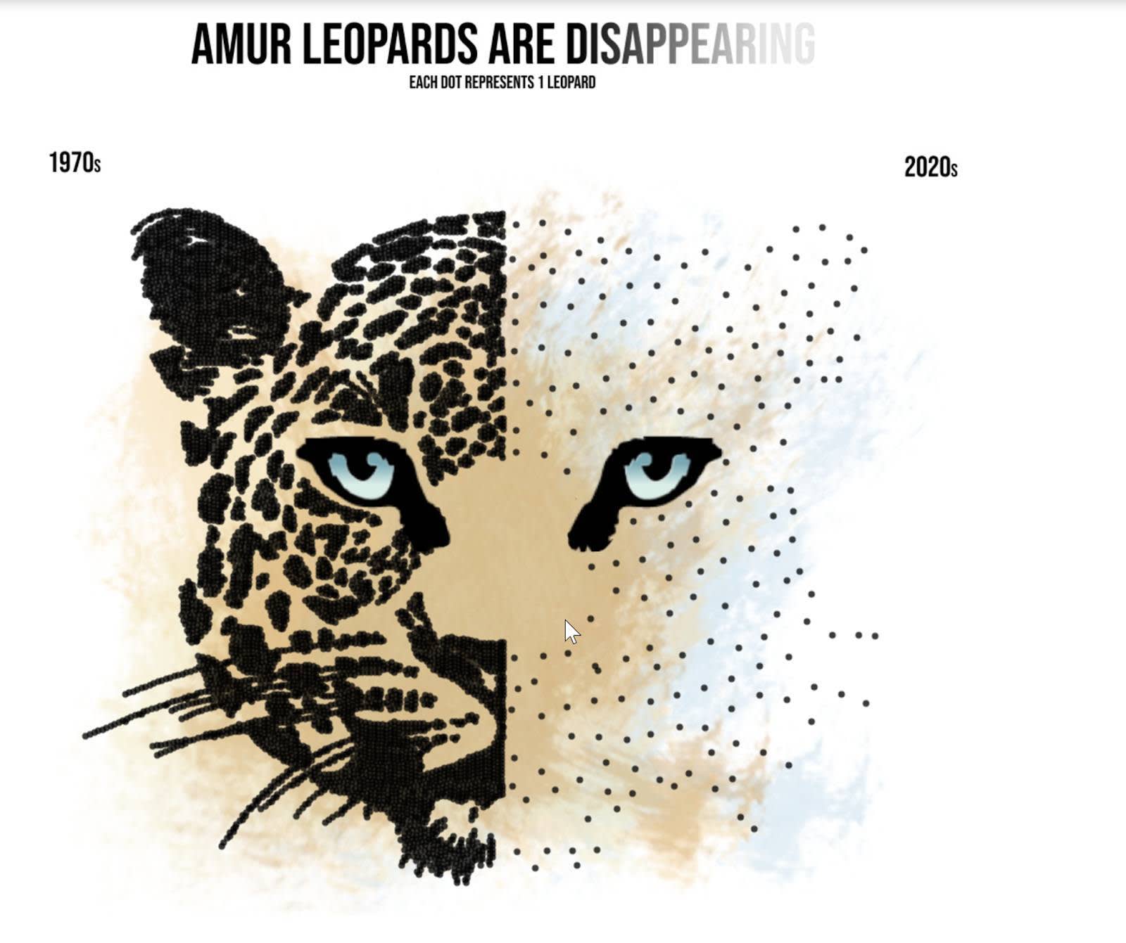
While your business goals require efficiency, data visualization allows for ample creativity! You can create beautiful visualizations that serve more than “communicating with data.” Visualizations can tell a story and bring new audiences to your analyses. In the Tableau Public Visualization by Asha Daniels, the number of individual leopards are shown by black dots. The black dots are arranged to look like irregular leopard spots in the half representing the 1970s with the unclustered dots for the 2020s. The visualization conveys an important message with an artistic representation.

Good Visualizations Require Good Data
Before you start exploring data visualizations, you need to make sure the data being used is high-quality data. Whether you are reading and interpreting a chart that someone else has made for you to view or creating charts for others to consume, always investigate whether the data is of good quality and is the right data to answer the question or comparison that you are exploring.
Resources
- Tableau Blog: Find hidden insights in your data: Ask why and why again
- Trailhead: Data Literacy Basics
- Trailhead: Variables and Field Types
- Trailhead: Guidelines to Recognize Misleading Charts
- Tableau Blog: Spot Misleading Charts, A Checklist
- Tableau Public Visualization: Disappearing Leopards
- The Data School Blog: Can you Make Art in Tableau?
- Tableau Website: Cycle of Visual Analysis
- Tableau White Paper: Designing Great Visualizations
