Apply Visualization Attributes and Principles
Learning Objectives
After completing this unit, you’ll be able to:
- Identify attributes and principles necessary for reading and creating charts.
- Describe how questions, comparisons, and data type help you determine the best chart type to use.
- Explain why bar charts are an important and common visualization type.
Guiding Principles for Designing Charts
When communicating with charts, there are a number of visual design guiding principles that can help you see and understand the data being displayed. Understanding these principles help you interpret and create charts effectively.
Preattentive Attributes
Preattentive attributes are visual attributes such as length, color, or position that can be processed almost instantly.
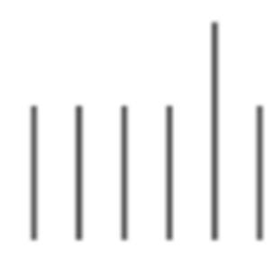
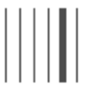
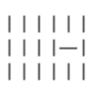
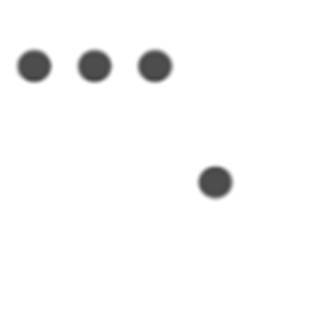
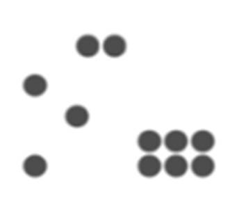
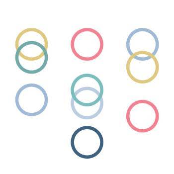
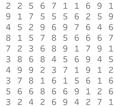
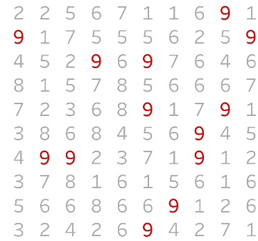
Take a look at the following visual. How many 9s do you see in the first image? Now compare that with an image where the same numbers are displayed using color to highlight the 9s. Notice the difference in the speed and accuracy at which you’re able to see how many 9s are in the second image.
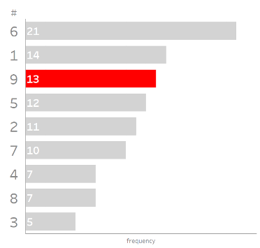
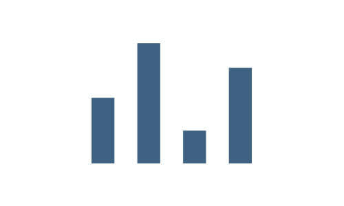
Now look at the third image. If you use the length of bars to show how many of each number is present and color to highlight the numbers of 9s, you can see that there are more 6s and 1s than 9s. Using the preattentive attribute position lets you see that the number of 9s ranks third when compared to the other numbers.
You process preattentive attributes visually almost immediately before they’re processed in the attention center of your brain. This means you can quickly see the distinctions between pieces of information that are presented using these attributes. The following figure shows 10 preattentive attributes, including the preceding 3 discussed, that can be used to help readers quickly interpret data. Utilizing these attributes when presenting data means the reader can instantly see differences or patterns without a lot of heavy cognitive lifting.
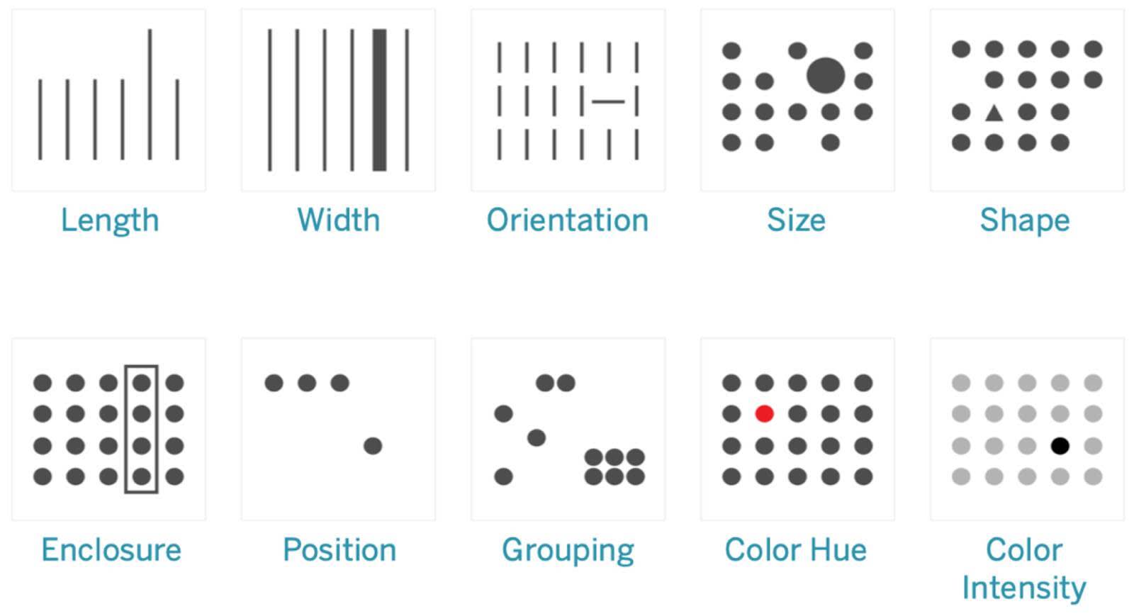
Encoding Data with Graphics
Data Type Determines Graphic Type
If you completed the Data Literacy Basics module, you learned that data is made up of qualitative and quantitative variables. Qualitative variables are variables that cannot be measured numerically, such as categories or characteristics. Quantitative variables are variables that can be measured numerically, such as height in inches. Some preattentive attributes work better when comparing quantitative data, while others work better with qualitative data. Particular shapes in charts, such as bars, boxes, points, or lines, use different preattentive attributes and are better suited to use when comparing different types of data. This table shows which attributes work well with qualitative or quantitative data.
Type |
Attribute |
Quantitatively Perceived? |
Categorically (Qualitatively) Perceived? |
|---|---|---|---|
|
Form
|
Length
|
Excellent |
Poor |
|
Width
|
Limited |
Poor |
|
|
Orientation
|
Poor |
Poor |
|
|
Size
|
Poor |
Poor |
|
|
Shape
|
Poor |
Excellent |
|
|
Enclosure
|
Poor |
Limited |
|
|
Color
|
Hue
|
Poor |
Excellent |
|
Intensity
|
Limited |
Poor |
|
|
Spatial
|
2D position
|
Excellent |
Poor |
|
Spatial Grouping
|
Poor |
Excellent |
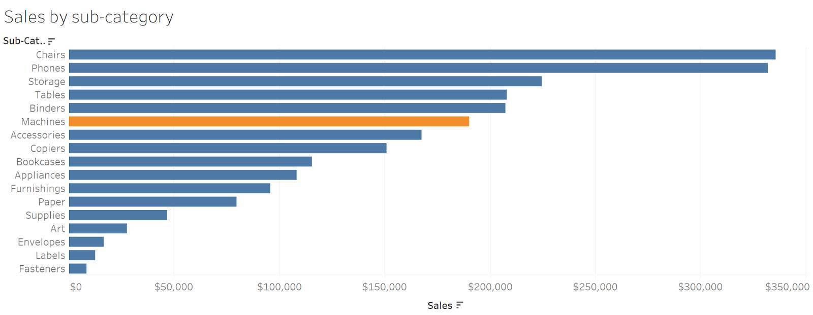
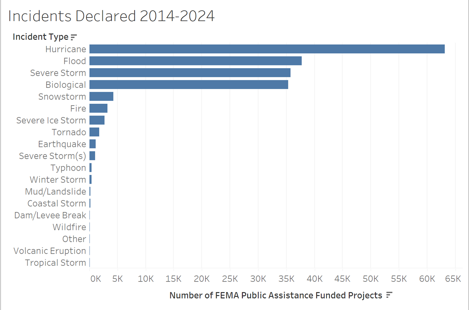
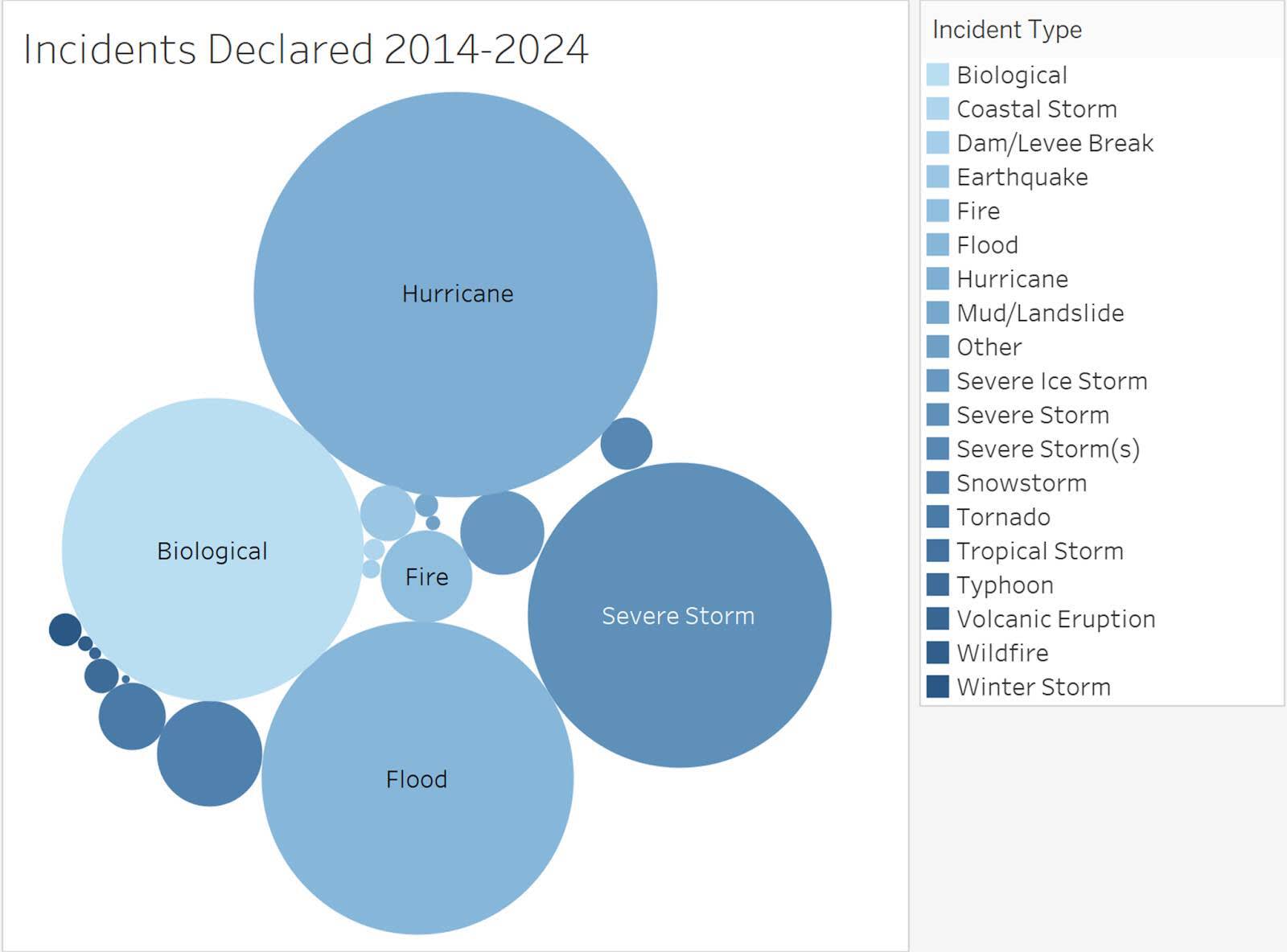
Take a look at the subsequent charts. When you compare quantitative values in a bar chart, you’re using the length attribute to make the comparison. And you can easily determine the largest value and any small differences between values. When you view the same data with a bubble chart using the size attribute, it’s more difficult to compare the values.
Comparisons Are the Foundation of Charts
As mentioned in the previous unit, asking good questions is an important (many may say the most important) part of data analysis. When you ask questions as you begin exploring our data, you make comparisons with variables. How has Sales changed from last year to this year? Which product is favored by customers?
The type of data (quantitative or qualitative) and the comparisons that you’re making determine the best chart type to use. These “best chart types” are based upon how well the human brain can perceive differences using specific attributes with quantitative or qualitative types of data.
Data visualization experts often debate the best chart to use for the many different ways of presenting data. The recommendations shared in the following comparisons table are based upon the work of Stephen Few from his book Show Me the Numbers and the chart selection resource created by the Financial Times. Check marks indicate the most common chart types. You learn more about each of the charts later in the module.
|
Comparisons
|
Value-Encoding Objects
|
||||
|---|---|---|---|---|---|
|
|
Points
|
Lines
|
Bars
|
Boxes
|
Shapes
|
|
Nominal
Comparing categories |
Dot Plot |
Color or intensity on lines to compare categories |
✅ Bar chart (vertical or horizontal) |
Multiple boxes to compare category distributions |
|
|
Time Series
Compare values through time. yearly, monthly, and so on |
Dot Plot |
✅ Line chart, Area chart |
Vertical bars only |
Vertical boxes only |
|
|
Ranking
Values are ordered ascending or descending |
Dot Plot |
Bumps chart |
✅ Bar chart (vertical or horizontal) |
||
|
Part-to-Whole
Values are compared as parts of (or proportion of) a whole |
Line Chart |
✅ Stacked Bar chart (vertical or horizontal), Multiple Bar charts |
Pie Chart, Tree Map |
||
|
Deviation
Values are compared to a baseline, oftentimes zero or other set value. |
Dot Plot |
✅ Line Chart |
✅ Diverging Bar |
||
|
Distribution
Shows how often values occur in a dataset. Can determine “shape” of a set of values. |
✅ Strip Plot |
✅ Frequency Polygon |
✅ Histogram |
✅ Box Plots |
|
|
Correlation
Compare two or more sets of values to determine relationships between them. |
✅ Scatter Plot |
Trend Line |
Table Lens |
Sized shapes or bubbles can be used to add third variable to scatter plot. |
|
|
Geospatial
Values are compared by location, usually with a map. |
Dots show location and presence on map. |
Route Lines |
✅ Shapes show recognized regions. Sized shapes or bubbles can show additional variables. |
||
Bars Are Not Boring
When you view the preceding comparisons matrix chart, notice that bars are recommended to use more often than the other shapes. A bar chart is the most appropriate chart in many use cases. As shown, you can easily perceive quantitative differences when using the length attribute. Since many use cases are comparing quantitative values, bar charts that use the length attribute help the reader of the chart understand the information in the most efficient way. While it can be fun to make fancy or unusual graphs, the humble bar chart is often the choice that the reader is most able to use and understand.
Resources
- Book: Stephen Few (2012): Show Me the Numbers: Designing Tables and Graphs to Enlighten. Analytics Press.
- Financial Times Website: Charts that work: Financial Times visual vocabulary
- Website: Choose the Right Chart Type for Your Data
- Trailhead: Data Literacy Basics
- Trailhead: Variables and Field Types
- Tableau Website: Why Visual Analytics?
Prepare for Quiz
Use this image to answer quiz question number 1.
