Write Accessible Components
Learning Objectives
After completing this unit, you’ll be able to:
- Identify the component sets included in the Lightning Component Framework.
- List the steps of creating accessible components.
- List the steps of building custom web components.
Introduction
The Lightning Component Framework provides a set of fully functional components for you to use. They’re all based on the latest SLDS component blueprints, which follow the relevant accessibility guidelines. Wherever possible, use these existing components. They’ve been vetted for accessibility and will save you from doing a ton of extra work. You can learn about these components in the Component Reference.
Use Components
The Component Reference includes information about two different sets of components, Aura components and Lightning web components. The Aura components listed fall into many different namespaces. Components in the ui and force namespaces were developed to meet an older ARIA specification, and are no longer the most accessible components available.

Lightning web components with the lightning- prefix, are written to the latest ARIA standard and follow the latest in SLDS component blueprints. Wherever possible, use these components over older alternatives.
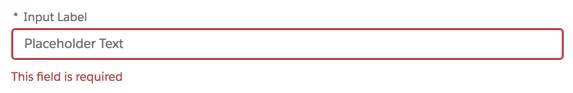
When you’re using Lightning components, you still have to keep accessibility in mind. For instance, when you’re placing an informational icon using <lightning-icon>, you still need to specify an appropriate alternative-text value so that users know the purpose of the icon. When you use <lightning-input>, you still need to specify a label to programmatically associate the resulting <input> with its <label>. Setting required="true" makes the input required in an accessible way.
Many Lightning components also have attributes to set ARIA properties. While these may not be required for accessibility, we include them in case you have a need to set these values.
Create Components
If you can’t find the component you need in our component reference, you may need to build your own Lightning component. If you do, follow these steps to make sure it’s accessible.
-
Always start from SLDS component blueprints. Explore the markup and ARIA roles, states, and properties carefully. Take note of any required attributes and attributes that change as a user interacts with your component.
-
Implement keyboard interactions. Remember that ARIA roles are a promise to your users. This promise includes providing the keyboard functionality users are expecting given the role you’ve specified. Our component blueprints include keyboard navigation instructions.
Tip: Don’t listen for Tab keypress events. Listen for focus instead. Screen reader users rarely use the Tab key to navigate a page.
-
Manage user focus. Follow our Global Focus Guidelines to ensure that interactive elements are focusable.
-
Write automation and manually test your components.
- Write integration tests to test keyboard interactions. The only reliable way to test keyboard interactions is to use a real browser. Don’t rely on manual DOM inspection to catch regressions. Write tests to ensure markup accuracy, including:
- Correct semantics at the correct node.
- Correct attributes set on the correct node.
- Correct attribute values updated during component lifecycle.
- Manually complete end-to-end feature testing using just your keyboard, following SLDS specifications. Make sure everything can be done with a keyboard.
Web Components
Web components are a browser feature that provides a standard component model for the web, consisting of several pieces maintained in different places: shadow DOM, custom elements, HTML templates, and CSS changes (source). In practical terms, web components have a custom element as a root. These custom elements have no semantic value, but can cause direct descendancy problems for assistive technologies.
Direct Descendancy Problems
If you create an unordered list, <ul>, with web component list items, <lightning-example-list-item>, your markup looks like this:
<ul>
  <lightning-example-list-item>
    <li>content</li>
  </lightning-example-list-item>
  <lightning-example-list-item>
    <li>content</li>
  </lightning-example-list-item>
  <lightning-example-list-item>
    <li>content</li>
  </lightning-example-list-item>
</ul>
This, however, isn’t accessible, because every child of a <ul> must be a <li> element. Screen readers can’t recognize that this is a list of three items. Here, it’s better to rely on ARIA roles rather than semantic elements.
Instead of a <ul> we can use another web component with role="list". Our list item web components would then need role="listitem", and we wouldn’t use <li> elements. Using the code shown below, screen readers can properly identify this as a list of three items.
<lightning-example-list>
<div
role="list"
>
  <lightning-example-list-item>
    <div r
ole="listitem"
>content</div>
  </lightning-example-list-item>
  <lightning-example-list-item”>
    <div
role="listitem"
>content</div>
  </lightning-example-list-item>
  <lightning-example-list-item>
    <div
role="listitem"
>content</div>
  </lightning-example-list-item>
</div>
</lightning-example-list>
Global HTML Attributes
Don’t use global HTML attributes to set attributes on the inner elements. When you set a global HTML attribute on the host with Lighting Web Components, our framework assumes you want it to be on the host, even if you pass it down as well. For instance, if you use the aria-describedby attribute on an input web component as an API to set the attribute on the child, you’ll inadvertently set it twice.
<lightning-example-input
aria-describedby="foo"
>
Renders as:
<lightning-example-input
aria-describedby="foo"
>
  <input a
ria-describedby="foo"
 />
</lightning-example-input>
Instead, camel case your web component’s API name, like in the following example:
<lightning-example-input
a
riaDescribedby="foo"
>
This renders appropriately:
<lightning-example-input>
  <input
aria-describedby="foo"
 />
</lightning-example-input>
More information on property and attribute names, including the use of camel case, is located in the Resources section.
Shadow DOM
Web components with shadow DOM enabled present additional problems for accessibility. Many aspects of web accessibility rely on component ID references linking different elements on the page. A simple example of this involves labeling form inputs.
<label
for="foo"
>First Name</label>
<input type="text"
id="foo"
 />
In the code example shown above, the id "foo" associates the label “First Name” with the text input. If the label and the input were then placed into separate web components because of the shadow DOM, this relationship would no longer exist in the browser’s accessibility tree.
<lightning-example-label>
     <label
for="foo"
>First Name</label>
</lightning-example-label>
<lightning-example-input>
     <input type="text"
id="foo"
 />
</lightning-example-input>
In this scenario, the label and input are no longer associated and the form is no longer accessible. The solution here is to not separate elements into different custom elements when an ID reference relationship is required.
<lightning-example-input>
     <label
for="foo"
>First Name</label>
     <input type="text"
id="foo"
>
</lightning-example-input>
As you build your own custom web components, study the SLDS blueprints and ARIA design specifications. Identify HTML and ARIA properties that rely on ID references, and never separate those elements into separate shadow roots.
A group at the W3C is developing the Accessibility Object Model, an approach that offers ways to assign roles and properties, update states, and create relationships without relying on HTML attributes and ID references. Although this model is still in the draft state, it will offer increased control over the accessibility of web components once it’s adopted by browsers, assistive technologies, and the development community.
That’s a Wrap!
Now you’ve been introduced to the basics of building accessible user interfaces. When you’re ready to start designing and testing for accessibility, look further into Trailhead for more resources. Also join our huge community of admins and developers through the Salesforce Trailblazer Community to share ideas, join groups, read success stories, and more.
Resources
- Documentation: W3C Standards and Drafts
- Salesforce Developer Reference: Lightning Web Components
- Salesforce Developer Reference: Property and Attribute Names
- Documentation: Accessibility Object Model
- Salesforce Help: Component Blueprints
- Documentation: W3C Web Components Specifications