Understand Accessible Navigation
Learning Objectives
After completing this unit, you’ll be able to:
- List strategies to provide users with navigation and action information.
- Explain the importance of managing focus in web application development.
Introduction
Users should always know where they are in an application and what actions they can take next. Provide users with navigation and action information by:
- Using consistent navigational elements.
- Applying proper heading nesting and order.
- Labelling landmark regions.
- Using a logical tab order that matches reading order (in left-to-right languages, left to right, top to bottom; in right-to-left languages, right to left).
- Using visible focus indicators for all interactive items.
Context Changes
When it comes to context changes, consider the following general rules:
- Users should expect a change in context, either because they requested it, or it was otherwise explained to them that a change was coming.
- After the change happens, users should know where they are on a page.
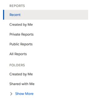
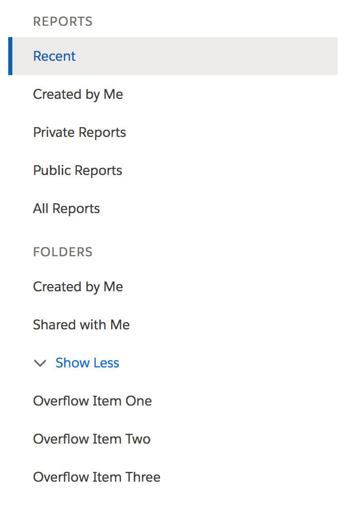
Consider the Show More button in the image of a Report and Folders navigation below.

After a user clicks Show More, you have a few options for alerting them to the new content that has been introduced.
- You could focus the first item of the new content. Is this the best option? Potentially, but the buttons reads, “Show More,” not “Take me to more.”
- You could use an
aria-liveregion to announce to screen readers that more navigational items have been added to the page. - You could change the text of the button to read, “Show Less.” This is the best option because the user's success is implied in the new text of the button: “I can show less, because more is now showing.”

The question for a screen reader user now is, “Where is the ‘more’ that was introduced?” By placing the new content in front of the user, finding the answer to this question is straightforward.
In some use cases, moving a user’s focus or using an aria-live region is appropriate. Knowing which technique to use in a given situation comes down to understanding the user’s expectations.
For example, picture an Edit button that launches a modal.

Once launched, the Edit button will be obscured by the modal, so it doesn’t make sense to keep focus on the button. In this instance, we move focus into the modal itself. As a general rule, you should never move a user’s focus unless the user has explicitly taken action. In this case, after the user clicks Edit, the focus should naturally move into the edit context.
It is also important to move focus logically when the user takes an action on something and that something goes away. Continuing with this example, where should the user’s focus go when the modal is closed? Focus needs to go to something, and not just the top of the page. A logical option, in this case, is to return to the Edit button that initially launched the modal.
Find more information about context changes, including aria-live regions, in the Resources section below.
Focus Management
Properly managing focus is one of the key factors of developing accessible web applications. In general, users can move focus through a page by pressing Tab to move forward and down the page, and Shift+Tab to move backwards and back up the page. This applies to HTML elements that natively receive focus, such as anchors, buttons, and form controls.
Complex components, such as interactive grids, menus, comboboxes, and tabsets are navigated with the arrow keys. Programming these advanced interactions is part of the promise you make to users when you use ARIA role attributes.
Let’s talk about how to manage focus when a user's context changes. What should happen to a user’s focus when they:
- Navigate to a new page?
- Open or close a modal dialog?
- Delete a record?
- Perform a drag-and-drop operation?
The answers to these questions and many more are in the SLDS Global Focus Guidelines.
Beyond these guidelines, consider the following:
- Users with some disabilities, including blind users, typically navigate forward, down the page when they interact with an application. If your design introduces new content to the page, make sure the new content is added in front of the item that triggered the change. For instance, when the user clicks a button that introduces a form inline on the page, the form should be after the button in the DOM order. Users expect to encounter the form as they go forward, down the page, not backward.
- Don’t steal focus on component initialization, unless that is part of the component’s specification. A modal dialog, for instance, is supposed to steal focus when initialized.
- Don’t create a focus trap. Allow users to get out of your components. Unless, again, this is part of the component’s expected behavior, such as with a modal.
- Handle infinite loading carefully. Don’t force keyboard-only users to load and navigate through an entire feed, list, or table in order to get to content on the other side. For example, our Chatter feeds all have a “Skip this feed” link at the beginning of the feed.
Next, we’ll take a look at writing accessible components.
Resources
Salesforce Help: Lightning Design System Global Focus Guidelines
W3C Techniques for WCAG 2.0: ARIA19: Using ARIA role=alert or Live Regions to Identify Errors