Get Started with Tableau Maps
Learning Objectives
After completing this unit, you’ll be able to:
- Explain when maps can aid visual analysis.
- Describe what kind of maps you can build in Tableau.
Spatial Data Analysis
Like all types of visualizations in Tableau, maps help you to see and understand data. And like other types of visualizations, Map visualizations are most effective when they're created to answer a question. In this case, a spatial question.
A spatial question is a query that focuses on uncovering data insights from a specific location, or a comparison between two or more locations. Often, spatial questions begin with "where" or "which."
For example:
- "Where in Washington State can I find level-2 electric vehicle (EV) chargers?"
- "Which metropolitan area in Washington State has the most registered EVs?"
- "Which city in Washington has the highest density of EV chargers?"
These questions can be answered by using maps to conduct spatial data analysis. But not all data questions are best analyzed on a map. Before you create a map in Tableau, ask yourself if a different type of visualization could answer your question faster or easier.
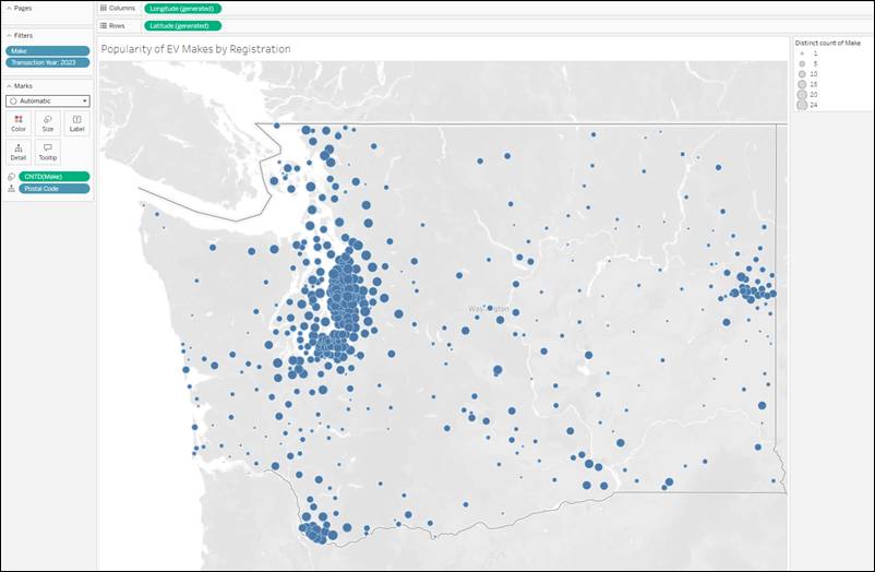
Let’s say your question is, “What make and model of EV is the most popular in Washington State?”
In this example, you see a simple point map showing EV registrations by distinct count of make per postal code in Washington State. Is it immediately obvious which one is the most popular?
How about with a stacked bar chart?
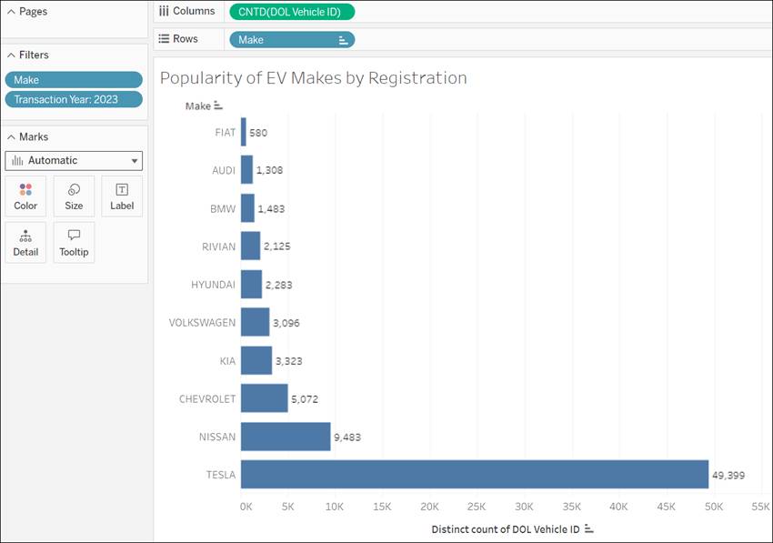
It’s easier to see which make of EV has more registrations in WA state with a stacked bar chart. In this instance, using a map to visualize your data isn’t the best choice. Let’s learn when maps are the right choice.
Map Types in Tableau
With Tableau, you can create many different map types to see and understand spatial data. You can create maps in all Tableau products, including Desktop, Server, Cloud, and Public. In this module, we briefly introduce Simple Point Maps, Filled Maps, Density Maps (heatmaps), and Layered Maps. In subsequent units, you learn how to make these maps and which types of data are best suited to them.
Simple Point Map
Simple point maps work well if you're analyzing data to find a specific location, or if you're looking for patterns of data across locations. They show quantitative data per location, and the map marks can be encoded with size and color to show increased or decreased quantity. In this example, we're visualizing the sum of Level 2 EV chargers in each postal code in Washington State.
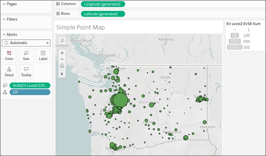
Looking at the map, you can clearly see that the Seattle metropolitan area has far more level 2 EV chargers than other parts of the state. So if someone needed to charge their car fast, they would head to that area.
Filled Maps
Filled maps work well for showing ratio or aggregated data. Let's say you wanted to know which populous area of Washington State purchased and registered the highest number of EVs. You could look at a bar chart of all 594 zip codes, but that seems like an overwhelming number of bars. The better option would be to add the data to a filled map.
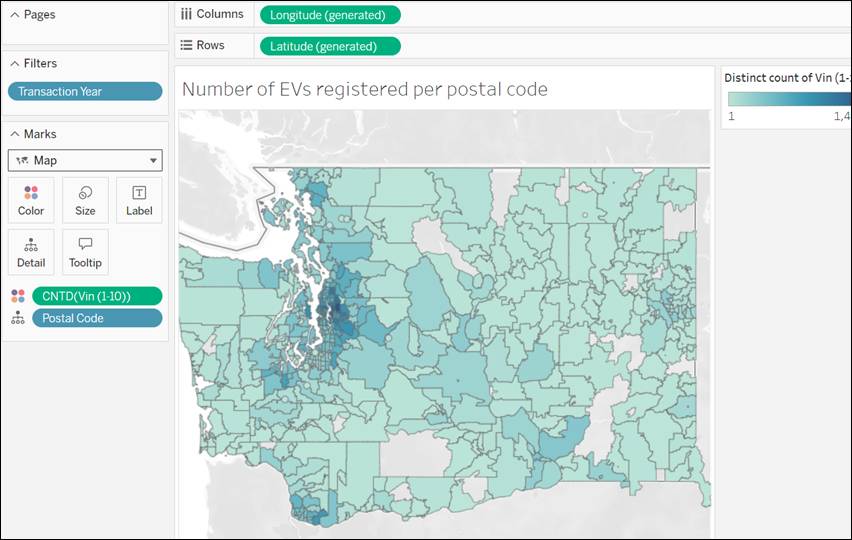
In this map, your eye is drawn to the darker blue around the Seattle metropolitan area. People living in this area purchase and register the most EVs. If you were thinking of starting a business repairing EVs, you would consider setting up shop in the Seattle metro area. In the areas of the map not filled in with color, there is no data in the data set for those postal codes.
Heatmaps
Heatmaps, also known as Density Maps, work well for showing concentrations where marks are clumped together, making it difficult to distinguish quantities of marks. Tableau creates density maps by grouping overlapping marks and color-coding them to reveal the relative concentration of the marks.
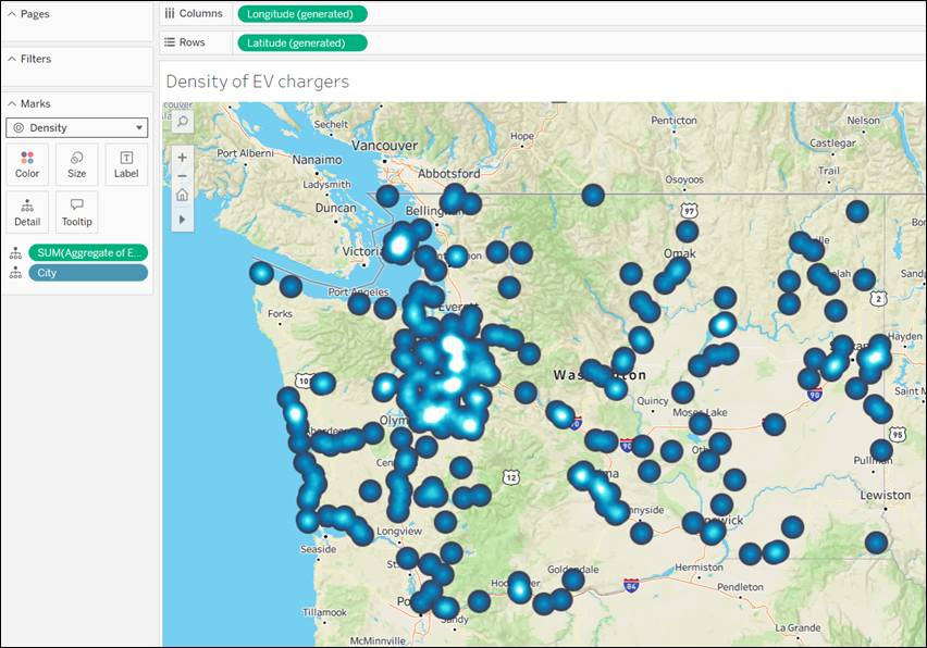
In this map, you can see that there’s a higher concentration of EV chargers around the greater Seattle metropolitan area. If you were planning a road trip from Oregon to Vancouver, Canada, you would plan to stop and charge your car in Seattle.
Layered Maps
Layered Maps let you layer one map on top of another, helping you visualize data sets in the context of one another.
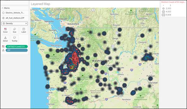
In this map, there’s a density map of Level 2 EV chargers, showing their concentration by postal code. There’s also a map showing the number of EVs registered per postal code (red circles) layered on top of the map of Level 2 EV chargers. You can tell there are two layers because there are two Marks cards. Analyzing this map, you can see that there’s a big concentration of registered EVs and charging stations around the Seattle metropolitan area, but also pockets throughout the state, particularly along the major interstate highways, where the ratio of changing stations is significantly higher than the registration of EVs in that postal code.
Customize Your Background Layer
You can add visual detail to your map by customizing how the map looks. The background layer of your map contains everything behind your marks, from the borders and ocean to neighborhood landmarks.
You can change the style from the default, Light, Dark, Normal, Streets, Outdoors, or Satellite.
Click through each tab to see examples of the background layers.
To change the background layer on your map, navigate to the toolbar. From the toolbar, select Map, and then choose Background Maps… Then, select a background layer.
Now that you know why you should build maps, and what kind of map types are available in Tableau, let’s learn how to take a spreadsheet and transform your data from rows and columns to shapes and points on a map.