Compare Business Requirements with the Storefront
Learning Objectives
After completing this unit, you’ll be able to:
- Explain what you need to compare with the actual storefront.
- Describe the best way to deal with schedule impacts.
- Explain the benefit of fixing authentication gaps.
- List the three typical parts of checkout.
- Describe the differences between the product tile, product details, and Quickview versions of product information.
Introduction
You’ve done all the hard work of getting your team from planning to implementation. Development is done, as is most of the testing. You’re ready for the big time.
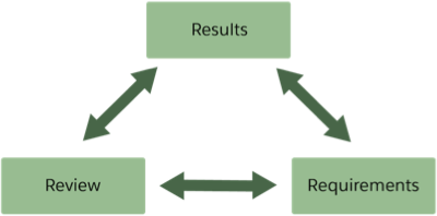
Now that launch is imminent, it’s time to step back and check the results. Does the new storefront meet the merchant’s business requirements, and have you configured Business Manager appropriately?
In this unit, we discuss the business requirements review. We’ll get to Business Manager later.
For now, you need to take a hard look at the business requirements as documented during the discovery phase in the functional specification document (FSD). Review this document against the actual storefront to ensure you’ve met the objectives.

What If There Are Gaps?
Things happen. Conversations between a developer and the merchant can result in a change that wasn’t documented. For example, the search results page shows infinite scrolling—requested at the last minute—when the functional specification called for pagination buttons. Sure it was a great idea, but it was a change. During this review, every missing module, field, button, and data must be accounted for.
But this might delay the launch, you say!
Relax. The best way to deal with any schedule impact is to identify the gaps, document them, and then create a plan for their completion. Each item should be given a score for impact and priority.
A cosmetic issue, for example, won’t stop the launch; but a missing catalog feed would, as would the absence of the Bill Me Later and PayPal payment methods or a credit card security code field. Shoppers not being able to pay is a show stopper.
Explaining that the launch date has to be delayed can be difficult, but presenting a reasonable explanation along with a detailed plan can go a long way to ease frustration.
The goal of this unit is to learn how to determine if new storefront functionality meets the requirements. And if not, what to do next.
Let’s take a look at these areas.
- Authentication
- The Home Page and Navigation
- Categories and Search Results
- Product Tile and Details
- Quickview
- Cart and Checkout
Authentication
Authentication is when the shopper identifies themselves. Typically, they enter an email address or user ID and then a password. You need to review what this looks like and compare it against the documentation.
Start by asking if the storefront lets the shopper:
- Create an account
- Log in to their account
- Log out of their account
Does the user interface change based on the shopper’s status? For example, does it display as follows?
Known shopper |
Hello, Grant Trustworthy |
|---|---|
Guest shopper |
Log in / Create an account |
A known shopper means that the shopper has been identified by the storefront, usually through cookies. They haven’t logged in yet. The next element to consider is where in the storefront the authentication happens, and does this match the documentation? These are a few possibilities of where to ask for authentication.
- When the shopper is accessing account details
- During checkout or payment
- When the shopper is viewing order status
Reviewing, documenting, and ultimately fixing the gaps here can help tighten security.
The Home Page and Navigation
You need to pay close attention to the storefront layout. What home page and navigation elements are required? The answer often involves these storefront elements.

-
Header—An area at the top of every page.
-
Footer—An area at the bottom of every page.
-
Global Navigation—A area that displays on every page for easy navigation (for example, a left frame that contains the table of contents).
-
Home Page—What’s shown when the shopper first opens the storefront and displays when they click Home, for example.
Header
The header provides functionality for multiple users—in this case, shoppers and merchandisers. You need to review the header for both user types.
For example:
Shoppers need to be able to: |
|
|---|---|
Merchants need to be able to: |
|
It’s best practice that merchandisers be able to change header elements within Business Manager. While the storefront code should be written to display these changes automatically, you need to compare these elements with the documentation as part of your launch readiness assessment.
Footer
Footer information, while important, involves scrolling down to the bottom of the page. Standard storefront footers contain things such as a newsletter sign-up link and links to the site map, contact info, the user’s account, and legal details. The footer should be on every page, and should only contain links to content assets. Merchandisers should be able to change the linked content assets without changing the footer.
Global Navigation
Global navigation must meet requirements, such as displaying a defined number of levels in the navigation’s hierarchical structure. This is an example of three levels.
- Sale
- Boots
- Leather
- Casual
- Work
Like they do in the header, merchandisers want to be able to automatically change certain elements, such as:
- Whether dropdowns display in a vertical or horizontal format
- The content that displays based on a category attribute
- The sequence of categories
Whether in the header or in its own area, the keyword search capability must be available on every page.
Home Page
The merchandiser must be able to change all content on the homepage via content slots. There should be no static information on this page. This is the first connection with shoppers, and the first attempt the merchandiser has to sell products.
Categories and Search Results
Here are some things to consider when designing category and search results pages.
- What’s the shopper’s experience supposed to be on a category or search results page? For example, are they supposed to be able to toggle from tiles to lists and back?
- Do the page breaks between multiple results work as documented? For example, was the storefront designed for infinite scrolling or for navigation via links or buttons?
- Do breadcrumbs work properly? Review all aspects of how they are supposed to work. For example, do they show the user path and do they exclude Home from the path?
Compare Product Tiles, Details, and Quickview
Product information displays differently depending on whether it’s a product tile, a product details page, or a Quickview window. Each has a unique purpose and size restriction.
You need to review for each display type.
Product Tile |
Product Details |
Quickview |
|
|---|---|---|---|
Image |
One |
Multiple |
Multiple |
Alternate product views |
No |
Yes |
Yes |
Video |
No |
Yes |
Yes |
Quickview link |
Yes |
No |
N/A |
Quickview mouseover |
Yes |
No |
N/A |
Pricing |
Standard pricing, was/is pricing, price range |
Standard pricing, was/is pricing, price range |
Standard pricing, was/is pricing, price range |
Star rating |
Yes |
Yes |
Yes |
Color swatches |
Yes |
Yes |
Yes |
Compare products |
Yes |
No |
No |
Product specifications |
No |
Yes |
No |
Recommendations |
No |
Yes |
No |
Ratings and reviews |
No |
Yes |
No |
Social icons |
No |
Yes |
Yes |
Product name |
Yes |
Yes |
Yes |
Product ID |
No |
Yes |
Yes |
Select size |
No |
Yes |
Yes |
Select color |
No |
Yes |
Yes |
Link to size chart |
No |
Yes |
Yes |
Link to full details |
No |
N/A |
Yes |
Select quantity |
No |
Yes |
Yes |
This table is a sample based on SFRA, but it can vary based on implementation and design. Other specifications to review here include mobile behavior. For example, Quickview would not be available for mobile devices.
Cart and Checkout
What details should you see on the cart page and during checkout? Let’s start with the cart.
Cart
Check if the storefront displays every item that a shopper purchased in the correct size, color, and quantity. Can the shopper edit an item and then return for more shopping?
The shopper should also be able to enter a coupon code and proceed to checkout, whether as a guest or as a logged-in user.
Checkout
Checkout, more than any other storefront feature, must be able to handle the underlying device in a way that maximizes the device’s capabilities and expedites the shopper’s interaction. Take a look at the Salesforce B2C Commerce Functional Consulting Strategy module for more details.
A typical checkout has three parts.
-
Billing—Make sure the specified payment process is accurate and includes required payment providers.
-
Shipping—Make sure all specified shipping methods and address verification processes are accurate and functional.
-
Order Confirmation—Make sure the order details are accurate and that the shopper can create a new account.
Make sure the overall checkout process is as precise, smooth, and short as possible. Aggravation at checkout translates into abandoned carts.
Next Steps
We took the time necessary to compare the FSD against the implemented storefront. Along the way, you identified gaps, documented them, and then created a plan for their completion. You gave each item a score for impact and priority. From the home page to product display to check-out, you covered it all.
Now it’s time to check the storefront’s Business Manager settings to ensure everything’s in order for launch. You’re halfway through your launch readiness review. How great is that?
Resources
