Make Your App Look Great
Learning Objectives
After completing this unit, you’ll be able to:
- Understand why designing the surface of your app comes last in the process.
- Learn the elements of an app’s surface.
- Review issues with the Motivator example app’s surface and fix some of them.
- View the final polished app.
The Last Shall Be First
As we said at the outset, it’s easy to start by creating app and dashboard elements that look really great. Analytics Studio gives you lots of easy ways to develop explorations, choose slick-looking chart types, size and position dashboard widgets, change font size and colors, and so on.
As you’ve also seen, the best-looking charts don’t help an audience do anything until they’re developed in the proper context. What do we mean by context? It’s the purpose and feature ideas for your app and its planned structure.
You’ve determined those parts of the Motivator. Now it’s time to think about how to polish it—to make the app’s surface put the best face on its underlying elements. Even though you don’t work on it until the end of the process, this is the part of the app your users encounter first. You’d better make it shine so that your audience wants to use all those features that took such hard work.
Creating Visual Appeal
Now it’s time to really think about what an app looks like. This is where you apply your aesthetic judgments to build visual appeal, which in turn can increase users’ emotional attachment to your app. Here are the elements you control to make features look so great users can’t wait to get their hands on them.
- The sizes and shapes you use: Do they reflect the importance of the features, and are they balanced with each other? Do they employ space efficiently?
- The kinds of chart types you employ: Are they the right ways to visualize the data they present? Are they consistent, with similar chart types used for like data (and different chart types used for different types of data)?
- Alignment, space, and positioning: Are elements arranged in an orderly, pleasing fashion? Are they distinct from each other so you can tell where one ends and another begins? Is there too much (or too little) space separating elements?
- Colors: Do you have a pleasing palette, where colors go together appropriately? Are elements that need to stand out colored effectively? Are similar elements colored consistently?
- Fonts: Are sizes and types consistent, with the same levels of information presented using the same sizes and types?
- Branding: Where appropriate, have you incorporated your team’s or company’s branding elements?
Making the Motivator More Motivating
With those elements in mind, let’s consider the parts of The Motivator’s dashboard that may be, well, demotivating. There’s some obvious surface stuff that’s just wrong (some of which you’ve noticed before).
- You can’t see the level of detail about activities we need. Maybe other chart types are needed.
- And why are the bars for the separate activities (calls, emails, and so forth) so big? Surely, the space they take up can be used way more effectively and make room for other useful metrics (such as averages or benchmarks, details about each activity type, and so on.)
- Type size is inconsistent. The metrics on the left are all different sizes. Is there a pattern to it? Or is it just random? It’s impossible to say.
- Some parts of the dashboard run into each other. Owner Name is part of a widget that includes lots of numeric values.
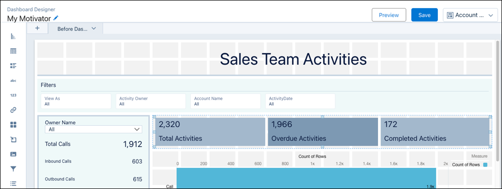
- The colors and sizes of the sections showing totals don’t make sense.
My Motivator Makeover, Step 3: Size and Colors Matter
We’re now at the design stage where we can start fixing those issues. At the end of the last makeover step, you noticed that the summary boxes showing total, overdue, and completed activities were incorrectly sized and colored. Let’s go back into Analytics Studio and fix that.
- Open the My Motivator dashboard in the dashboard designer.
- Resize the Total Activities metric to 4 cells wide.
- Drag the Overdue Activities metric 1 cell to the left.
- Widen the Completed Activities metric to the left by 1 cell. Your metric widgets are now the same size.
But not the same color.
- Click the Total Activities metric.
- In the widget properties panel on the right, click Widget Style to expand it.
- Under Background Color, click the current color and select dark blue.
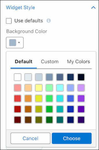
- The widget text is also dark, so now it’s hard to see. Easy to fix. In the widget properties panel, click Title to expand it. Change the Title Color to white.
- Now expand Number and update Number Color to white. That’s better.
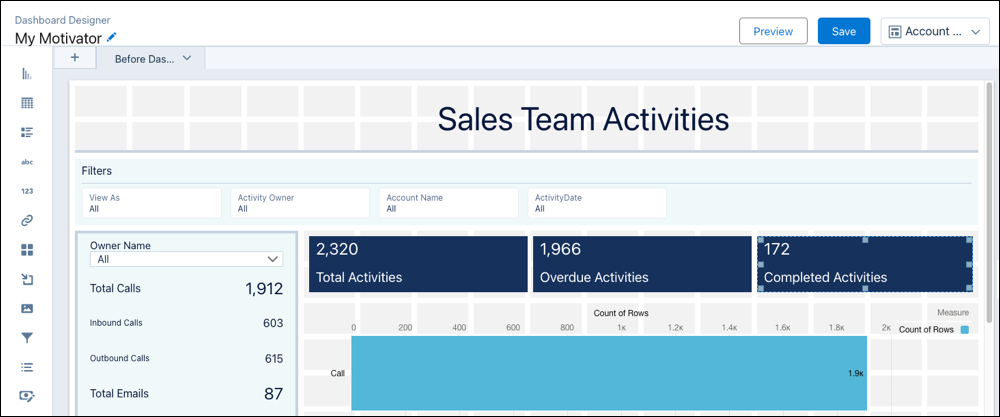
- Repeat steps 5–9 to change the background and text colors for the Overdue Activities and Completed Activities metrics.
- Save your updated dashboard, and then preview it. Wow, now those metrics really pop.
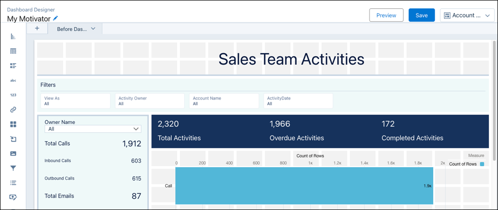
There’s one more tweak you can make here. Those metrics still look a little detached, when really you want them to be viewed as one. Remember that container widget that you used to move the widgets together? That can help here.
- Edit the dashboard.
- To select the container widget, hover over the edge of the container below one of the metrics and click when your cursor changes to cross arrows.
- In the widget properties panel on the right, click Widget Style to expand it.
- Change the background color to the same dark blue that you used for the metrics.
- Save your updated dashboard, and then preview it.
Now, your metrics read like a story.
The Motivator, Made Over
It’s getting there. You’ve identified the audience, purpose, and features for your app. You’ve understood how The Motivator doesn’t live up to those designs. And you’ve made a few fixes at all levels—purpose, structure, and surface.
It’s clear that your app is getting closer to your design goals. But it’s also clear there’s a long way to go. We can’t take you all the way there, step-by-step. That’s beyond the scope of this Trailhead module. We’ve introduced you to the basics of design and taught a few techniques to get you started expressing your ideas.
But, we can show you The Motivator, made over by our design team. So, without further ado, go back to Analytics Studio and open The Motivator 2 dashboard.
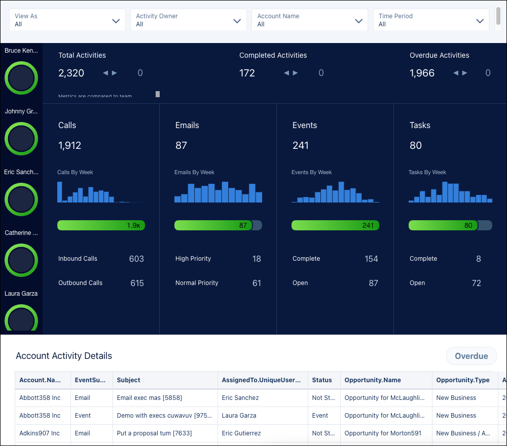
Cool, you can see right away how the finished makeover improves on the original.
-
Purpose enhancements. It now includes the all-important leaderboard on the left, a Time Period filter, and lots more details about all types of activities. Plus it now includes account details.
-
Structure enhancements. The summary KPIs are at the top, where we moved them. Also, the KPIs for each member of the team are top left, where they’re most prominent and easy to reach. The space is apportioned much more appropriately: Instead of large bars just representing totals of each activity, the same amount of space has tons of detail for all the activities. In addition, like elements are together, while different elements are separated from each other.
-
Surface enhancements. The aesthetics are just right—and get your users excited about your app. Colors work together. It’s easier to pick out elements with the new color palette. Type sizes are consistent. Similar elements are similarly sized, colored, and arranged. The whole thing just looks professional.
Awesome, right? Of course, we cheated a bit and took you straight to the finish line. But we hope you can see how we got there. We also hope that by using the resources referenced throughout this module, you can get there yourself with a little time and determination.
A Designer Admin’s Work Is Never Done
Maybe that’s good enough for now. But as the admin for DTC, you soon find that leaving well enough alone is never good enough. Your users expect enhancements, and there’s always a way to make an app more usable, right?
For example, you’ve heard about the Analytics Studio pages feature, which can make dashboards easier to use by dividing content into multiple pages. They let you tell a story by creating a dynamic pathway through your dashboard. Maybe each activity in The Motivator can get its own page, and you can add useful details, such as seeing each rep's progress toward quota; closed, won, and lost deals; and total revenue. That can help you and them understand how activities contribute to sales performance and see if certain types of activities have more impact than others.
But that’s for another day. Your unexpected journey into the world of design is almost over. All that’s left to do is answer these questions and complete your well-deserved badge.
Resources
-
Create Dashboard Pages from Salesforce Help.