Explore Granularity
Learning Objectives
After completing this unit, you’ll be able to:
- Define granularity.
- Identify how aggregation and granularity impact data.
What Is Granularity?
Granularity refers to how detailed data is. In the previous unit, you looked at the following bar chart with all the values in the Age variable aggregated as a sum. The information is not very detailed, therefore has low granularity.
The bar chart shows fully aggregated data, with a single number for the entire data set. The jitter plot shows fully disaggregated data, with a mark for each value. The jitter plot is more detailed, therefore has a higher granularity than the bar chart. The bar chart is high aggregation, low granularity. The jitter plot is low aggregation, high granularity.
|
|
|---|


This disaggregated data shows the highest level of detail, which provides the highest granularity of all the visualizations. “Lowest level of detail” is one of the characteristics of meaningful data, as explained in the Well-Structured Data module.
Examples of Granularity
Let’s continue exploring granularity. We’ll use a data set that contains information about a business franchise and examine the data using levels of granularity.
This data set contains more than 50,000 rows. Each of these rows contains information about a single transaction. Lower granularity (higher aggregation) allows you to see larger patterns. Increasing to higher granularity (lower aggregation) lets you see the details behind the patterns.
A scatter plot is a chart that enables users to plot numeric data (quantitative variables) on both a horizontal and a vertical axis to see correlations or relationships between values. For this example, we use a scatter plot to explore the relationship between a business’s sales and its profits.
View a Scatter Plot with Two Quantitative Variables
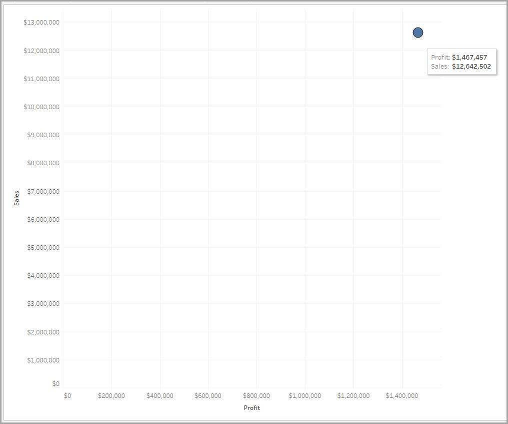
We begin with the quantitative variables Profit and Sales, shown in the following scatter plot.
At this point, one number (Sales) is plotted against another (Profit). The two numbers are compared with only one data point or mark because Sales and Profit are fully aggregated to a single number (Sum of Sales and Sum of Profit).
This data is not very detailed, thus has low granularity. To learn about the business’s profit and sales, the data must be more granular.
View a Scatter Plot with Qualitative Variable Added
When a qualitative variable is added to the scatter plot, the granularity of the data increases.
With the Category qualitative variable color-coded, the data is now separated into three marks, one for each product category sold. It’s more granular than the one-mark scatter plot, but you may still want to see the data in greater detail.
Look at profits by category in the following scatter plot. Furniture profits lag behind the other two. A reasonable next step is to add granularity by investigating whether this trend holds true across geographical markets.

View a Scatter Plot with a Second Qualitative Variable Added
With the Region qualitative variable added to the following visualization, you can explore whether furniture has lower profits across all geographical markets. The number of discrete regions from the data source is multiplied by the number of categories to create marks in the scatter plot. So, the 13 regions are multiplied by the three categories to create 39 marks on the scatter plot.
The data is now granular enough that you can see a potential cause for the low furniture profits. The Southeast Asia region has noticeably lower furniture profits than other regions. You can continue increasing the granularity of the data to dig deeper into negative furniture profits in that region.

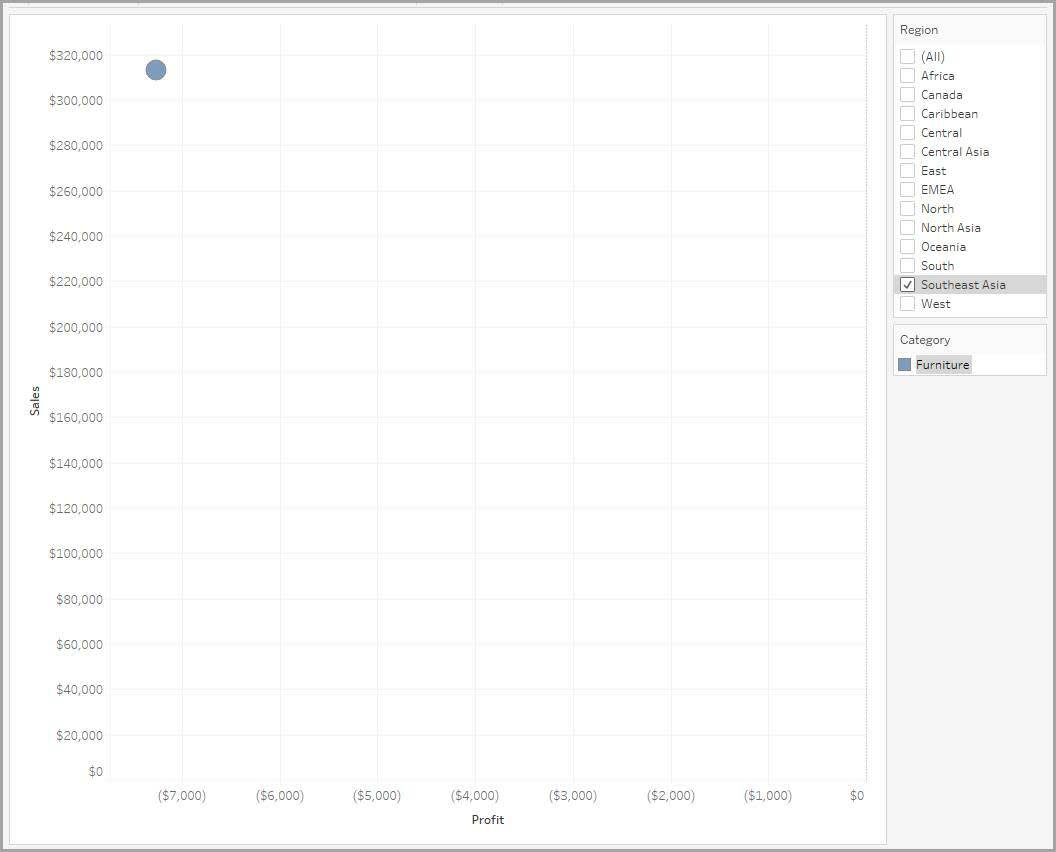
View a Scatter Plot with Filtered Data
You notice that the Southeast Asia region has lower furniture profits than other regions. You want to see whether this unprofitability is because of just one or two transactions or if many transactions are unprofitable.
You know that the data set contains one row for every transaction. If the data is disaggregated, you see one data point (or mark) for every transaction in the data set. But before disaggregating the data to this level, filter the data to keep only the transactions about furniture in the Southeast Asia region.
The following scatter plot shows the filtered data contains only one mark for furniture in Southeast Asia.

View Disaggregated Data
With the data filtered to show only furniture in Southeast Asia, you are now ready to see the data at its highest granularity.
Disaggregating the data shows a separate mark for every data value in every row of the selected data. In the following visualization, you see one mark for each furniture transaction in Southeast Asia. Exploring levels of granularity in this way leads to an important discovery: Many furniture sales transactions are unprofitable in Southeast Asia.

You now know how predefined aggregations impact data and how different levels of granularity affect data analysis.
Resources
- Tableau Help: Scatterplots, Aggregation, and Granularity
- Tableau Site: Free Training Videos
- External Site: Tableau Tutorials: How to Build a Jitter Plot