Optimize Navigation with Proper Headings in Page Layouts
Learning Objectives
After completing this unit, you’ll be able to:
- Explain the importance of heading hierarchy for keyboard navigation.
- Configure accessible headings on a Lightning record page.
The Importance of Heading Structure
When you’re driving, road signs tell you where you are and where you’re going. In a digital environment, headings serve a similar purpose. They provide a structural outline that helps all users navigate and understand the hierarchy of the information on a page.
Remember that semantic markup is the digital scaffolding that assistive technology relies on. Using the correct heading tags (levels 1–6) creates a logical outline that assistive technology can interpret. Level 1 is the highest heading level and levels 2-6 are nested sequentially below level 1. While bold, large text may help sighted users scan a page visually, it’s just text to a screen reader unless it’s properly tagged. These tags function as an important navigation method for screen reader users, allowing them to jump directly to specific sections without tabbing through every single element on the page.
The good news is that Salesforce handles much of the heavy lifting for you. Our standard components are built with accessibility in mind, automatically generating the appropriate heading tags to keep the page structure logical. However, as an admin customizing pages, you should understand how headings work and how you can inadvertently introduce accessibility barriers in your org. By knowing the rules of the road, you can ensure that your custom additions don’t accidentally remove or obscure the signposts your users rely on.
Navigating the Noise with the Blind Institute of Technology
You continue working on the contact page in the org that you created for this badge shortly. But first, let’s check back in with our friends from BIT who will show us why the current headings on the contact page aren’t ideal.
As Rebecca demonstrates, the current contact page layout continues to create barriers for screen reader users. She showed how text that visually resembles a heading was completely bypassed by the screen reader because it lacked the correct heading tag. The demo also highlighted the increased cognitive load, or mental effort, imposed by the Details tab, where a long, unstructured list of fields made finding specific information difficult and inefficient.
Choosing the Right Heading
As you saw in the BIT demo, the Heading text looked like a heading to the eye, but the screen reader skipped right over it. That’s because the text only had a larger font size rather than a semantic heading tag. To a screen reader, it’s just text.
Now you’re going to fix it. But before you do, how do you know which heading tag to apply? Remember, headings should form a logical outline, like a table of contents, with subheadings nested within higher level headings. Stick to the hierarchy to keep the structure sound.
Salesforce Platform pages have two level one headings by default. These are tagged with <h1> in the page’s HTML.
-
Banner navigation section: Displays the app name.
-
Main content area: Displays the record name and object.
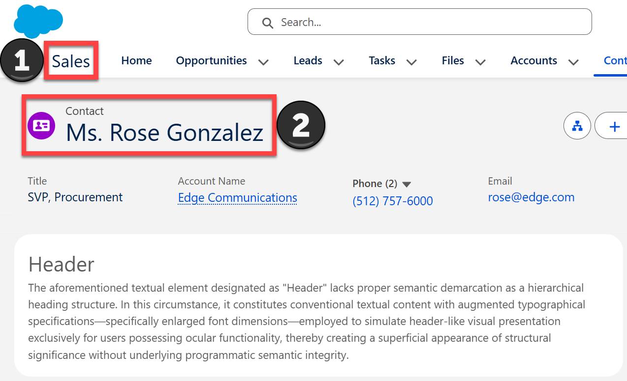
Check out the contact page for Ms. Rose Gonzalez. In this example, we’re viewing the record from the Sales app (1), which is the first <h1> heading on the page. The second <h1> heading includes the record name (Ms. Rose Gonzalez) and object (Contact) (2).
Because the contact page already has two <h1> headings, the custom rich text component on the page should start with a level 2 heading, or <h2>.
Fix Heading in the Rich Text Component
Alright, now that you know the correct heading tag to use, fix the heading in the rich text component on the contact page.
Hands-on challenge note: In order to pass the challenge for this unit, you must complete the steps outlined in the badge content.
- Open the Ms. Rose Gonzales contact record in your org.
- Select
 , then Edit Page.
- Select the existing rich text component in the main region that starts with “Heading”.
- In the Properties section (right panel), highlight the Heading text.
- Select the menu button where it currently displays Normal.
- Select Heading 2.
- Save your updates to the contact page.
Component and Section Headings
Let’s talk about a couple other headings Salesforce automatically assigns. For instance, the tabs component on your contact record is assigned an <h2> heading. If you look at the accessibility tree while on the Details tab, you see that the next heading after "Tabs" (1) is the "Activity Publisher" (2) in the right sidebar, also an <h2> heading.
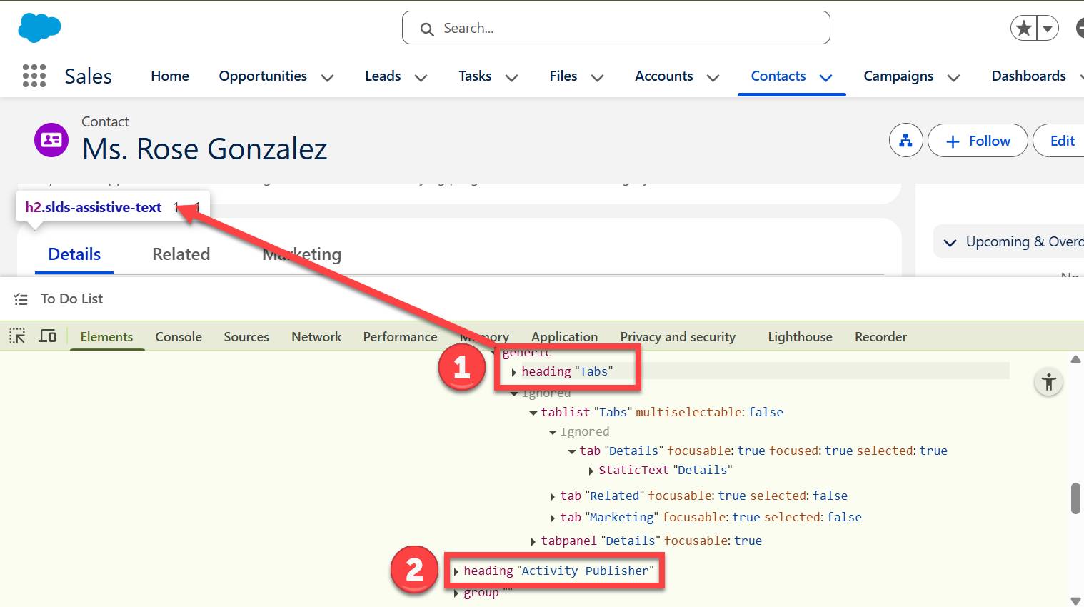
Notice anything missing? The actual fields on the Details tab were completely skipped in that heading navigation. While the Details grouping (labeled as a tabpanel in the accessibility tree) is keyboard focusable, meaning a user can tab into it, the lack of internal headings creates an unnecessary barrier. Without headings to categorize the data, a screen reader user can’t get a quick overview of the content. Instead, they are forced to tab through every single field just to understand what information is on the page.
Add Section Headings and Organize Fields
First, let’s upgrade to Dynamic Forms to make page updates easier and more intuitive.
- If needed, reopen the Ms. Rose Gonzales contact record.
- Select
 , then Edit Page.
- In the main region, on the Details tab, select the Record Detail component.
- In the Properties section (right panel), select Upgrade Now to enable Dynamic Forms.
- Select Next, then select Contact Layout as the source for the dynamic form.
- Select Finish.
Next, let’s add some sections to the Details tab and organize the contact fields in a more logical way. Notice that when you enabled Dynamic Forms, it automatically arranged most of the fields in a section labeled Contact Information. It also surfaced two existing sections, Address Information and System Information. These sections were previously only visible when the record was being edited because the headings were disabled in the page layout editor. That’s a start, but there is still some more work to do.

- In the left panel, select the Fields tab.
- Add a Field Section component below the Contact Information section.
- Set the Custom Label for the new section to
Phone Numbers.
- Move the following fields from Contact Information to the new Phone Numbers section:
- Do Not Call
- Phone
- Home Phone
- Mobile
- Other Phone
- Do Not Call
- Move the following fields from Contact Information to the existing Address Information section:
- Mailing Address
- Other Address
- Mailing Address
- Move the following fields from the Details tab to the Marketing tab you created earlier:
- Lead Source
- Lead Source Rating
- Last Marketing Touch Date
- Lead Source
- On the Marketing tab, select the Section field section.
- Change the Custom Label to
Lead Details.
- Save your changes.
Review and Test Your Work
Now, let’s take a look at your improvements from the perspective of the accessibility tree. Because you’ve added field sections that have headings, a screen reader user can now navigate through the Details tab by jumping from heading to heading. Instead of tabbing through a long, undefined list of fields, screen readers can quickly skip to the specific section they need.
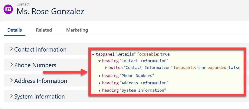
The screenshot of the updated contact record here shows how the field sections you just added equate to headings with the same labels in the accessibility tree. The field sections were collapsed in this example for clarity, which you can also see in the accessibility tree where it says button “Contact Information” focusable: true expanded: false.
By organizing fields logically across sections and tabs, you reduced the noise on the page. You placed high-traffic information on the Details tab where it’s easily accessible, while moving specialized data, like the fields in your new Marketing tab, to a separate area. This keeps the main view clean for the majority of users while ensuring that specific teams can still find what they need.
In the next unit, you learn how to apply the same concepts to bring structural clarity to a screen flow.